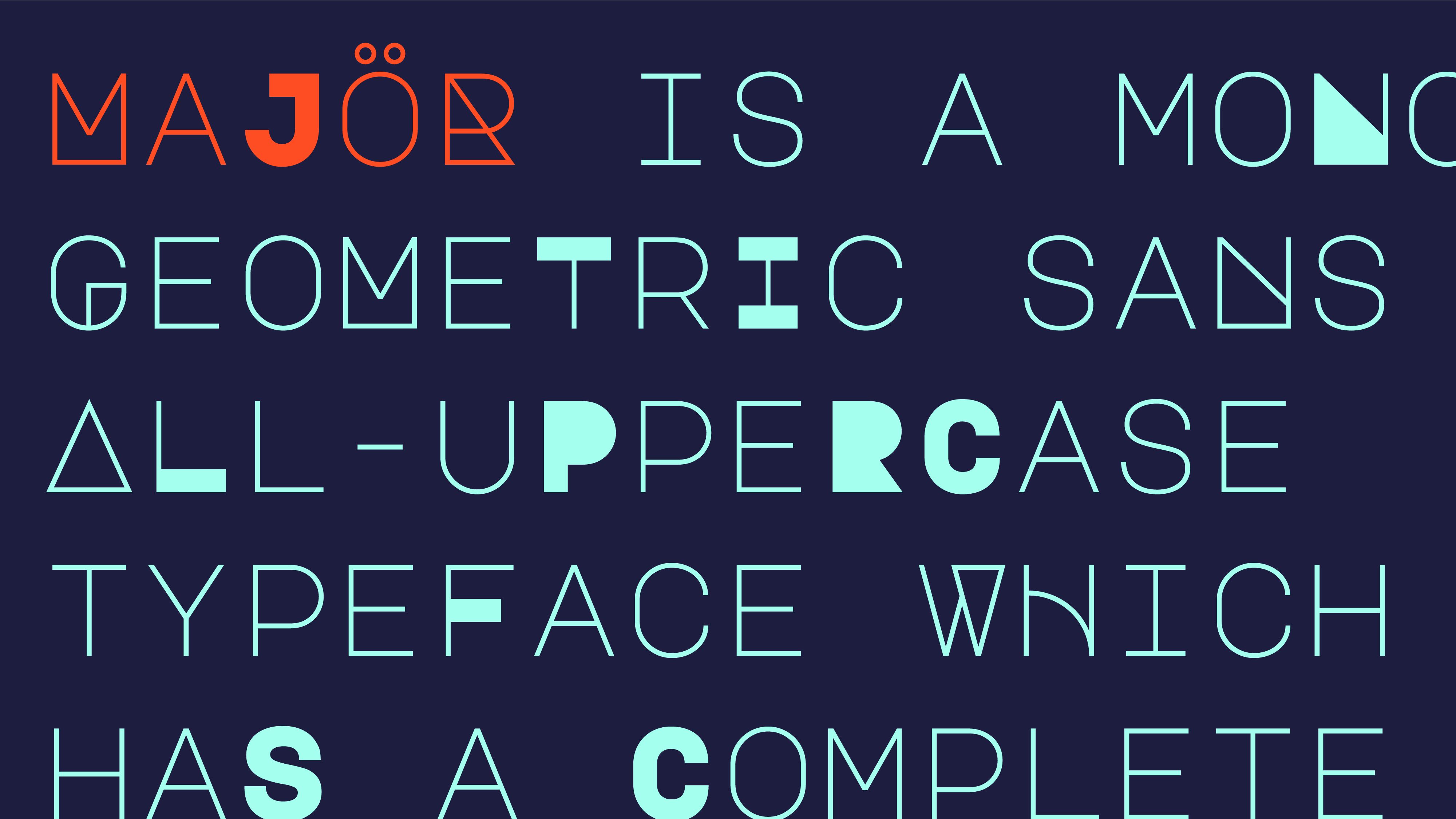
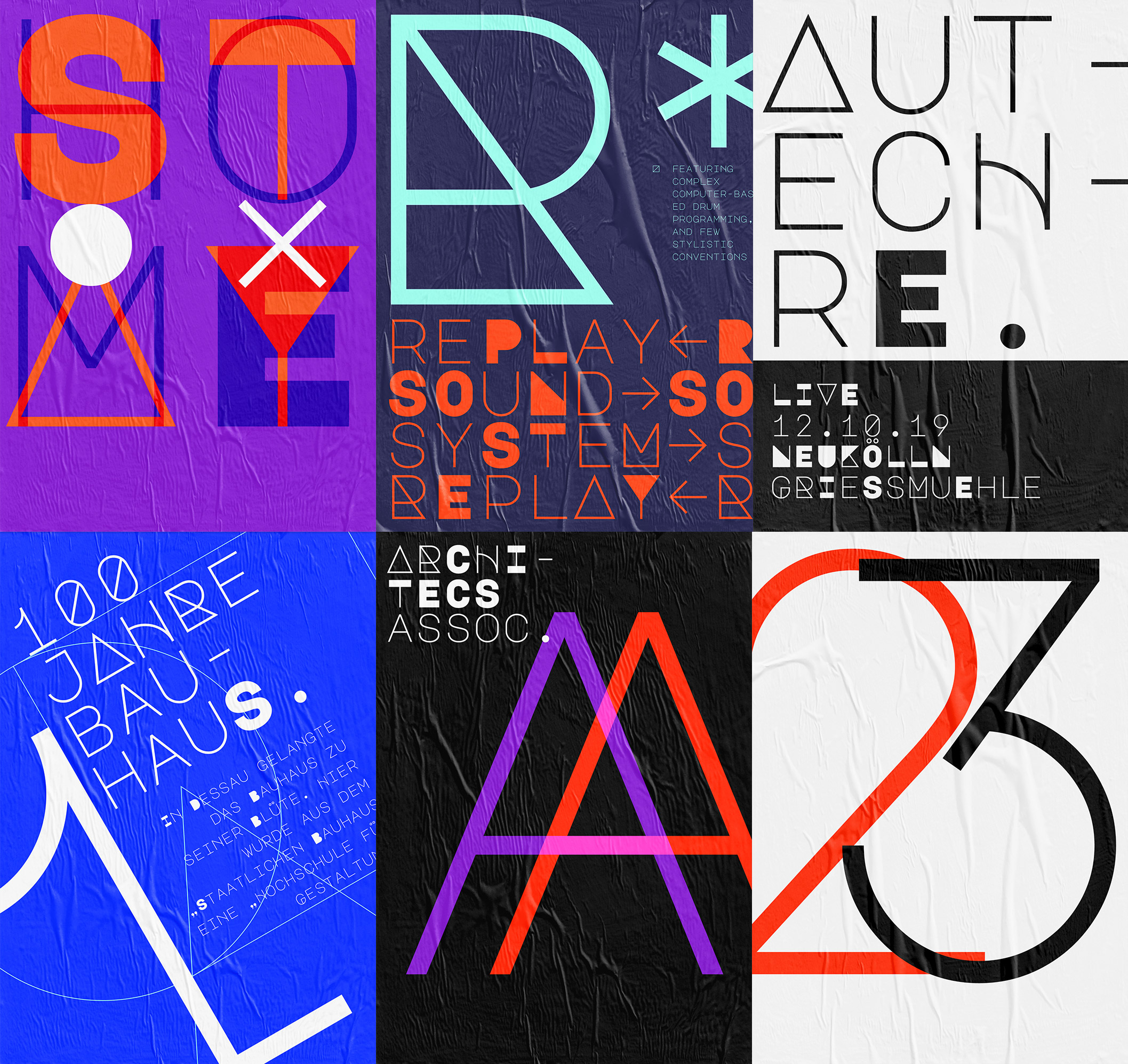
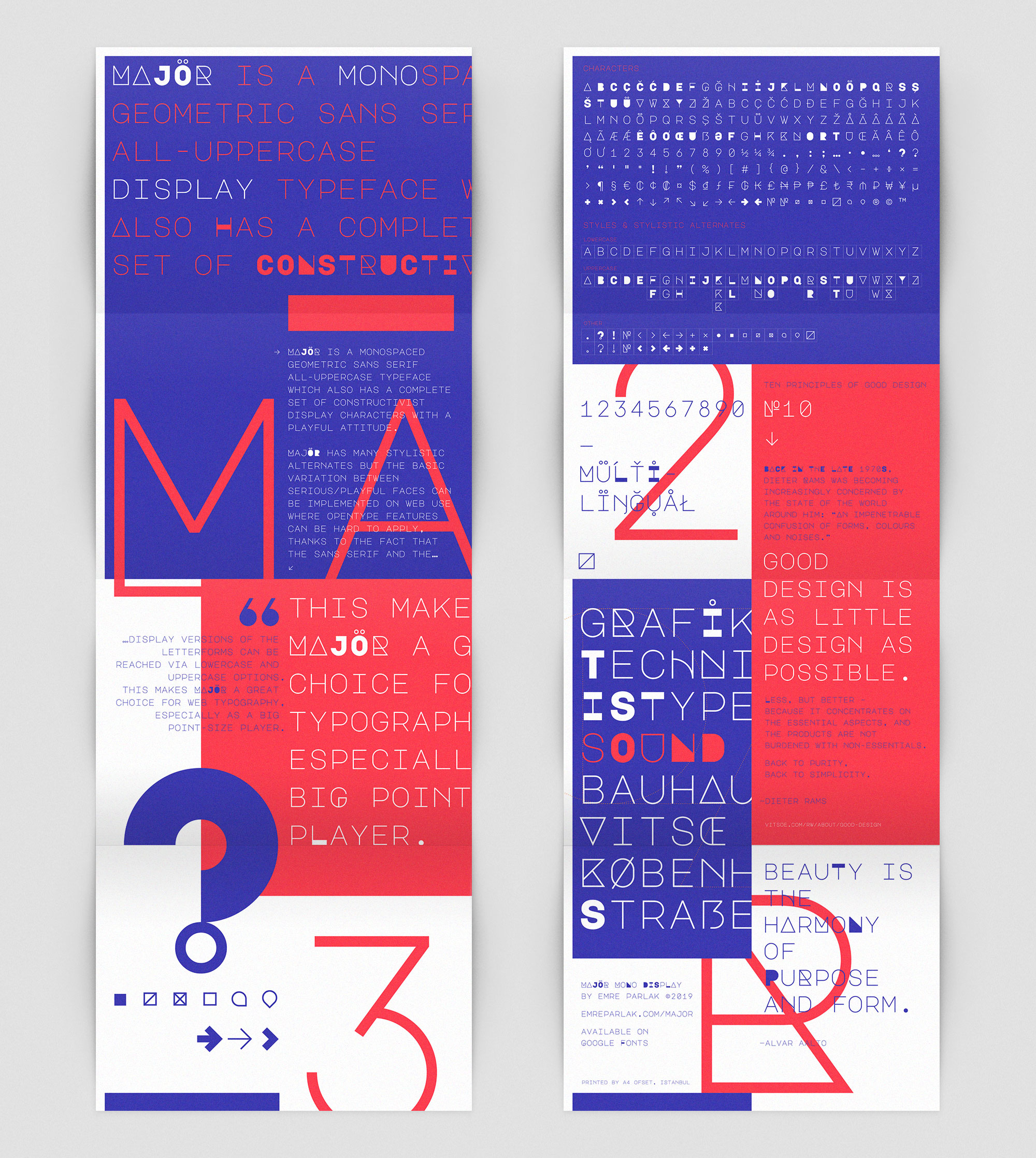
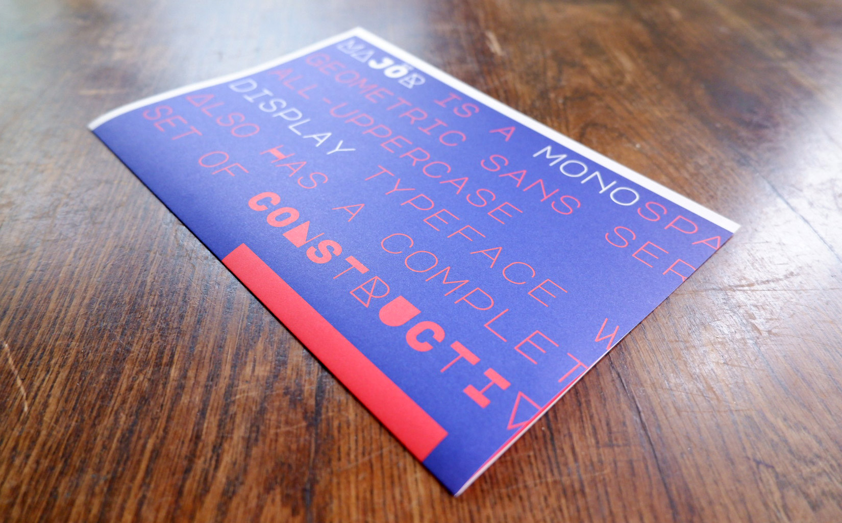
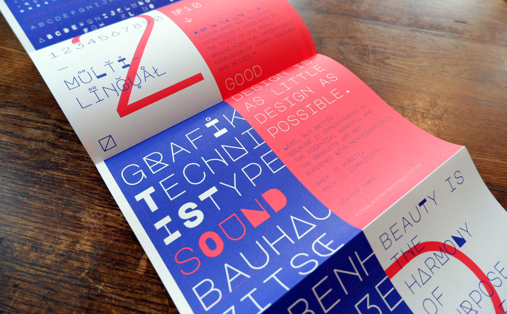
Majör Mono Display
A monospaced geometric sans serif all-uppercase typeface that also has a complete set of constructivist display characters with a playful attitude.
Type Design
2019
2019
2019
Majör Mono Display is released on Google Fonts. You can check out Majör’s microsite for more information including a downloadable specimen.
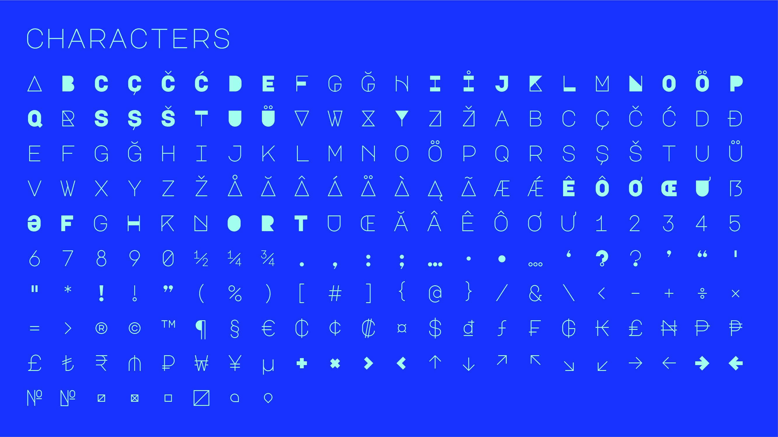
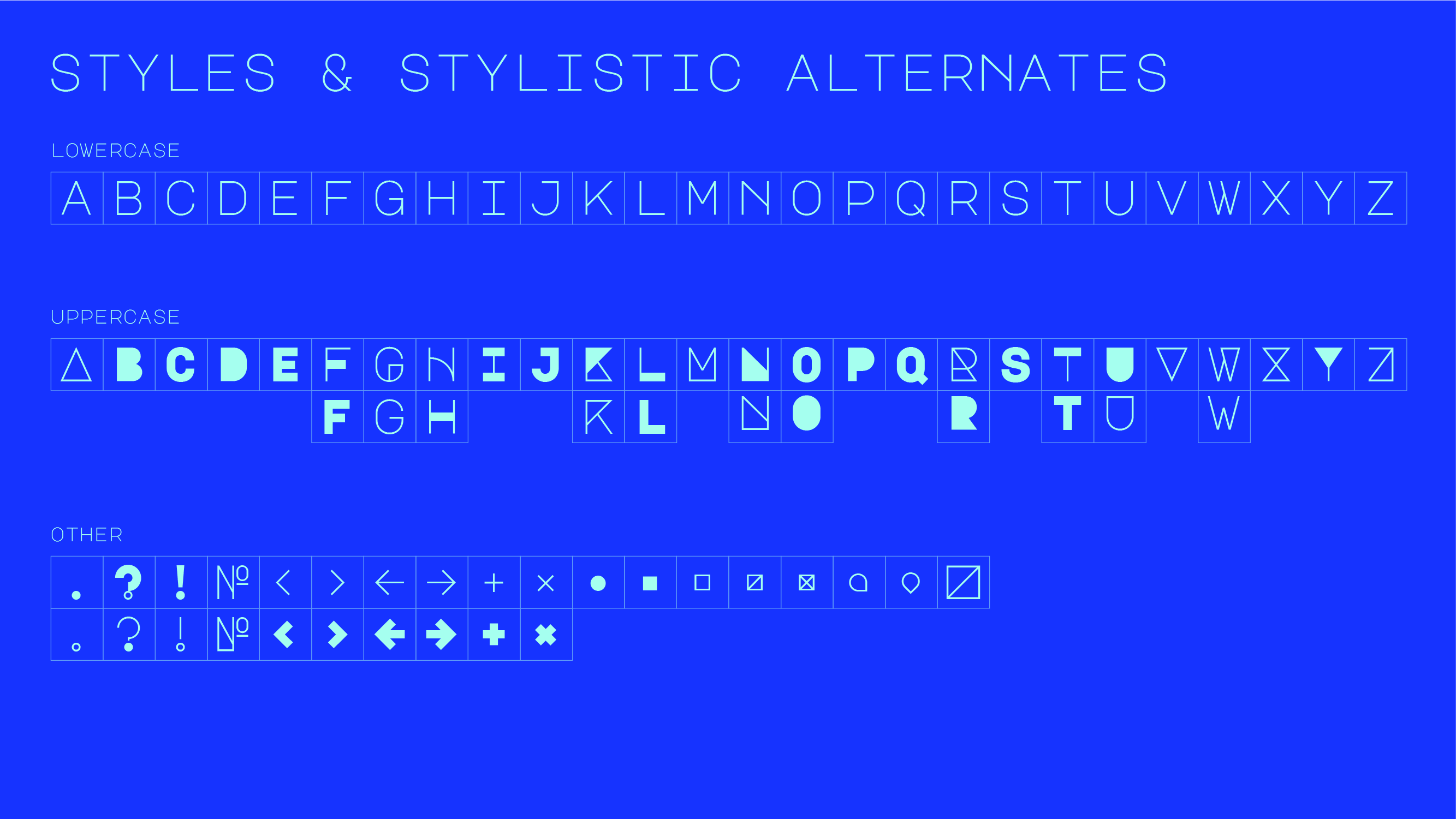
Characteristic of the font
Majör has many stylistic alternates but the basic variation between serious/playful faces can be implemented on web use where Opentype features can be hard to apply, thanks to the fact that the sans serif and the display versions of the letterforms can be reached via lowercase and uppercase options.
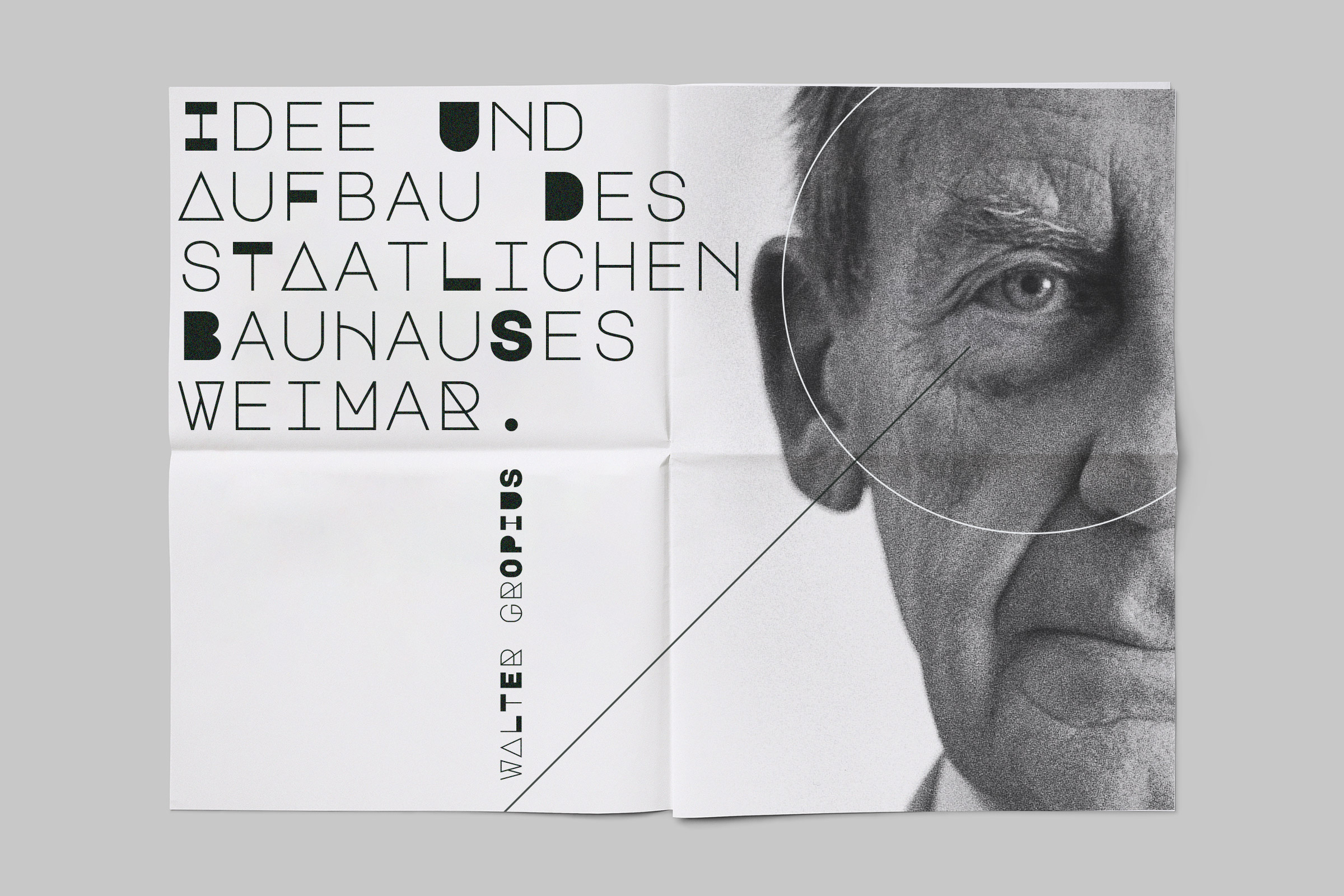
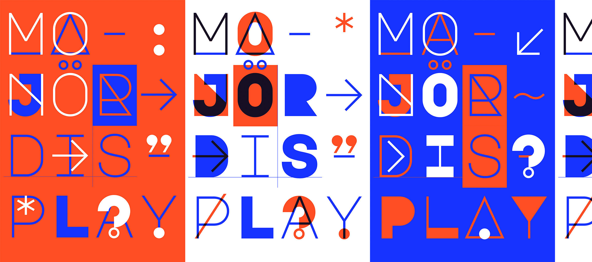
Specimen Design
For the promotion of the font, a 3 folded, 2-color brochure was designed. It measures 21 × 59.4 cm and uses Munken Lynx 100 gr. paper.
To see more and to use Majör in your projects:
— Majör Mono Display microsite
— Majör Mono Display on Google Fonts
To see more and to use Majör in your projects:
— Majör Mono Display microsite
— Majör Mono Display on Google Fonts
I believe that good design results from clear communication and productive collaboration. I prioritize efficiency in my design process, ensuring I understand the problem, empathize, and make well-informed design decisions that align with the project’s objectives.
© 2009–24 Emre Parlak