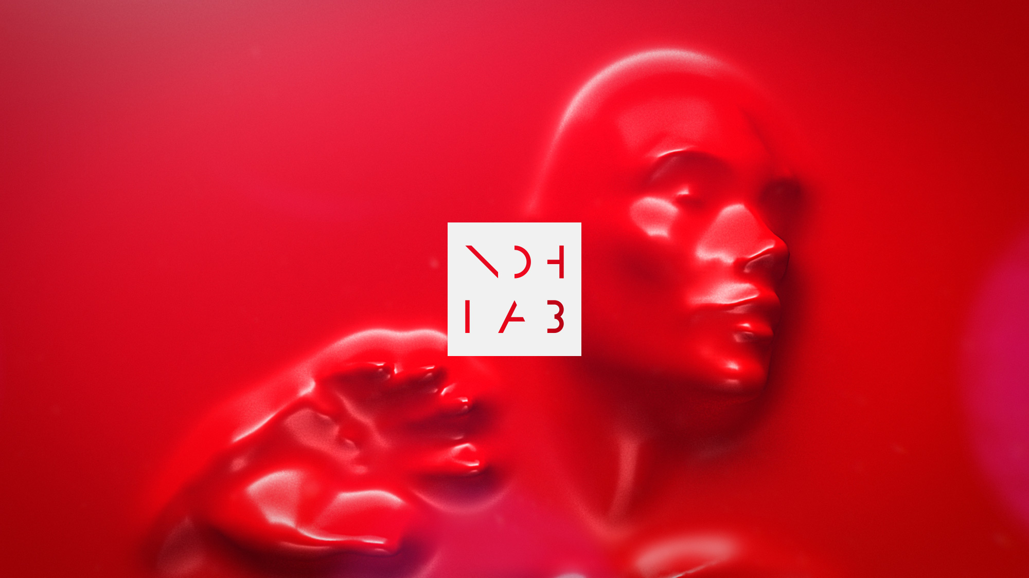
Nohlab
A studio focused on producing interdisciplinary experiences around art, design, and technology. It builds a bridge between digital and physical reality while examining the relationship of technology with art and design. I reflected on the multidisciplinary creations around art, design, and technology through a dynamic identity.
Visual Identity
2019
2019
2019
Approach
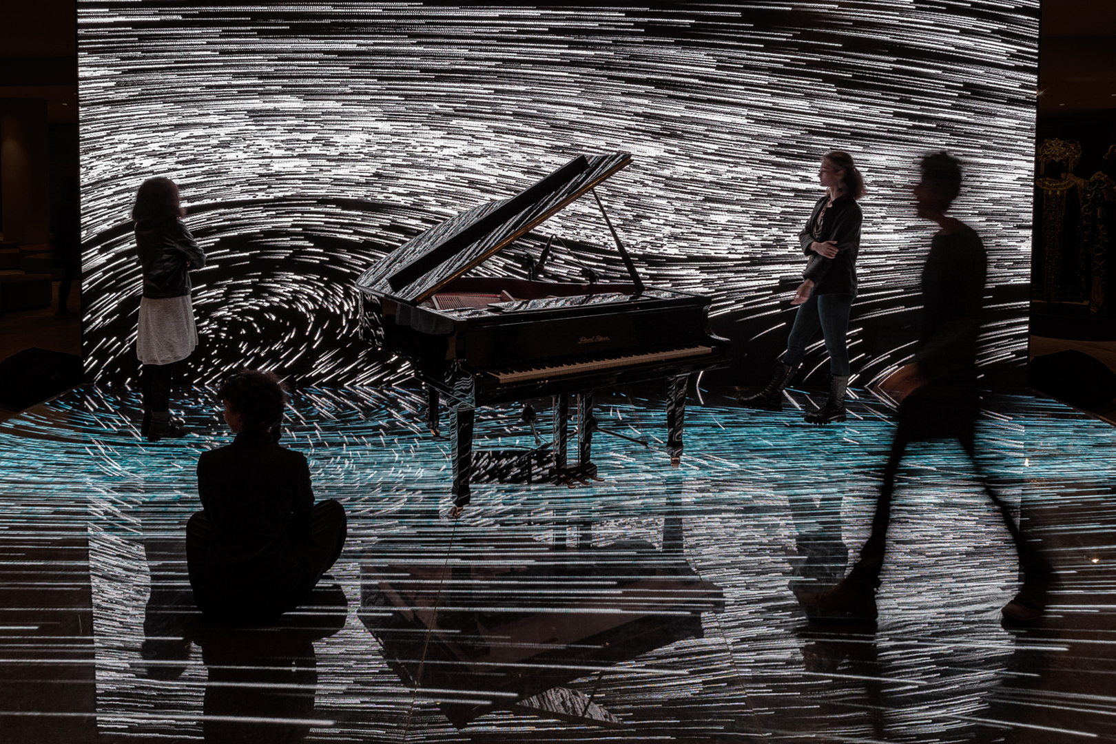
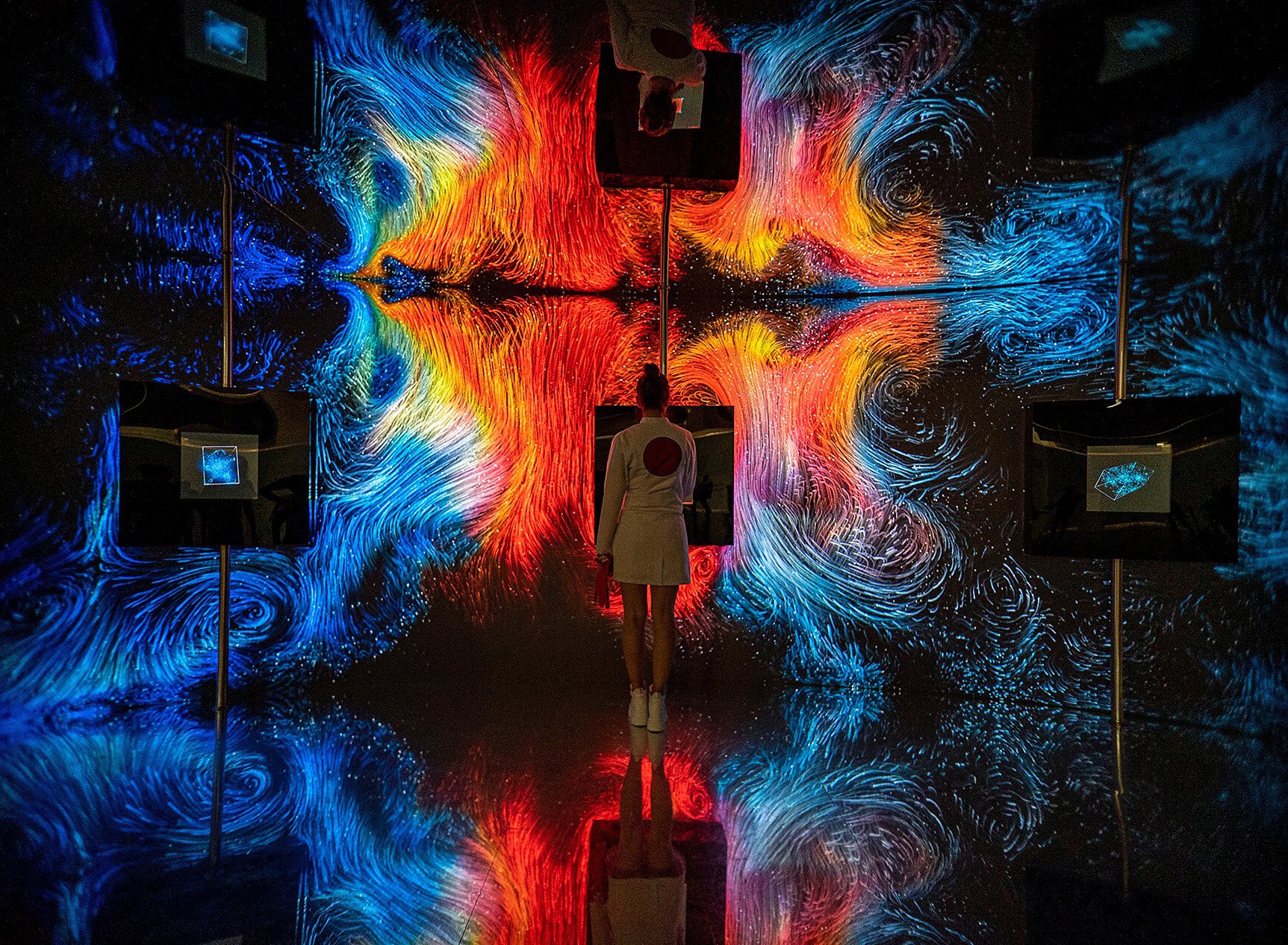
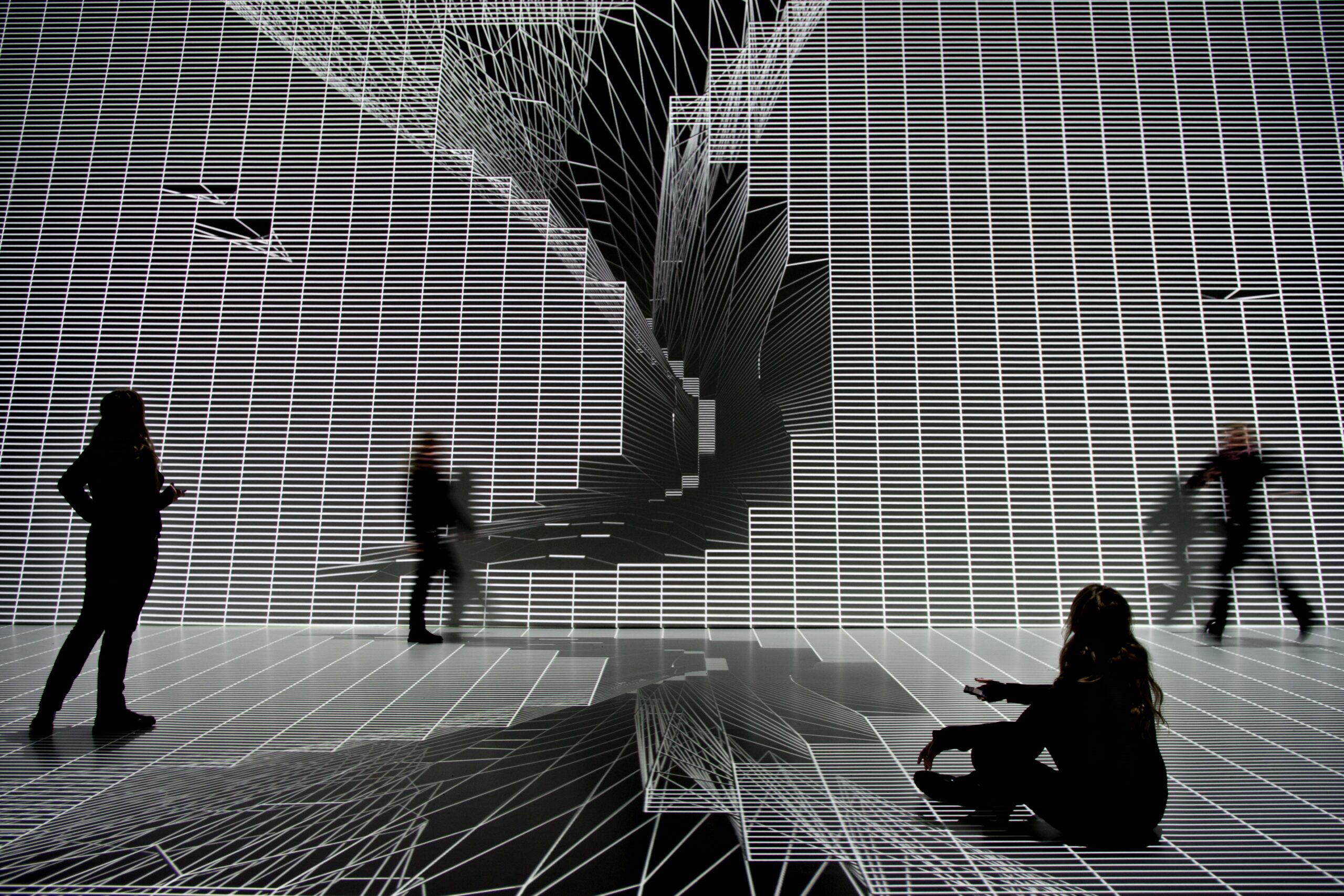
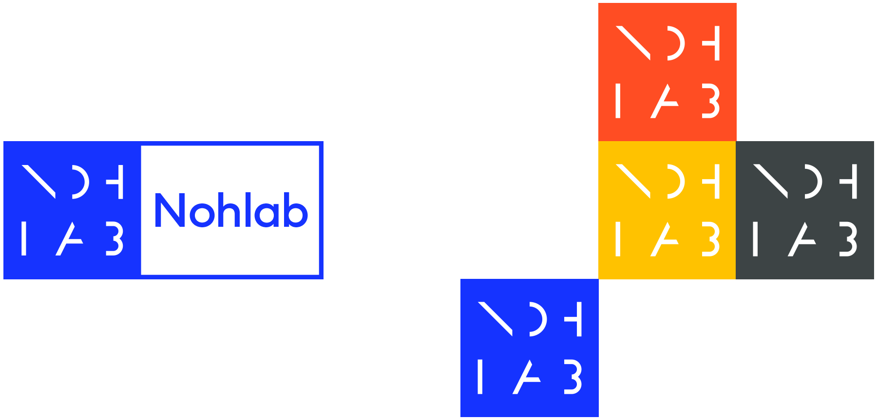
The main starting point for the Nohlab branding was the strong geometric elements and patterns they used in their projects, and the dynamism of their work on different areas and surfaces. Inspired by their work for various mediums, the logo also positions itself, reshapes, and gains a dynamic identity. It does this through keywords, such as screen, frame and trace.
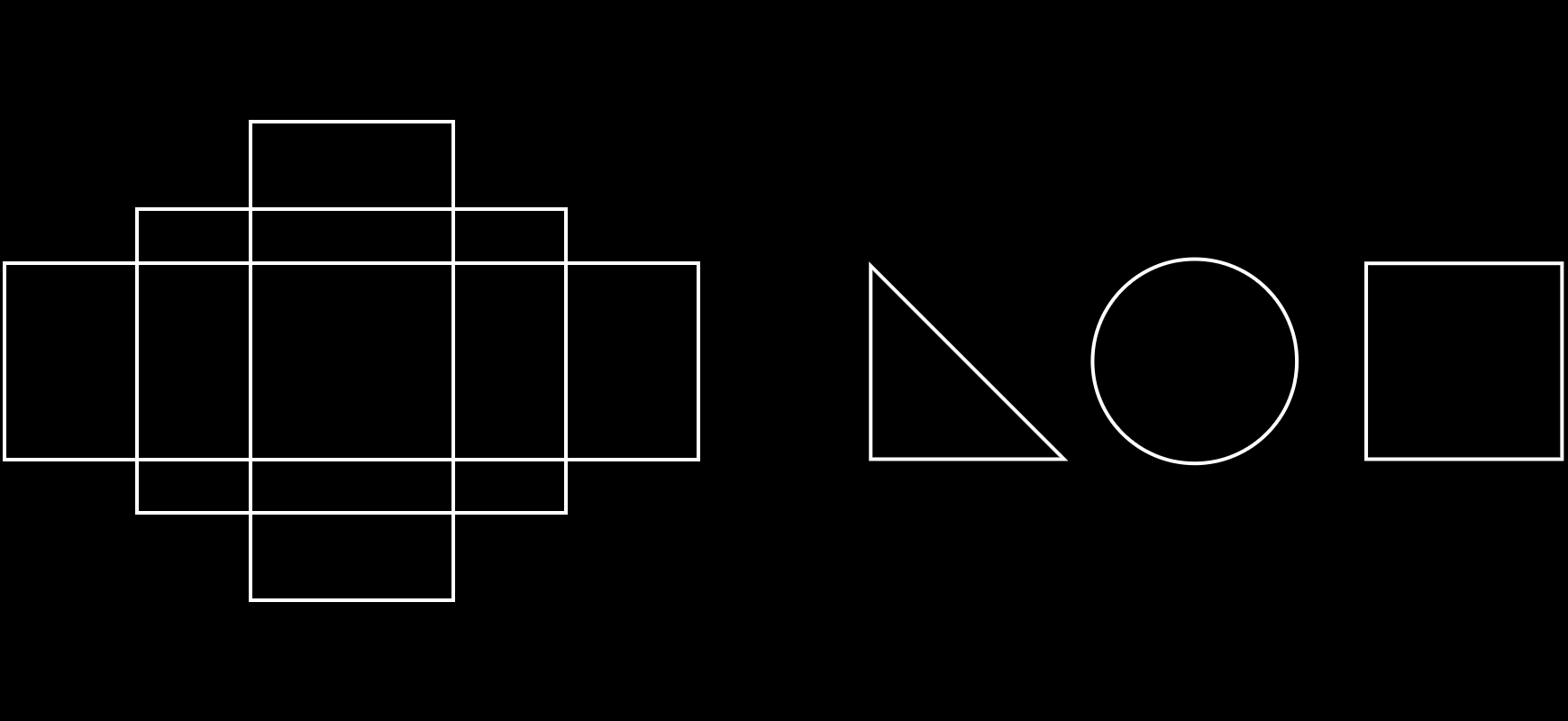
The basic geometric shapes, which are the starting point of the visual outputs produced, reflect the simplicity of what seems to be complex. These shapes turn into letters and these letters form their pattern and multiply themselves.
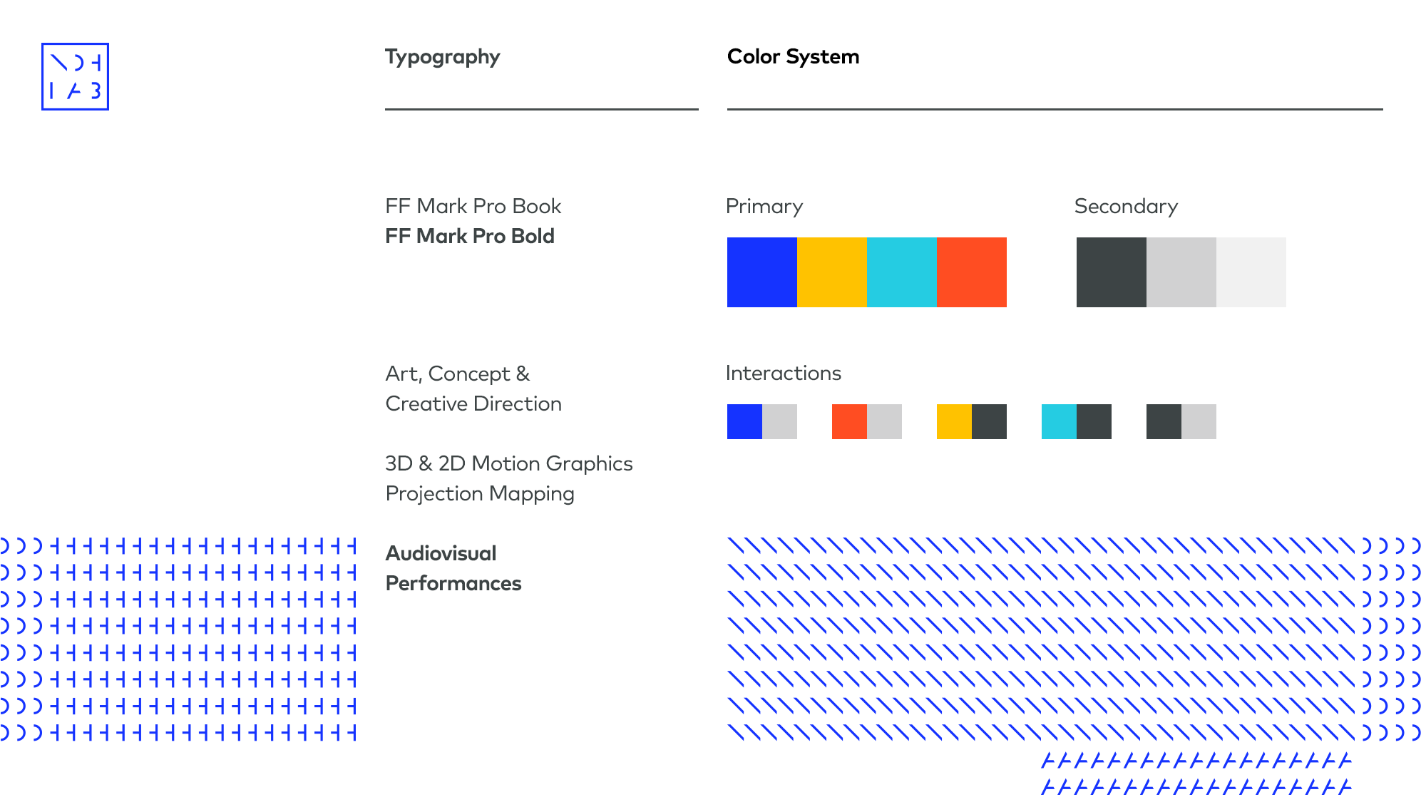
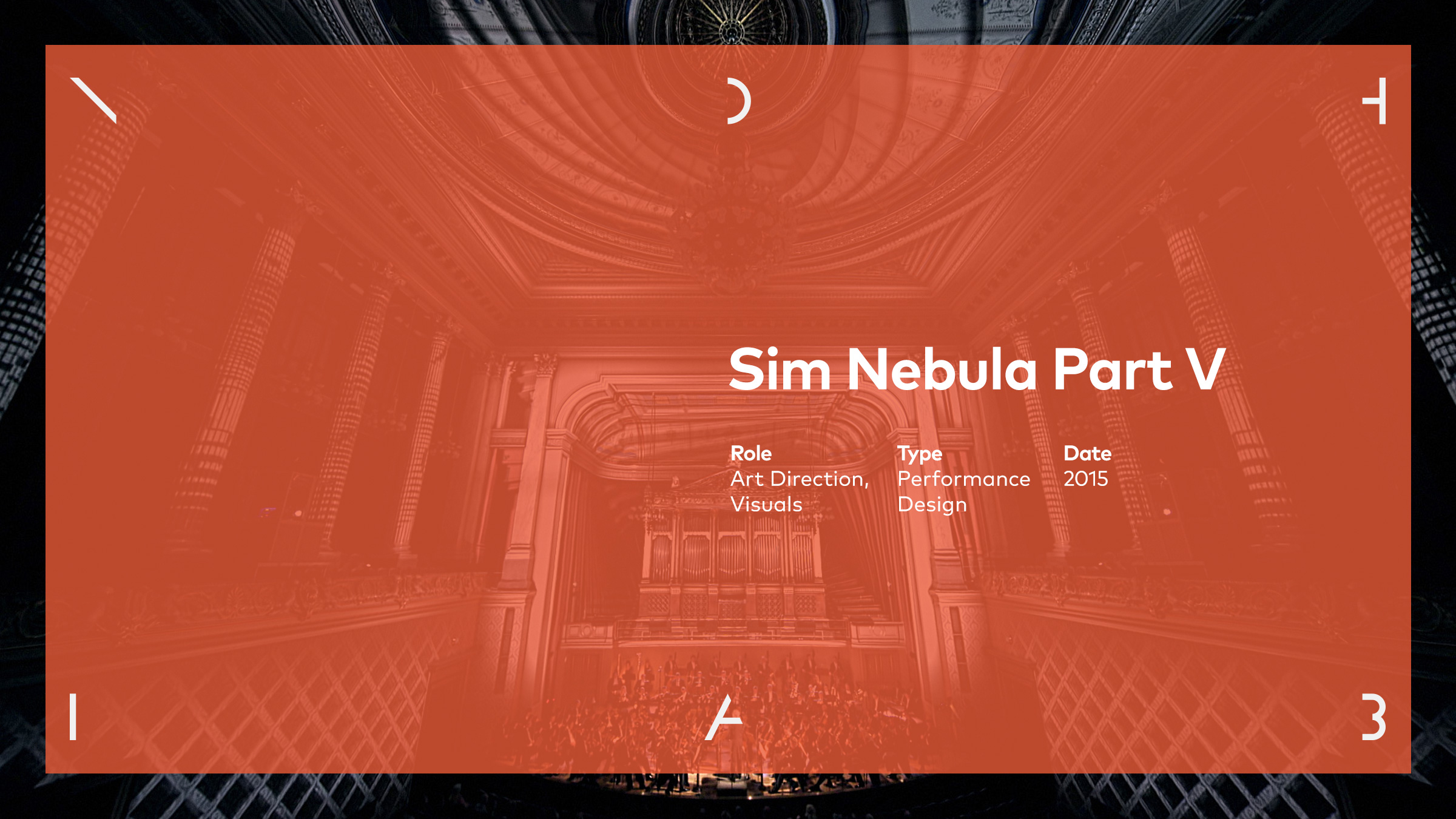
Identity is shaped flexibly according to different dimensions and applications.
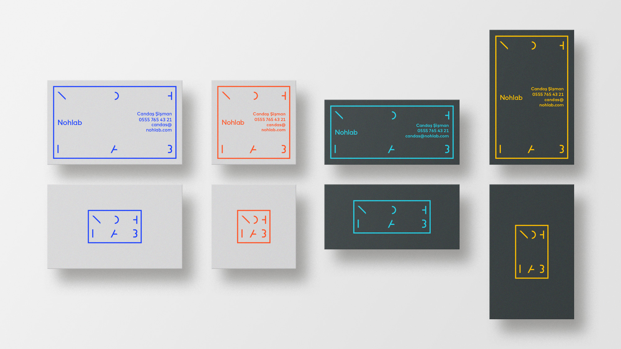
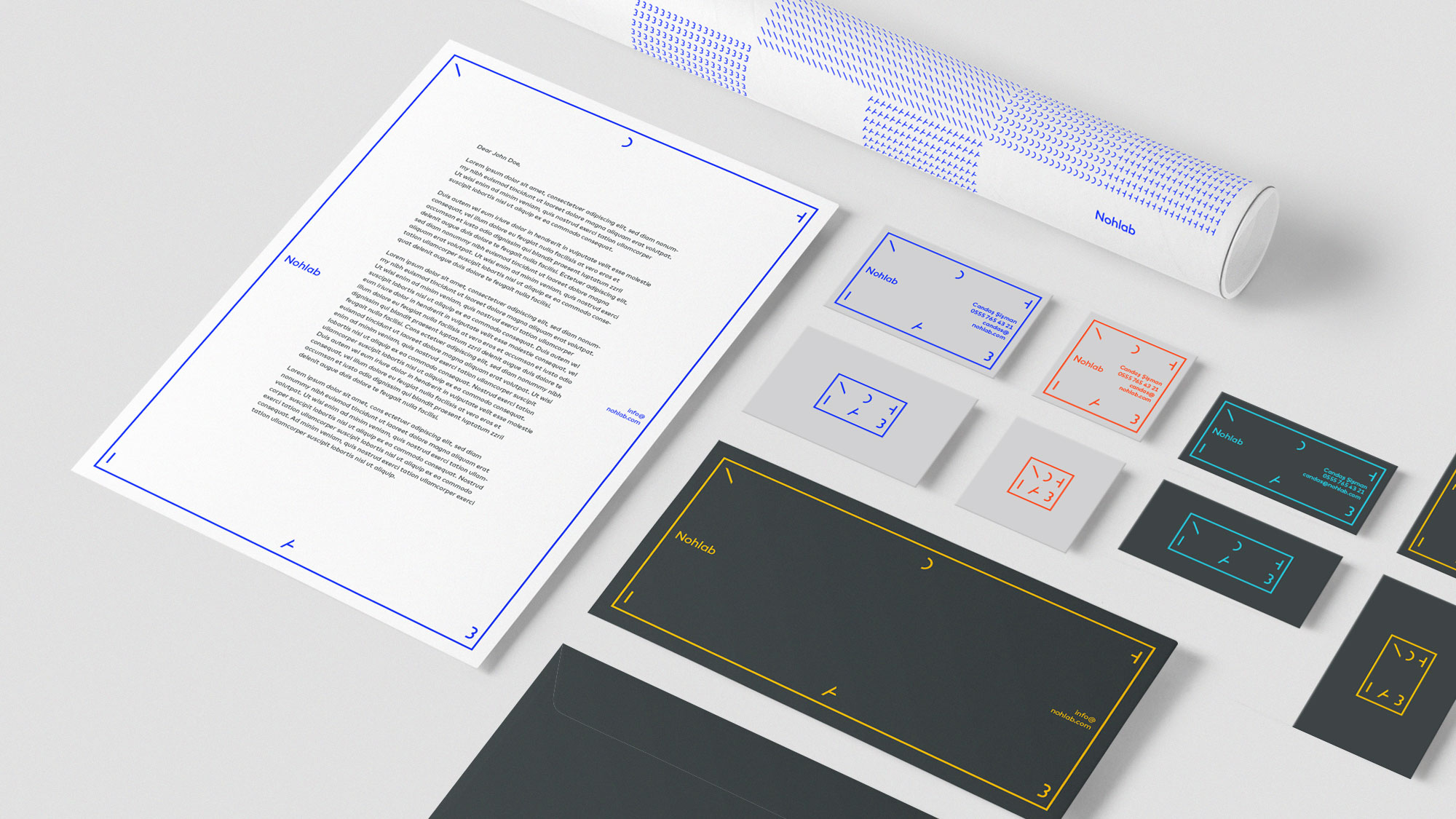
In applications such as business cards, letterhead, etc., the logo takes shape by adapting to different sizes and surfaces.
I believe that good design results from clear communication and productive collaboration. I prioritize efficiency in my design process, ensuring I understand the problem, empathize, and make well-informed design decisions that align with the project’s objectives.
© 2009–24 Emre Parlak