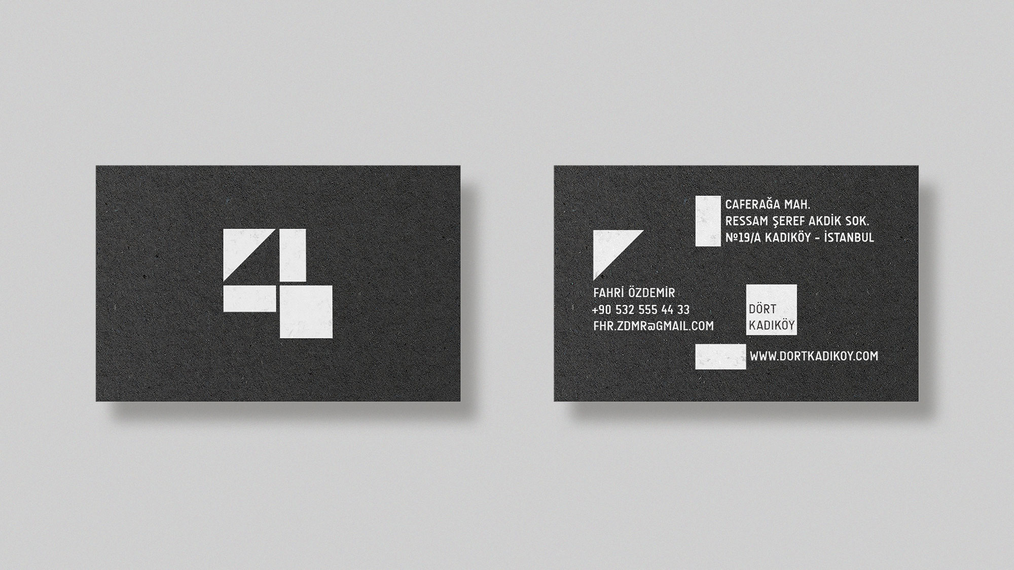
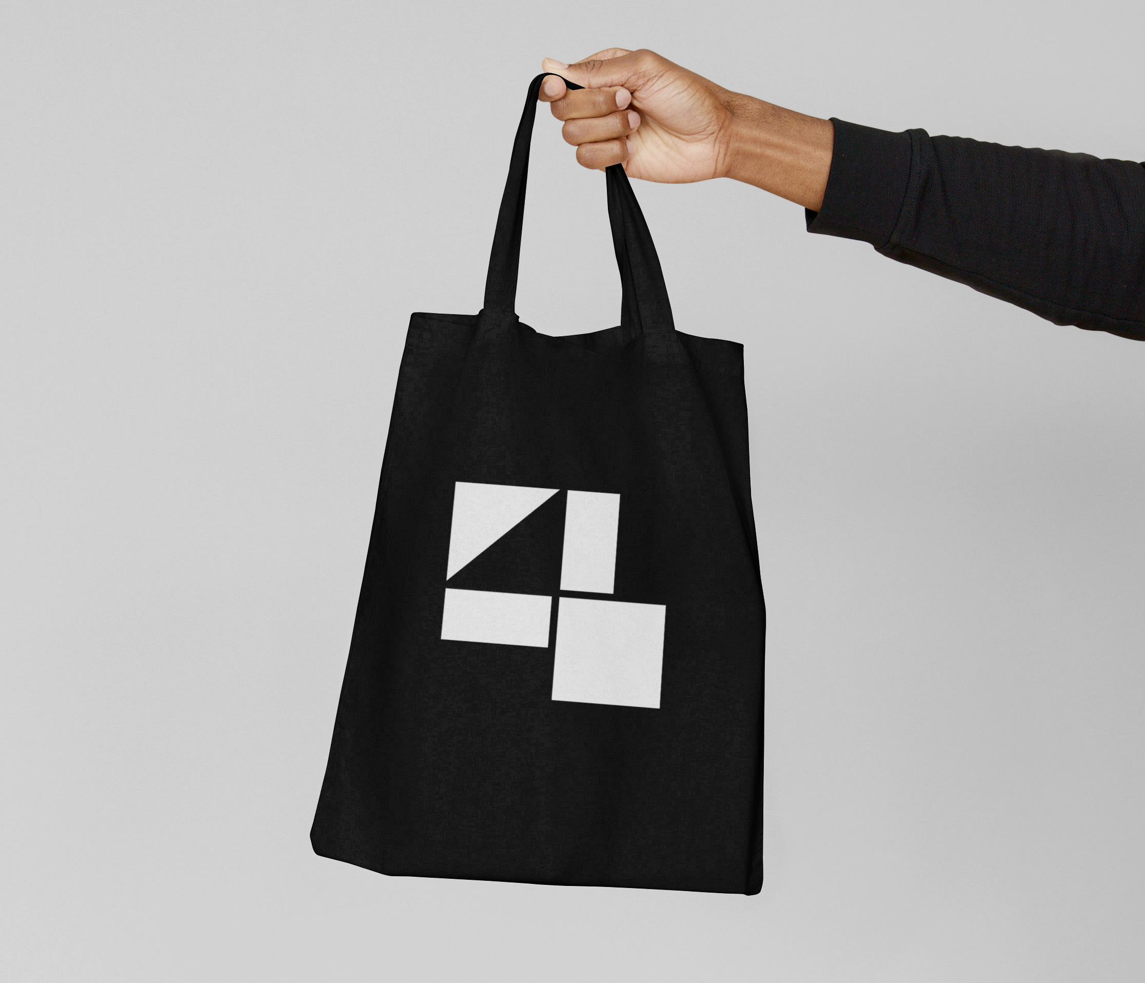
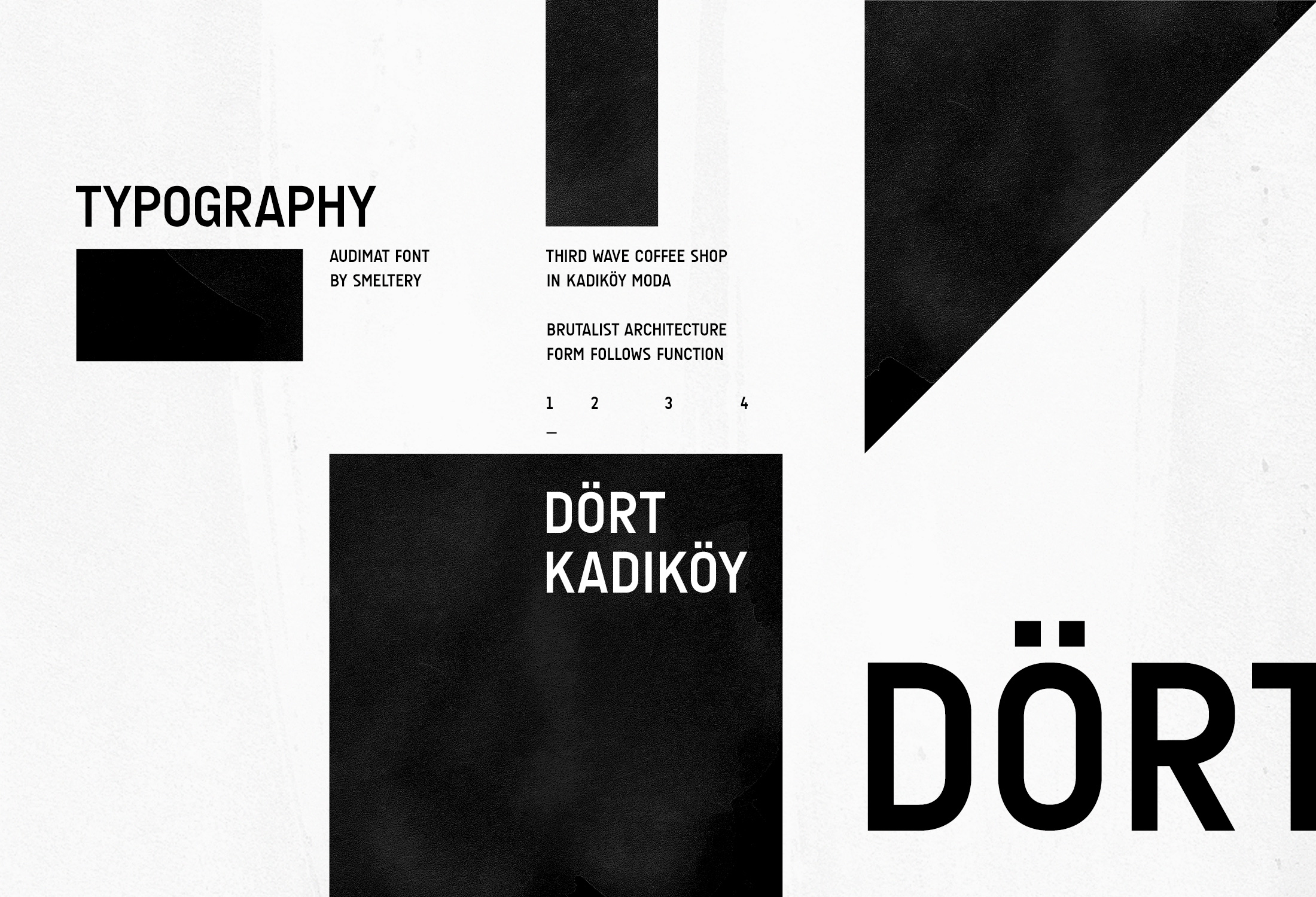
Dört Kadıköy
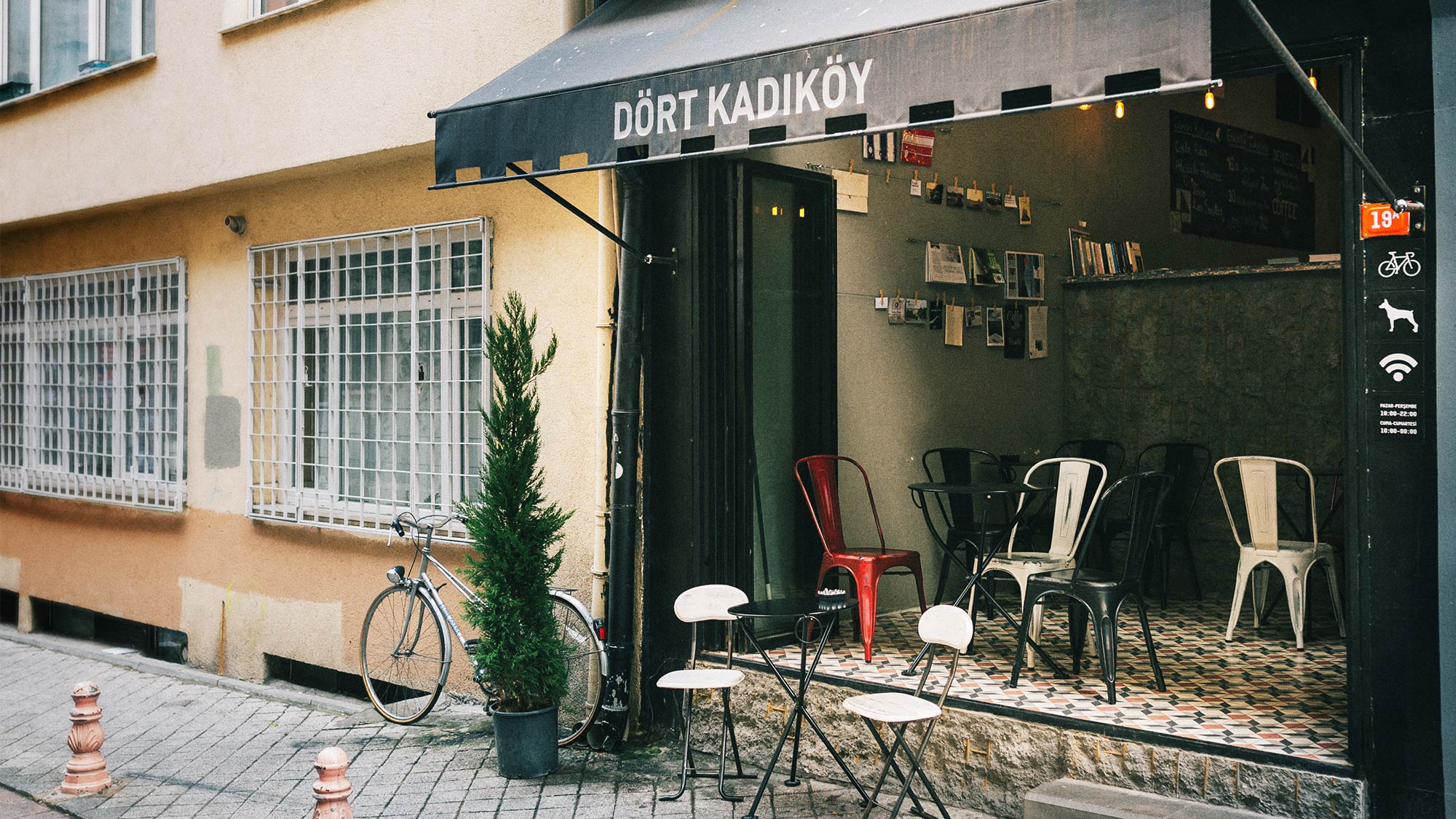
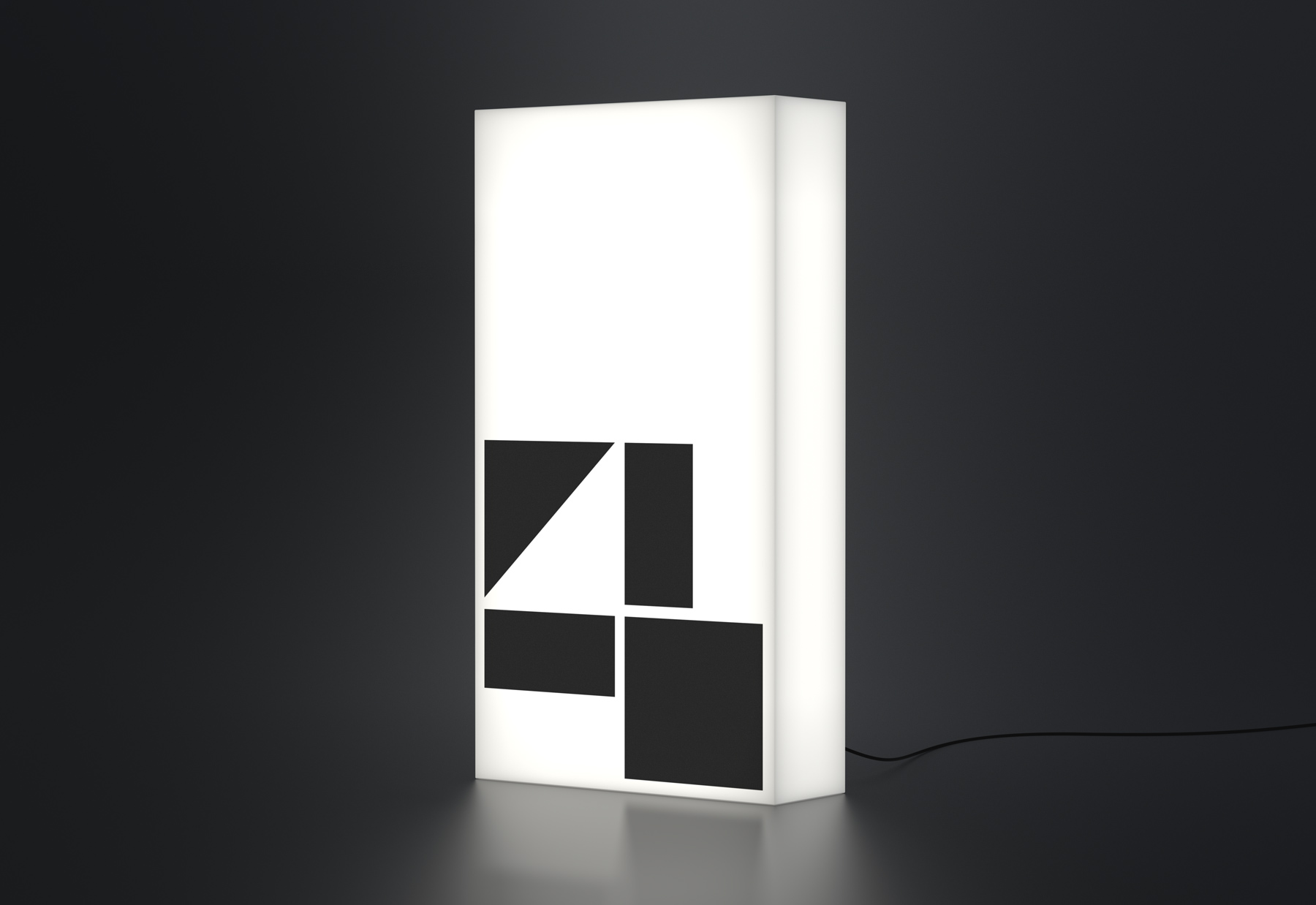
A Third Wave coffee shop in Istanbul. In 2016, four friends joined forces to open their dream coffee shop in Kadıköy Moda, Istanbul. They called it “Dört Kadıköy” (Four Kadıköy). I designed an identity where four pieces come together to form the figure ‘4’ in an interplay between positive and negative shapes.
Visual Identity + Print Design + Signage Design
2016
2016
2016
Approach
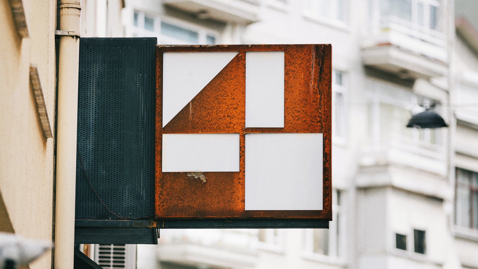
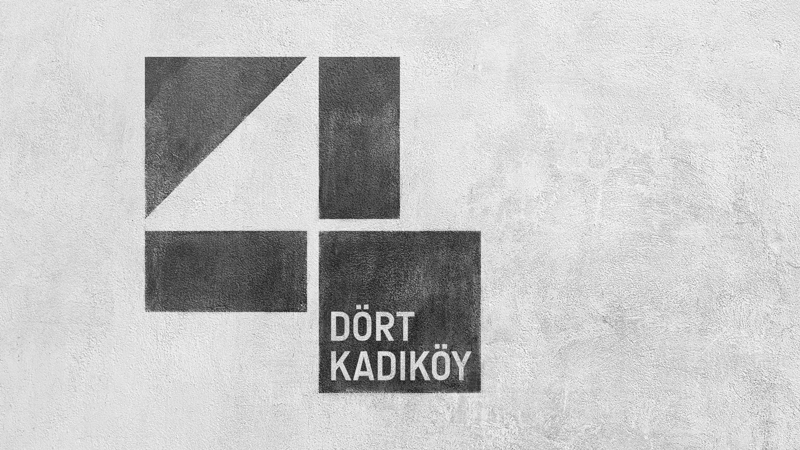
The simple name of Dört recapping their story, along with its brutalist architecture, were my starting points for its visual identity. The construction of the logo starts from a single square which is divided equally into fourths. Three of them are again divided into halves, and the final 4 pieces come together to form the figure ‘4’ in an interplay between positive and negative shapes.
The symbol expresses the brutalist simplicity of Dört Kadıköy: a logo inspired by the architecture and integrated with it.
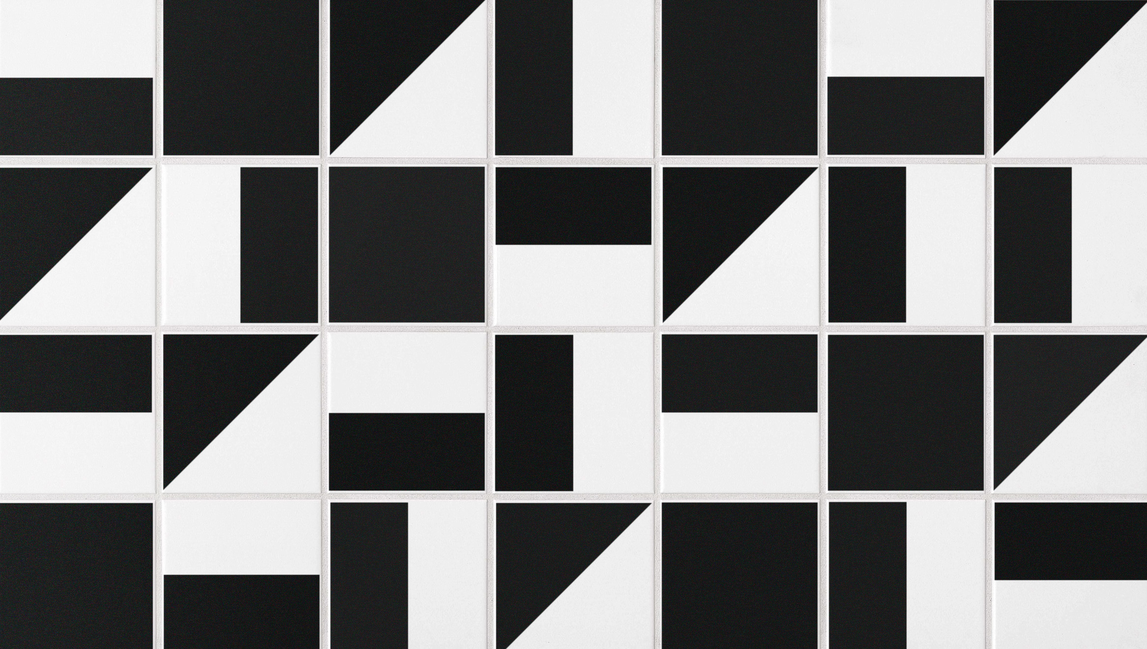
An example of parts of the logo to ceramic tiles as a pattern.
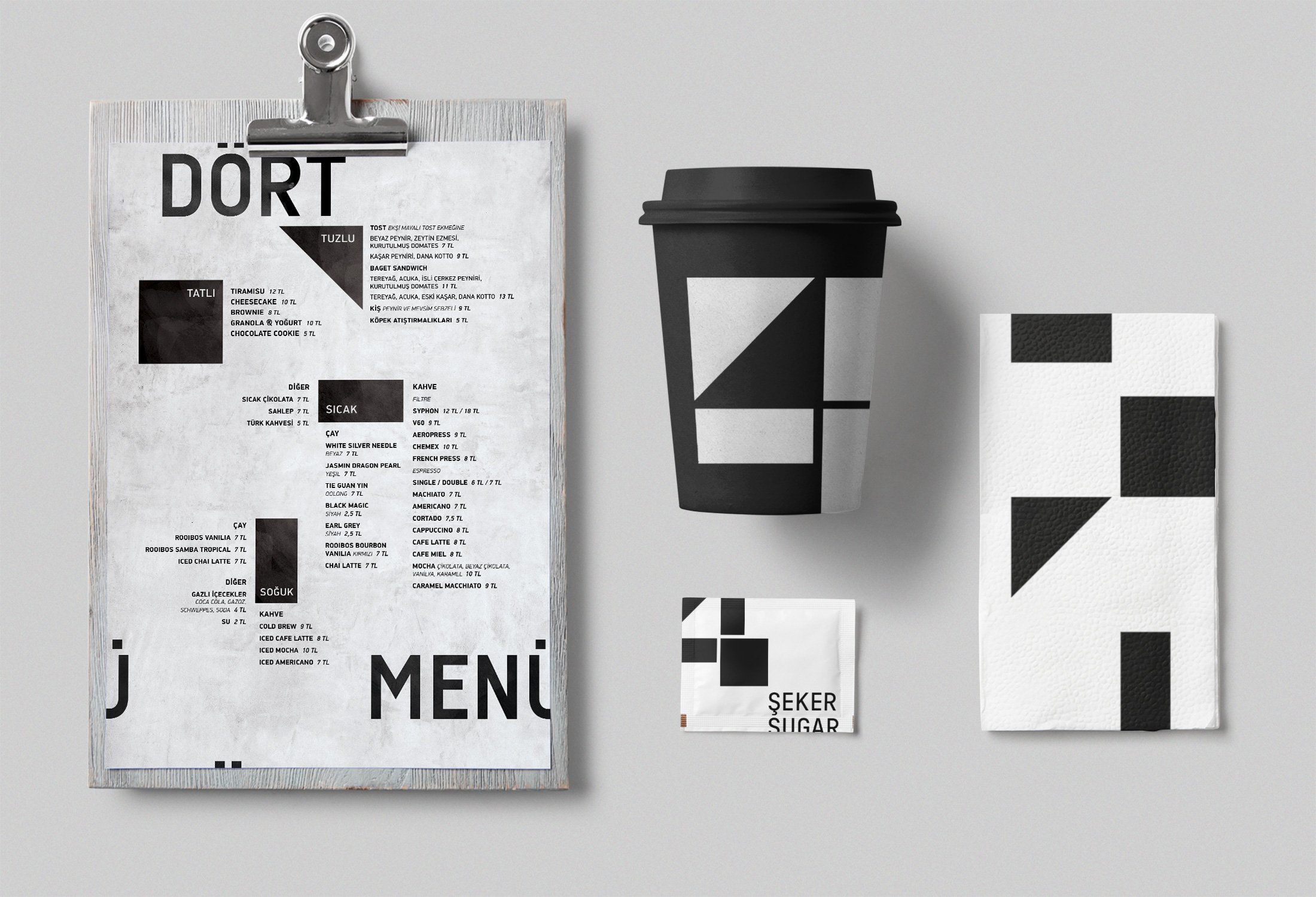
The parts that make up the logo also function as graphic elements to maintain the identity of various items.
The parts that make up the logo also functions as graphic elements to maintain the identity in various items.

I believe that good design results from clear communication and productive collaboration. I prioritize efficiency in my design process, ensuring I understand the problem, empathize, and make well-informed design decisions that align with the project’s objectives.
© 2009–24 Emre Parlak