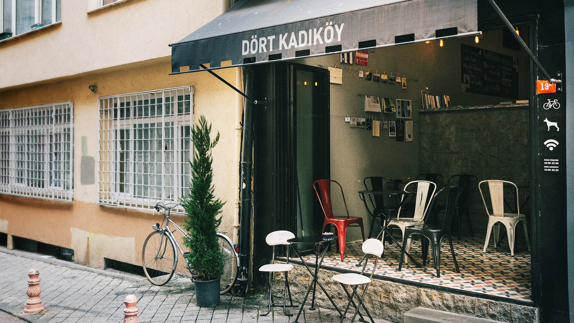
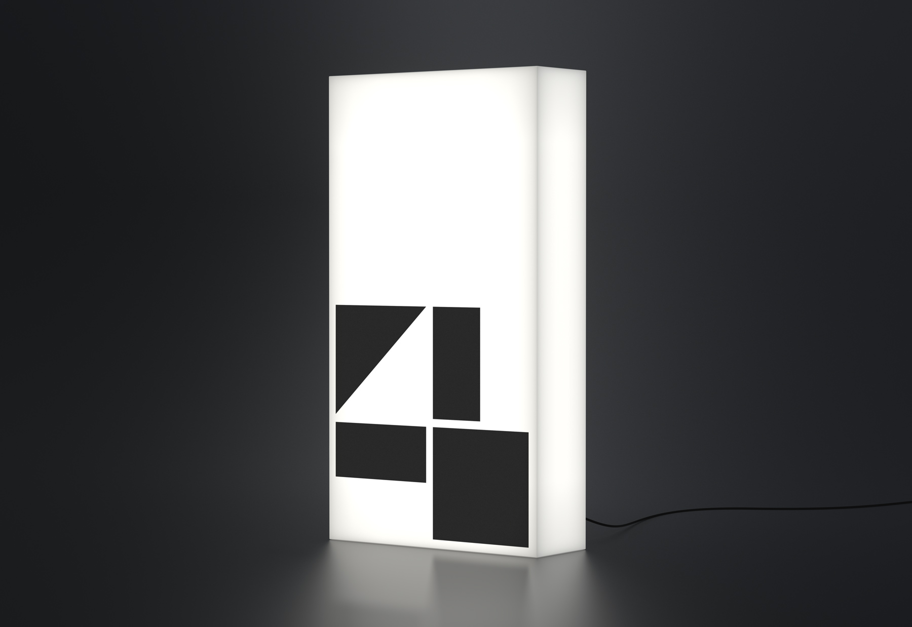
Dört Kadıköy
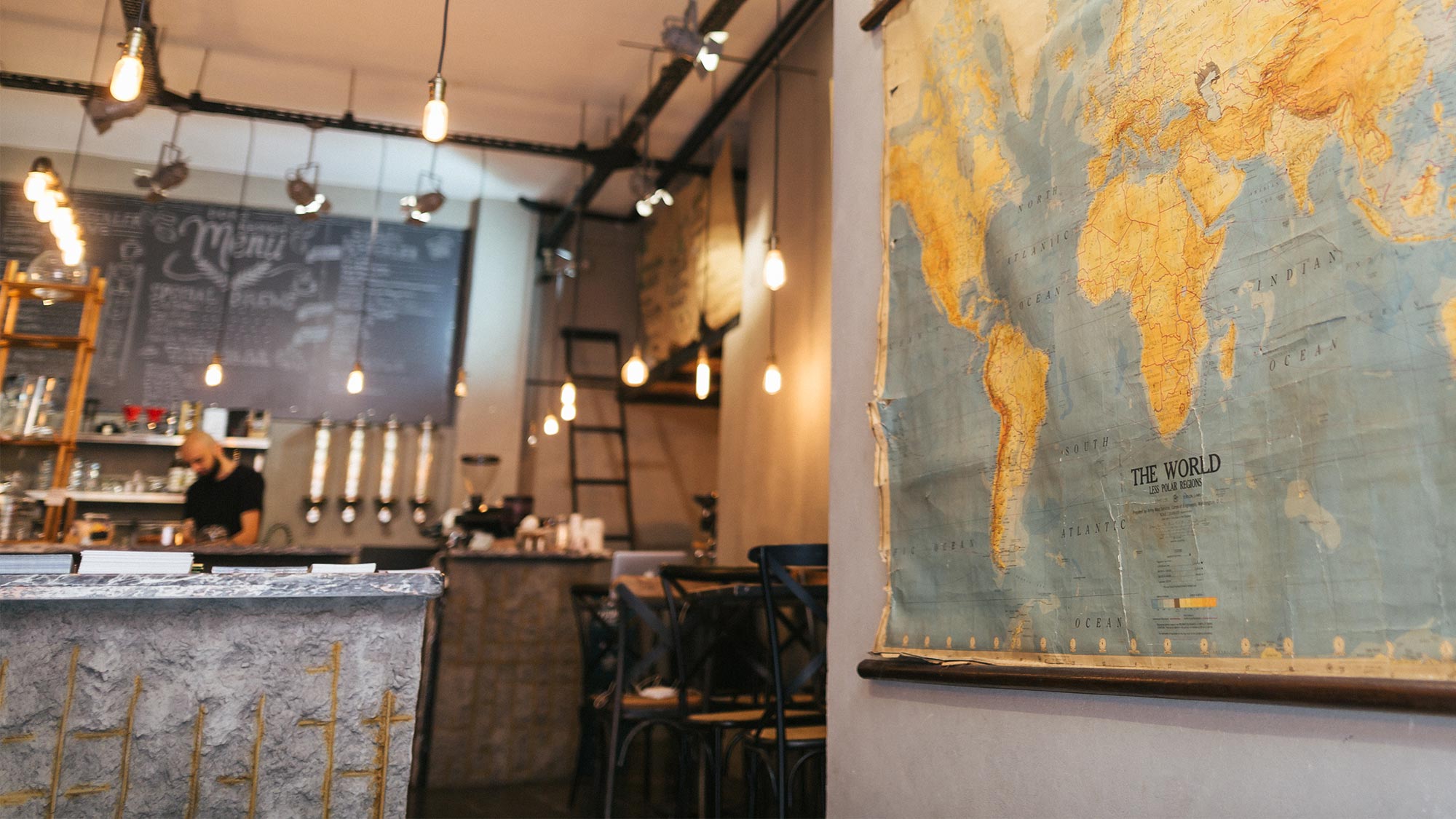
A Third Wave coffee shop in the vibrant Moda neighborhood of Kadıköy, Istanbul. Founded by four friends in 2016, they set out to bring their shared dream to life. The name “Dört Kadıköy” (Four Kadıköy) reflects their partnership. I designed an identity where four distinct pieces come together to form the figure ‘4,’ utilizing the interplay of positive and negative space to represent unity and collaboration.
Brand IdentityCollateralPrint DesignSignage Design2016
Approach
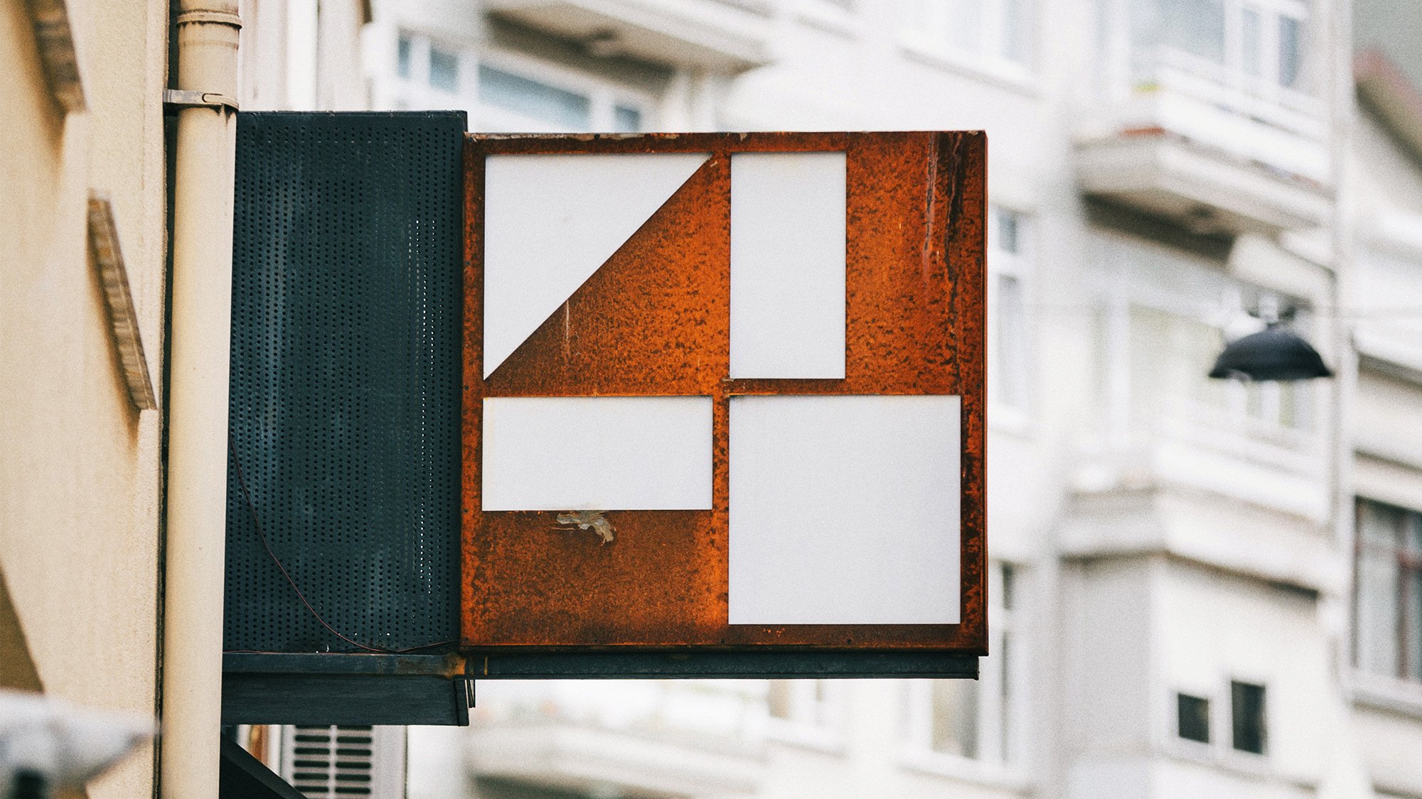
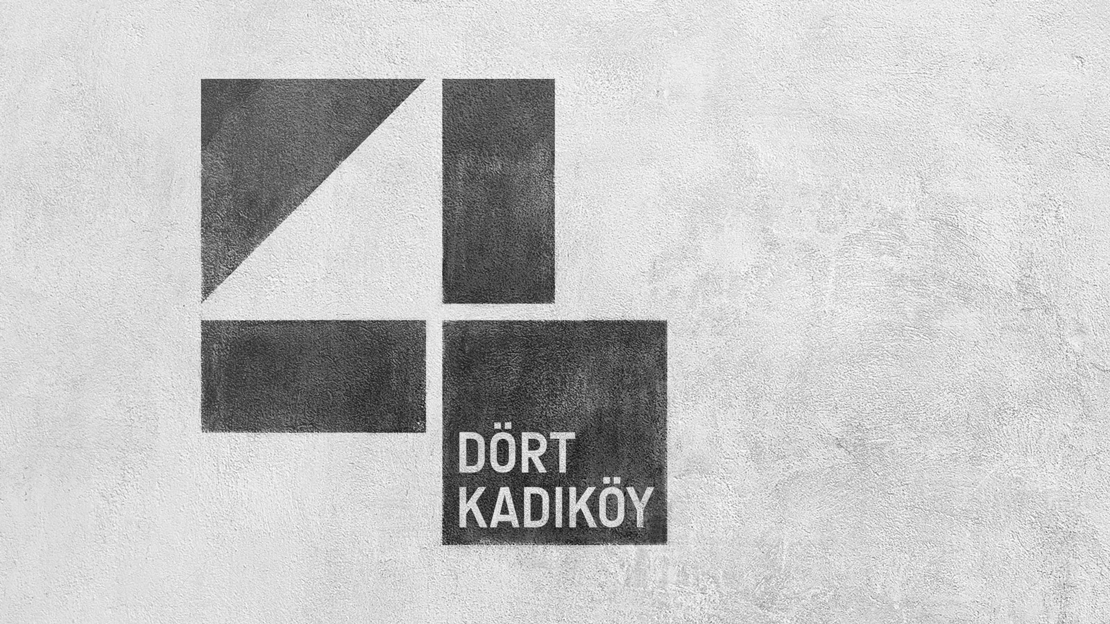
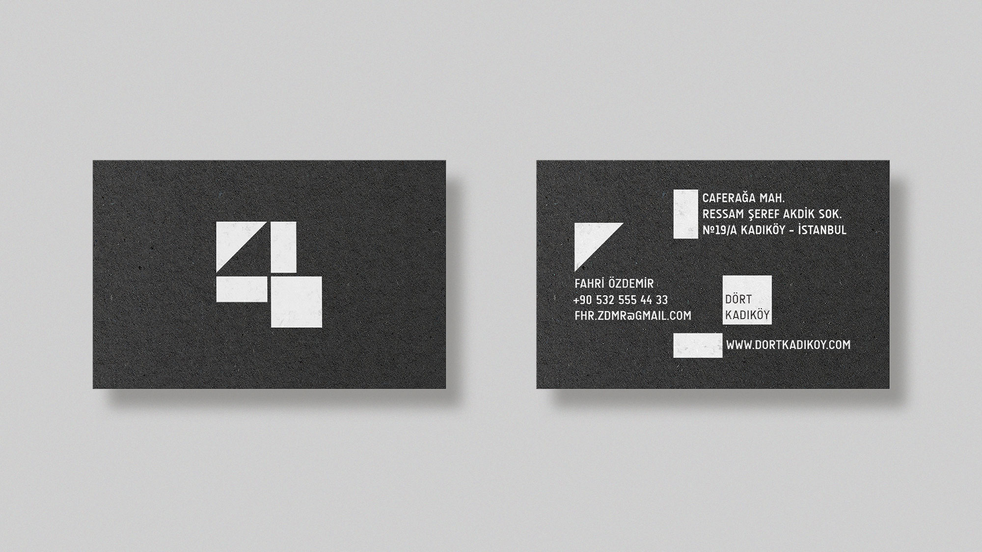
Inspired by Dört’s straightforward name and the shop’s brutalist architecture, I developed a visual identity that reflects both. The logo’s construction begins with a single square, divided equally into four parts. Three of these are further split in half, resulting in four distinct pieces that come together to form the figure ‘4.’ This interplay of positive and negative shapes captures the simplicity and cohesion behind the brand’s story.
The symbol expresses the brutalist simplicity of Dört Kadıköy: a logo inspired by the architecture and integrated with it.
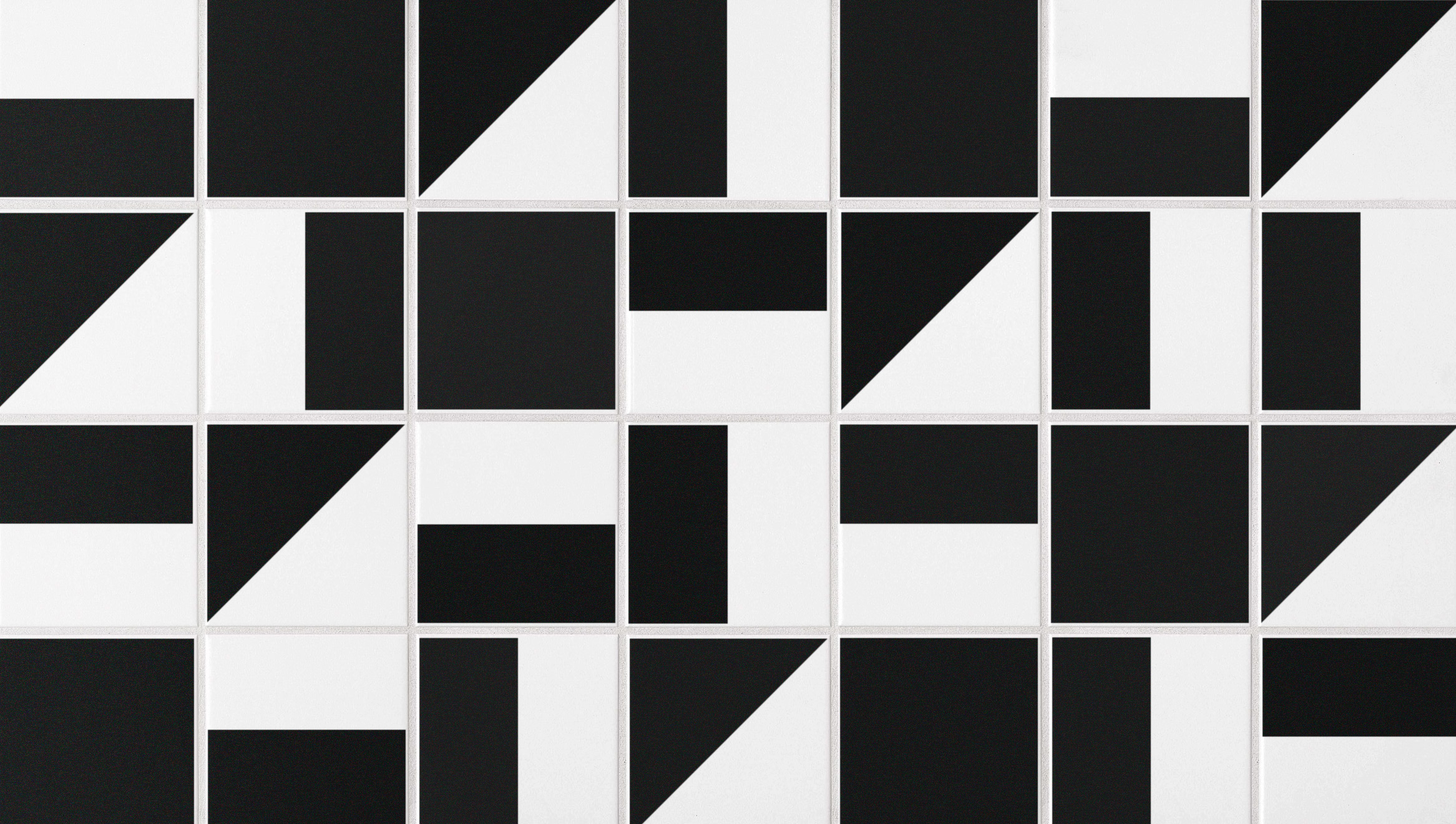
An example of parts of the logo to ceramic tiles as a pattern.
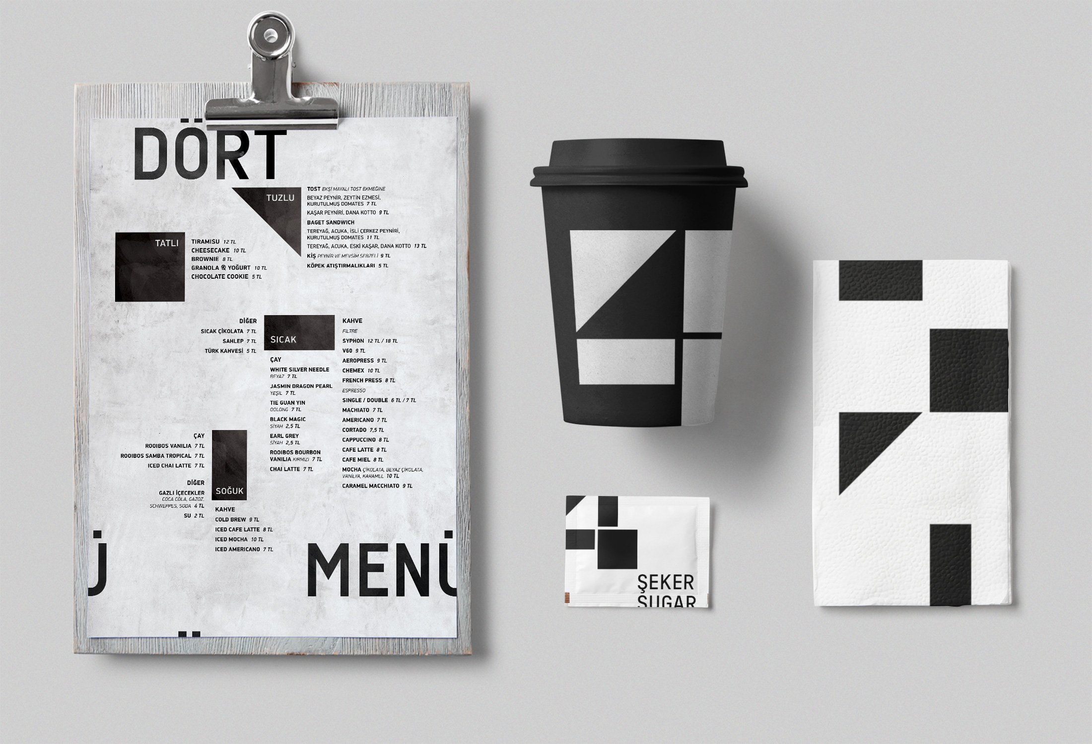
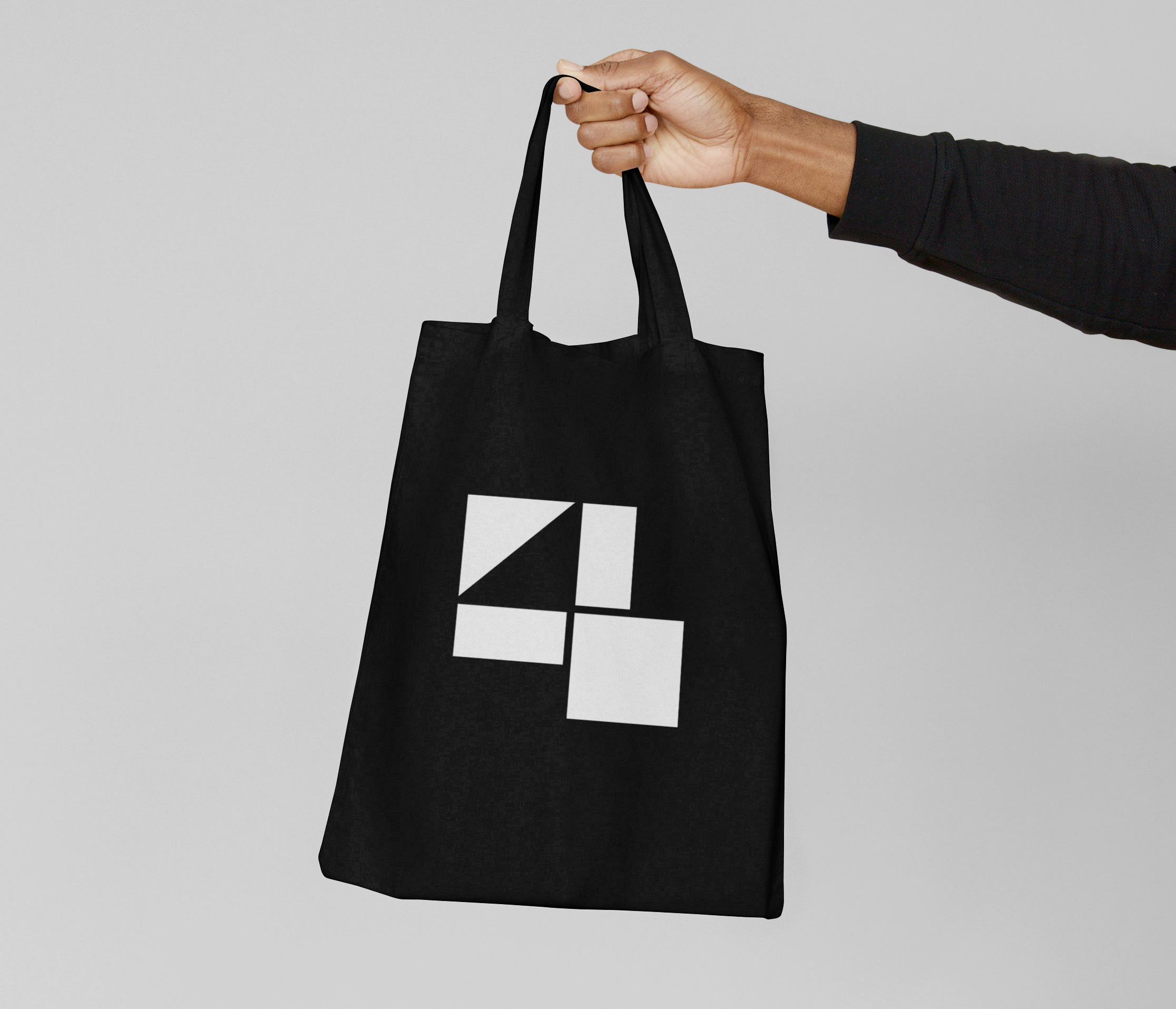
The parts that make up the logo also function as graphic elements to maintain the identity of various items.
The parts that make up the logo also functions as graphic elements to maintain the identity in various items.


If you’re working on something that needs a strong visual language — or you’re not sure yet what it needs — I’m happy to talk. More about me & my approach 〉
