Istanbul Type Seminars 2012
In Istanbul, ISType brings together academics, industry professionals, and students to discuss current issues and innovations in typography and reflect upon developments and opportunities for its future growth. I designed motion graphics for the 2012 event by revealing the power of the grid, color, geometry, and typography.
Motion Design2012
Approach
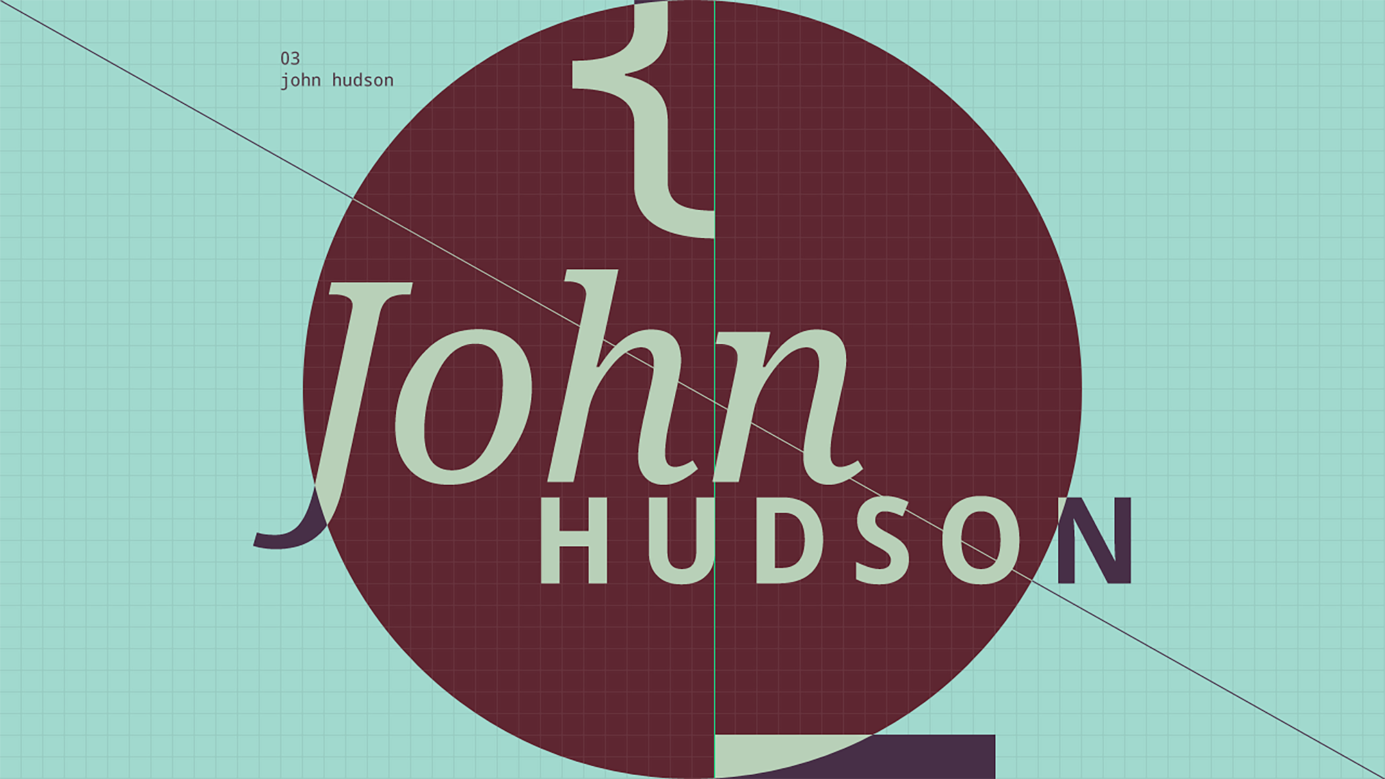
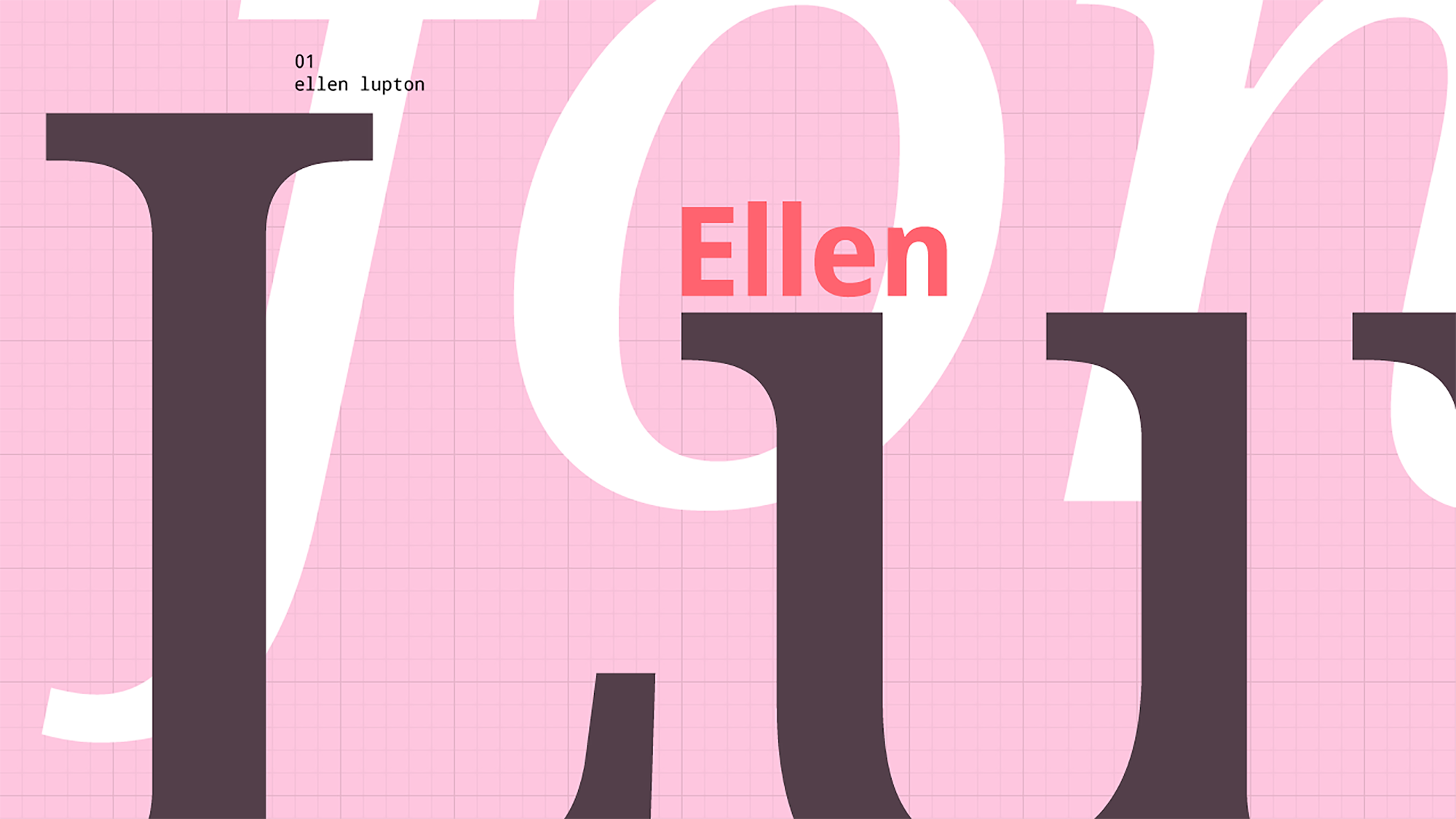
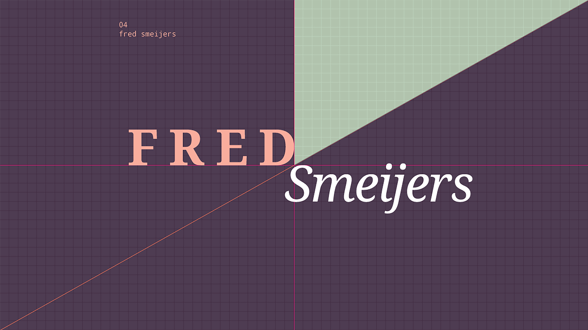
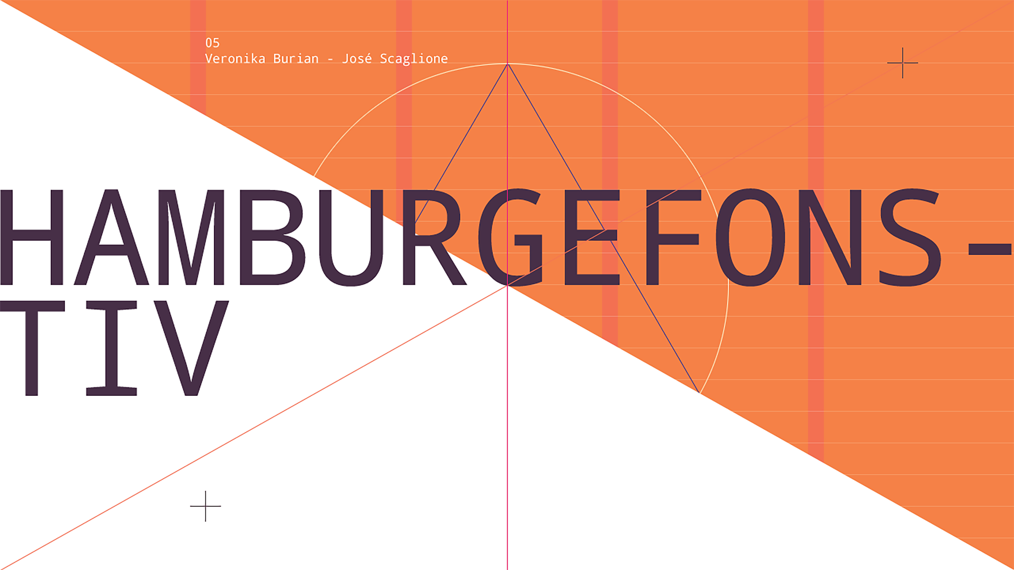
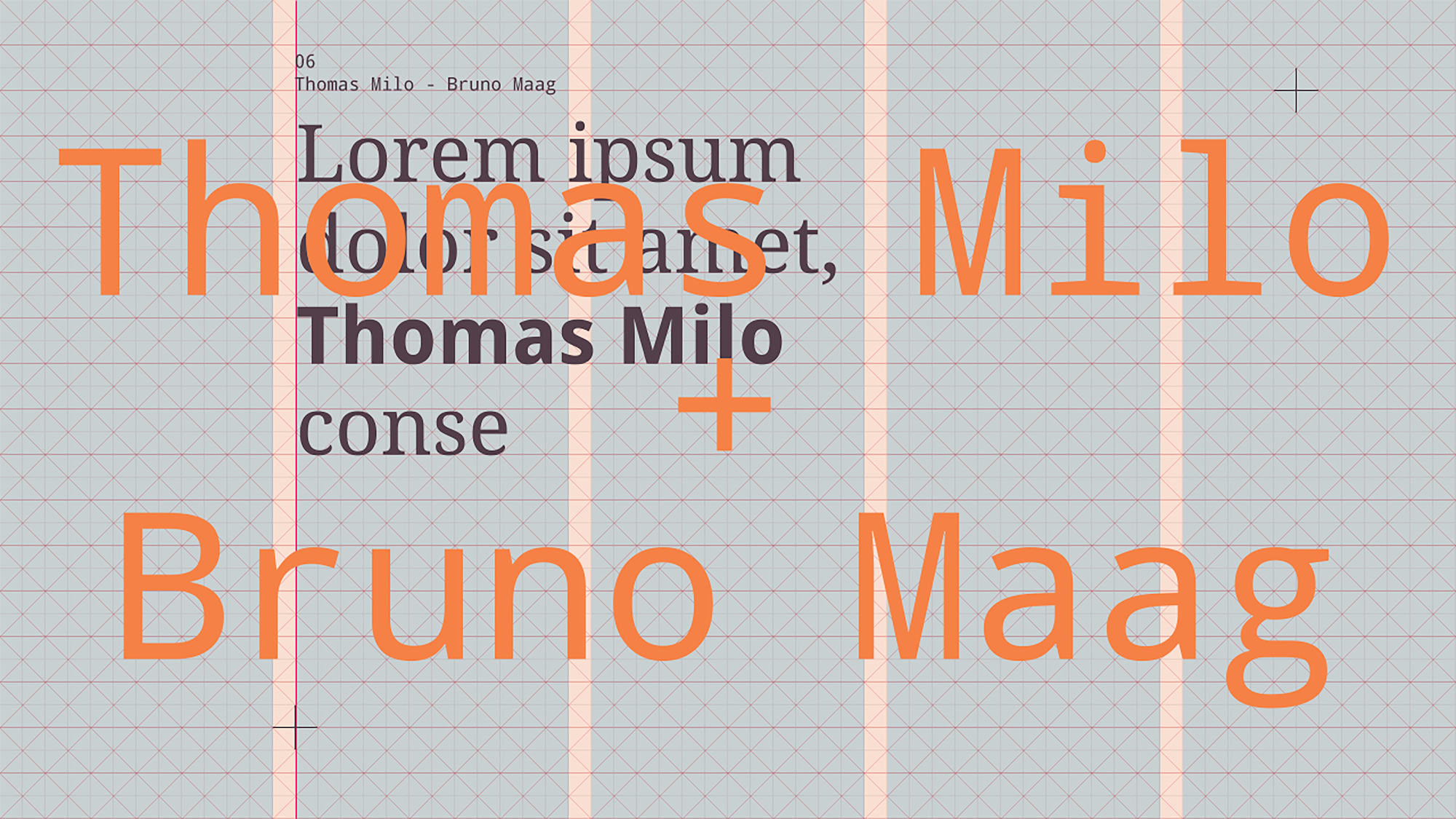
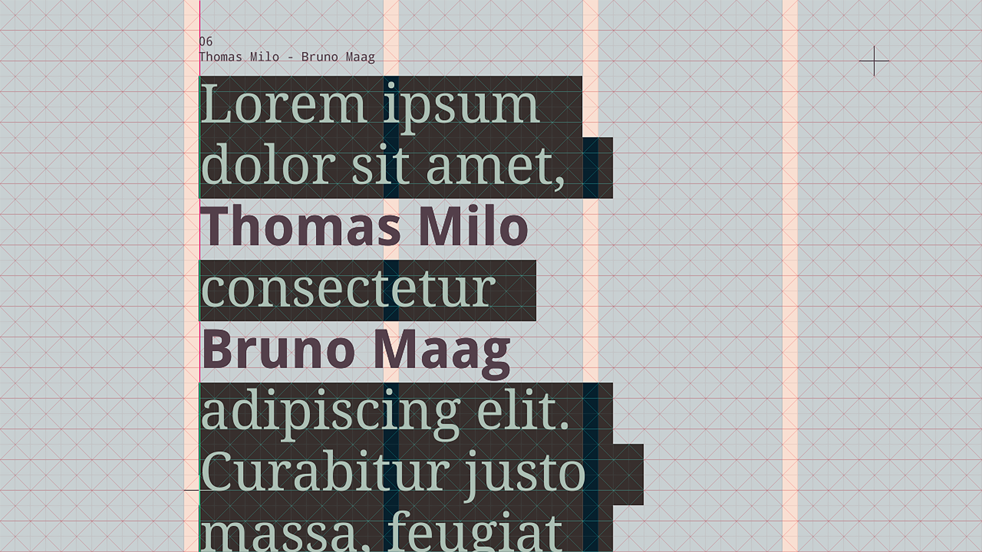
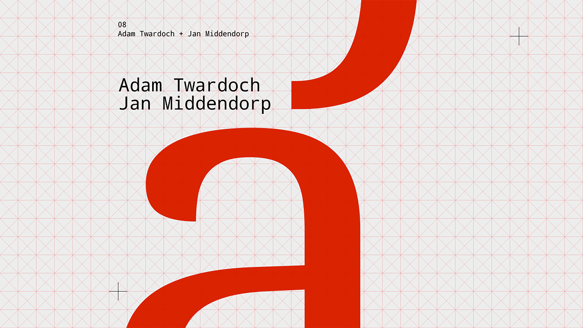
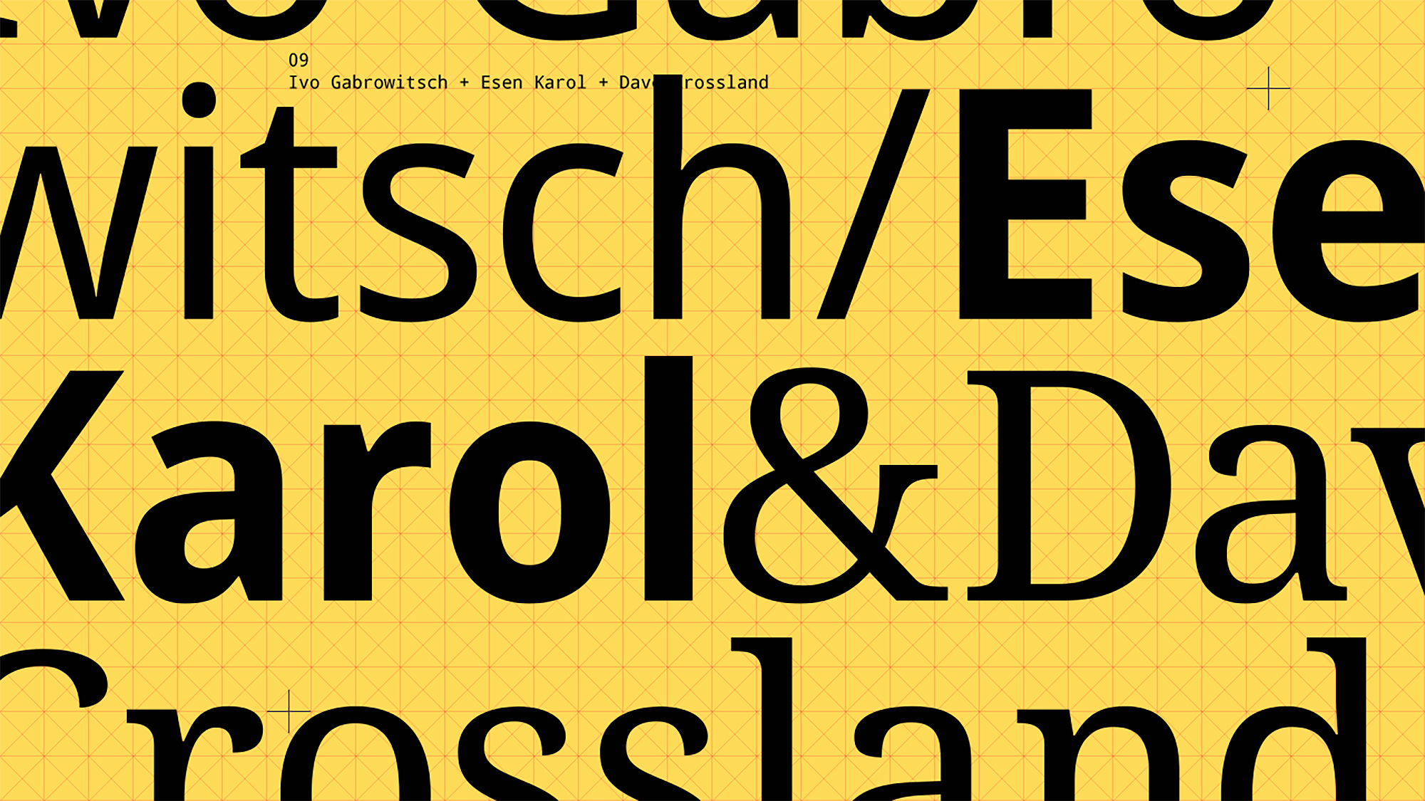
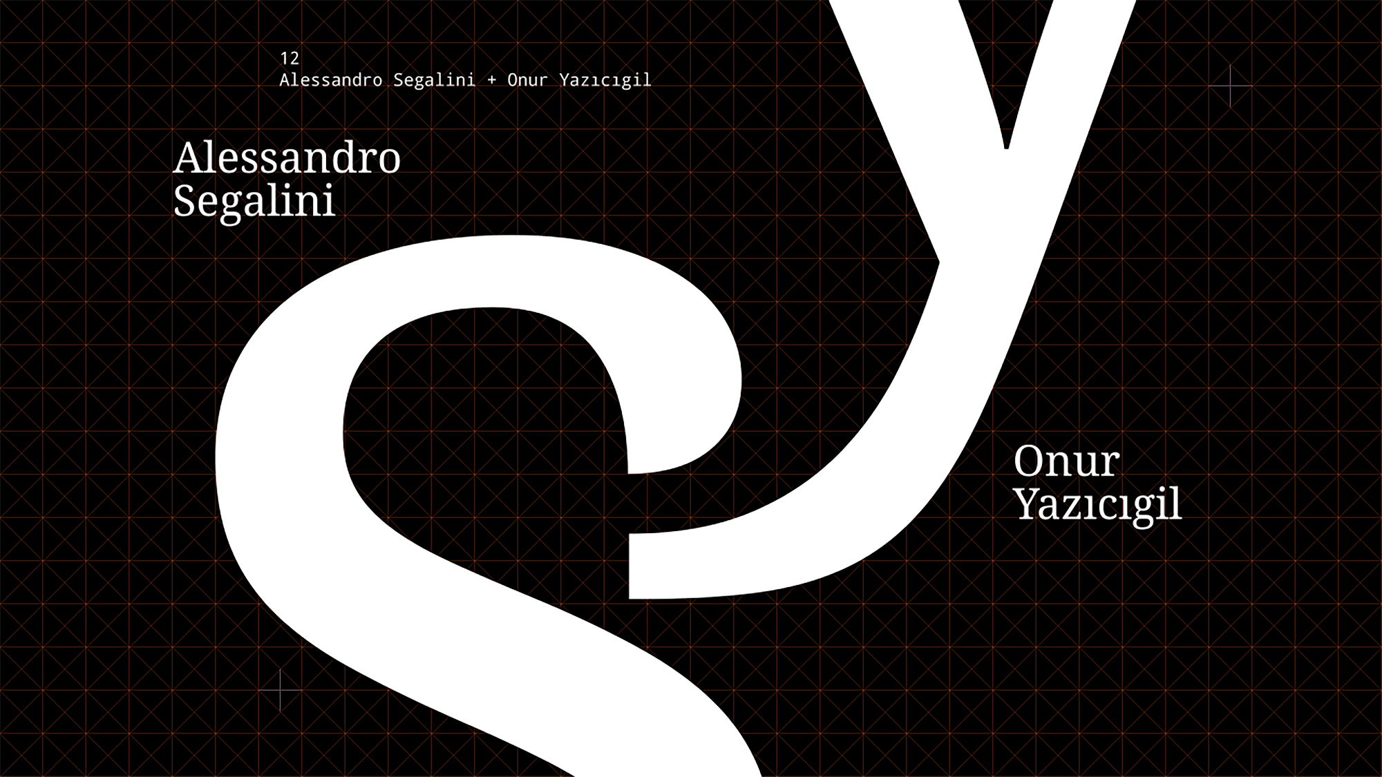
Regarding the creation/use of letters on paper, the typographic and geometric design formed on the 2-dimensional square grid system. Every scene refers to specific speakers and highlights them, and these scenes evolve within the grid structure as they transform into each other. The colors for the scenes are inspired by the speakers themselves. For example, Gerard Unger’s passion for the color purple (apparent on his website, his book’s cover, and even his shirts) was the reason I used purple in his scenes.
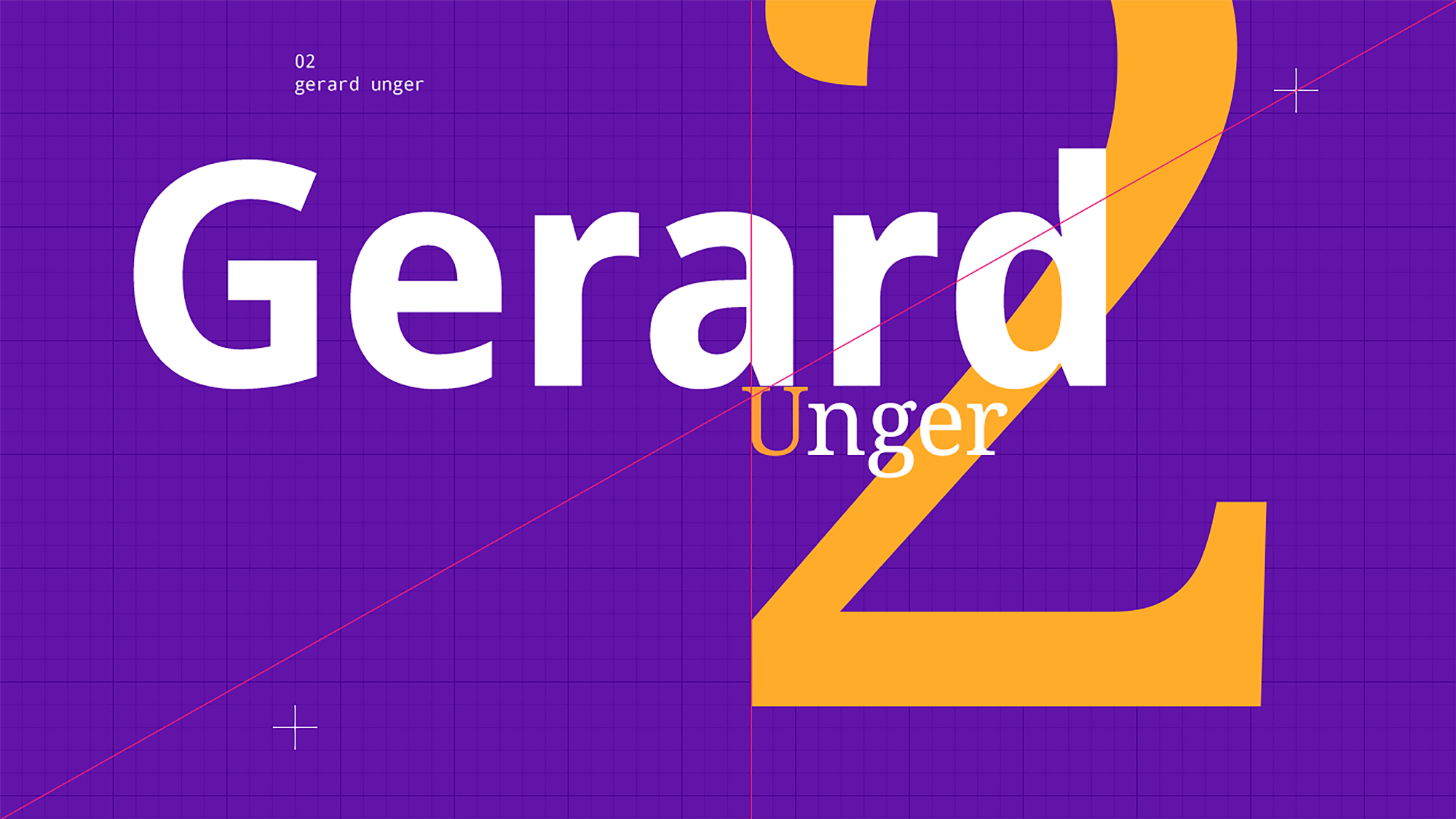
Like Walter Gropius said, “Limitation makes the creative mind inventive”. Only one font, Droid superfamily which has sans-serif, serif, and mono was used on the scenes (it is provided by the conference sponsor Google). The main purpose of this limitation was to create a common language among the speakers and to reveal the power of the grid, color, and geometry in the scenes.
Credits ↓
Motion Design & Sound Editing: Emre Parlak
Original Sound: Bartosz Dziadosz (Pleq)

If you’re working on something that needs a strong visual language — or you’re not sure yet what it needs — I’m happy to talk. More about me & my approach 〉
