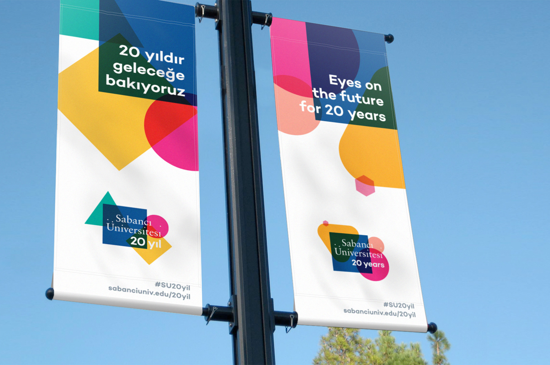
Sabancı University 20 Years
In 2019, Sabancı University, ranked first in Turkey according to Times Higher Education (THE), approached us to find an original way to celebrate their 20th anniversary. We developed a data-based, dynamic visual identity system for use throughout the year, incorporating diverse sets of data about the university.
Brand IdentityCollateralPrintInformation DesignEnvironmental Graphics2019

Exploration
Sabancı University wished to emphasize the University’s rational but also emotional aspects, and its successes in the academic/business world but also in building connections and friendships over the 20 years. They were proud of their past, and also looking forward to the future. During the first meeting, we all agreed it was a good idea to use data visualization as a scientific and artistic way of representing the interdisciplinary nature of Sabancı University.


We tried many combinations of different data structures and visual styles. The rectangle in the University’s logo almost begged to play an active role in nearly all of our systems of visualization, as an element interacting with or joining our data-based graphics.

Approach
What we chose in the end was a system of logos consisting of overlaid colorful shapes which change in size and intersect according to many parameters such as the number of academic and administrative staff, the number of students, and the number of graduates. Throughout the year, this family of logos grew and took on new shapes with new data.


The shapes and their colors always obeyed a global system of reference meticulously designed to optimize the combinations that are likely to arise. The blue square (representing covered area) was present in all the variants both as a reference to the original university logo, establishing continuity with the past along with the type, and as a dark-color ground improving legibility.

The logos produced offered the opportunity to see both the total numbers of the 20-year history and how these numbers have changed over the years. Since many data types have breakdowns such as faculties and undergraduate/graduate sets, dozens of different intersections and hundreds of different logos showing the past years were produced.


While this system provides visualizations depicting the 20-year story of Sabancı University, it also takes this one-year opportunity to create a colorful celebratory world within a logo that conceptually refers to the dynamic, brave, rich, and interdisciplinary nature of the university.


