SUPER NORMAL
A magazine that focuses on typography but also on all design areas that typography touches. In doing so, it is a publication that includes experimental designs as well as text, asking questions, investigating, and visualizing these within each issue’s specific theme. It is a space that contemplates what normal is, searches for movement and excitement within normality, and questions ordinariness and rules.
IdeaNamingCreative DirectionBrand IdentityEditorialDigital Design2024

Idea
The magazine redefines normal, focusing on experimental typography and design. So what is normal? Is it simply not abnormal? According to what are norms shaped? Are they things that comply with rules, have no surprising aspects, and are ordinary and natural? Can this absence of surprising elements change with the additions that come with it? Does being SUPER NORMAL mean it is very normal?
The magazine, open to participation by invitation, does not have a fixed publication period; under normal conditions, typically published annually. This period may be shortened or extended in SUPER NORMAL situations, which change depending on what is considered normal. Each issue will have a topic or question intended to provoke participants. Responses can be in text and visuals, only text, or only visual form, depending on the topic or question.
Designing the System
Each issue of the magazine will feature one Pantone spot color alongside black, inspired by the issue’s theme. The general identity system is built around a grid based on a mono font, offering flexible applications. This modular system ties into the theme of the first issue, “Is it readable?” (“Okunuyor mu?” in Turkish). An overarching, or “umbrella,” design language was developed to accommodate diverse designs while keeping the identity itself understated, maintaining a meta-level presence. This adaptable language is designed to evolve with each issue.


The logo can be used in two different ways: angled and straight.
Editorial Design
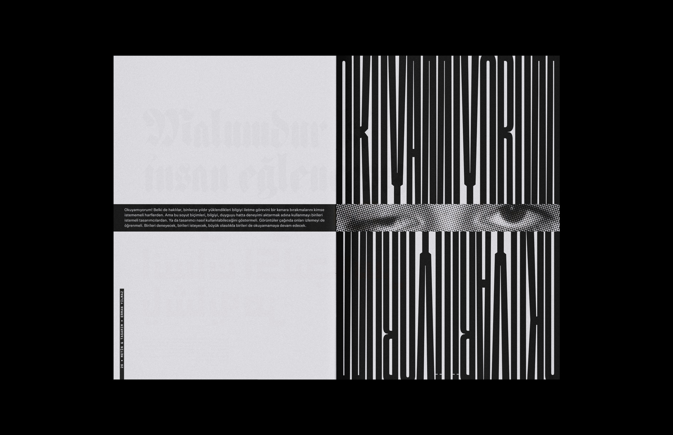
Inspired by the question “Is it readable?” the editorial design of the magazine’s first issue establishes a visual language that challenges norms and rules. It aligns with the identity, utilizing a modular and dynamic grid system.


