9016 Architecture
A 2011 born design and architecture office in Istanbul. I designed a lean and minimalist approach that elevates and focuses on content.
UI DesignEditorial Design2018
Approach
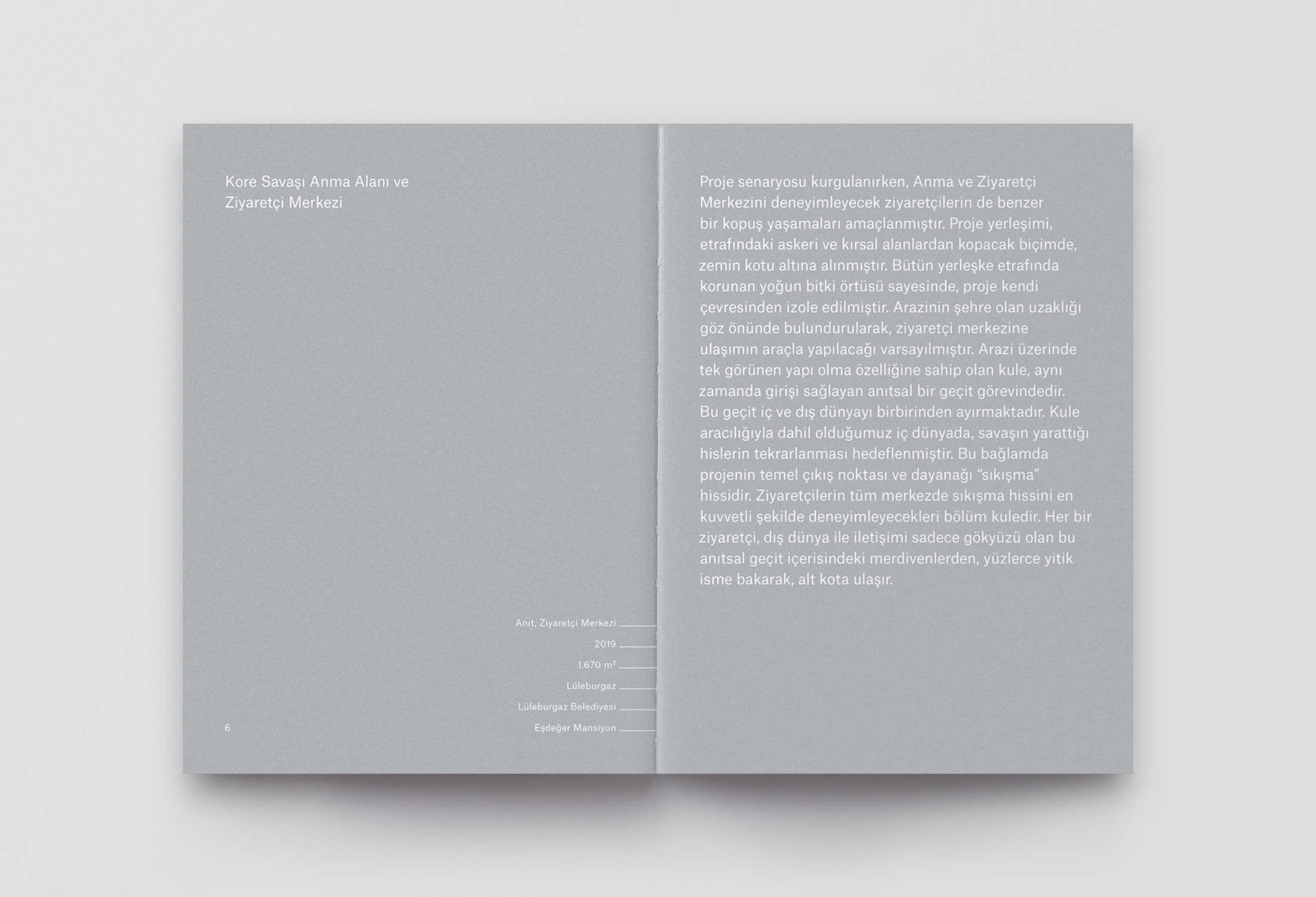
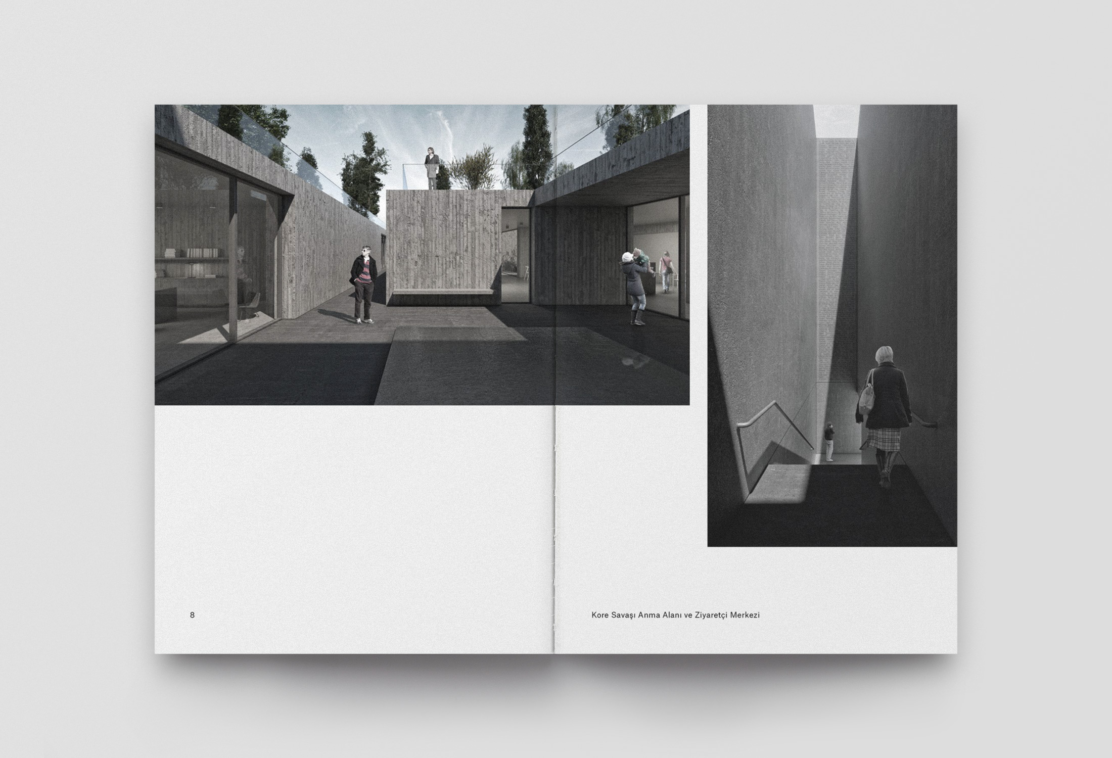
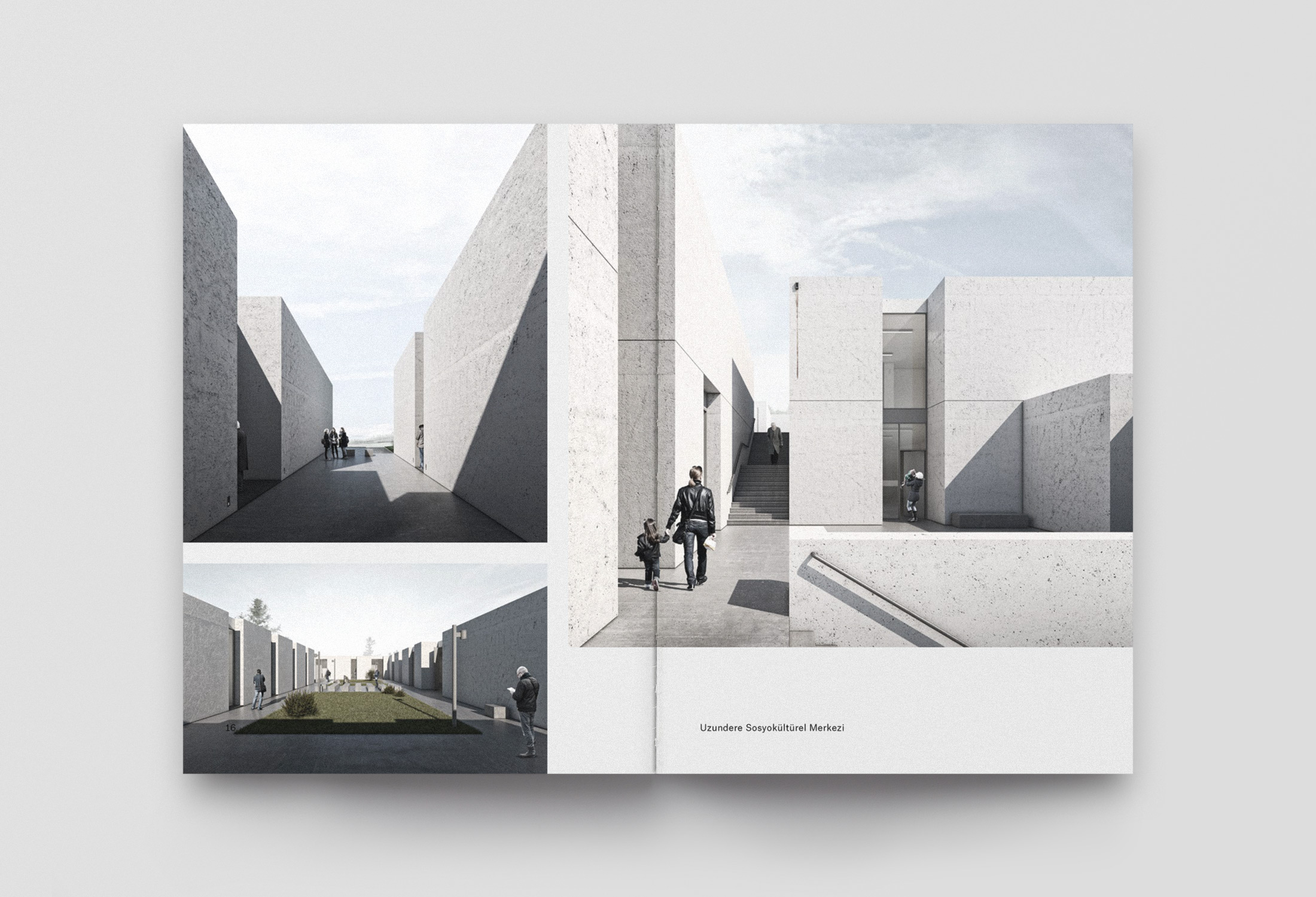
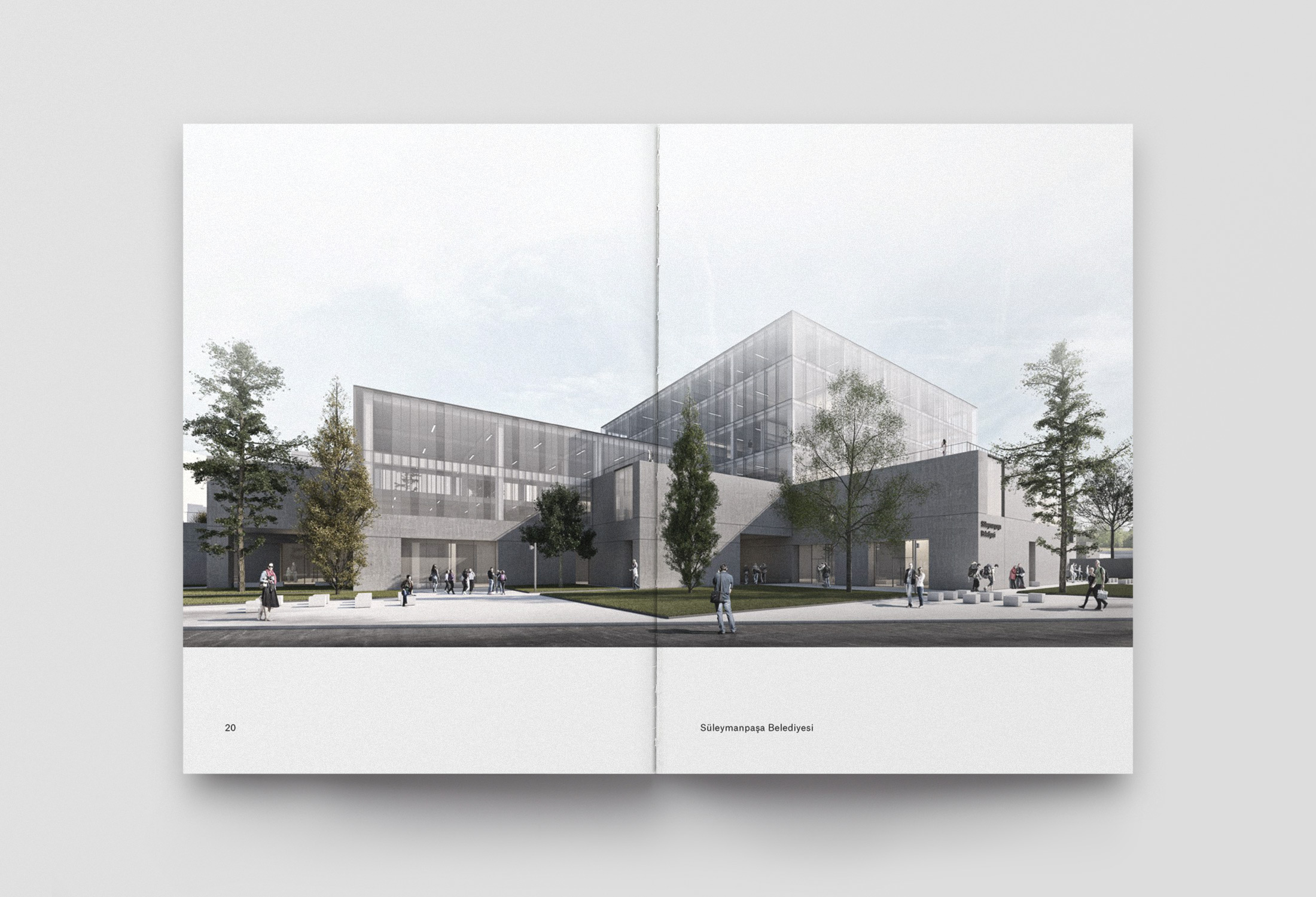
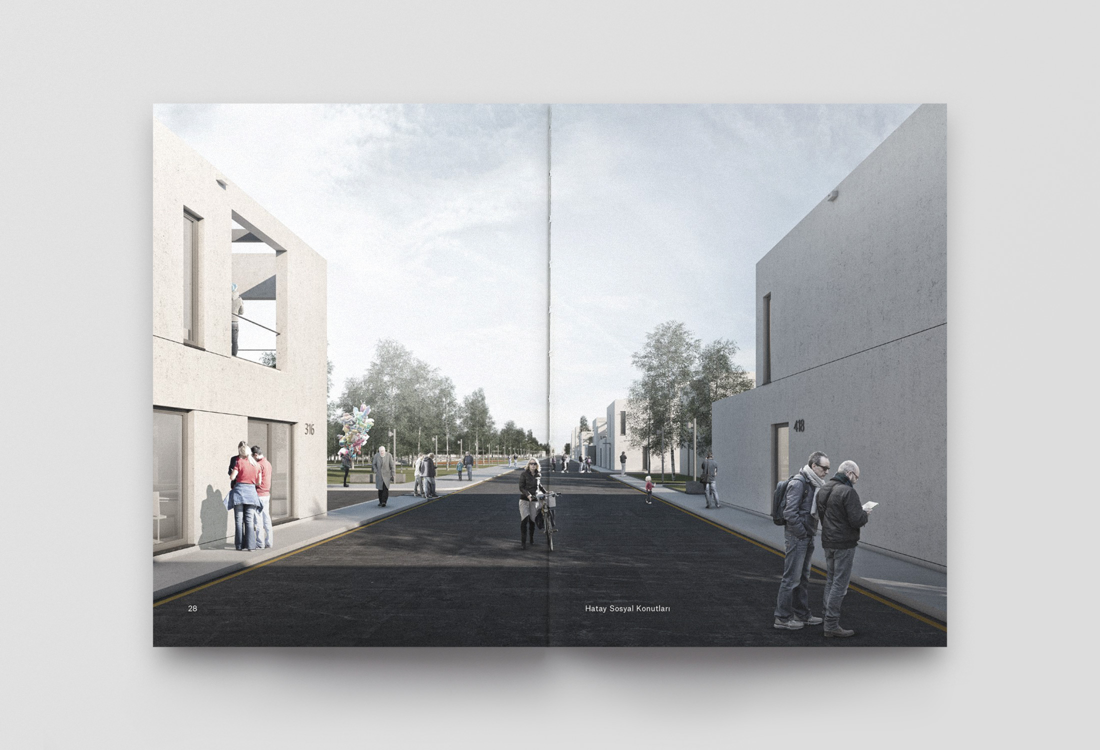
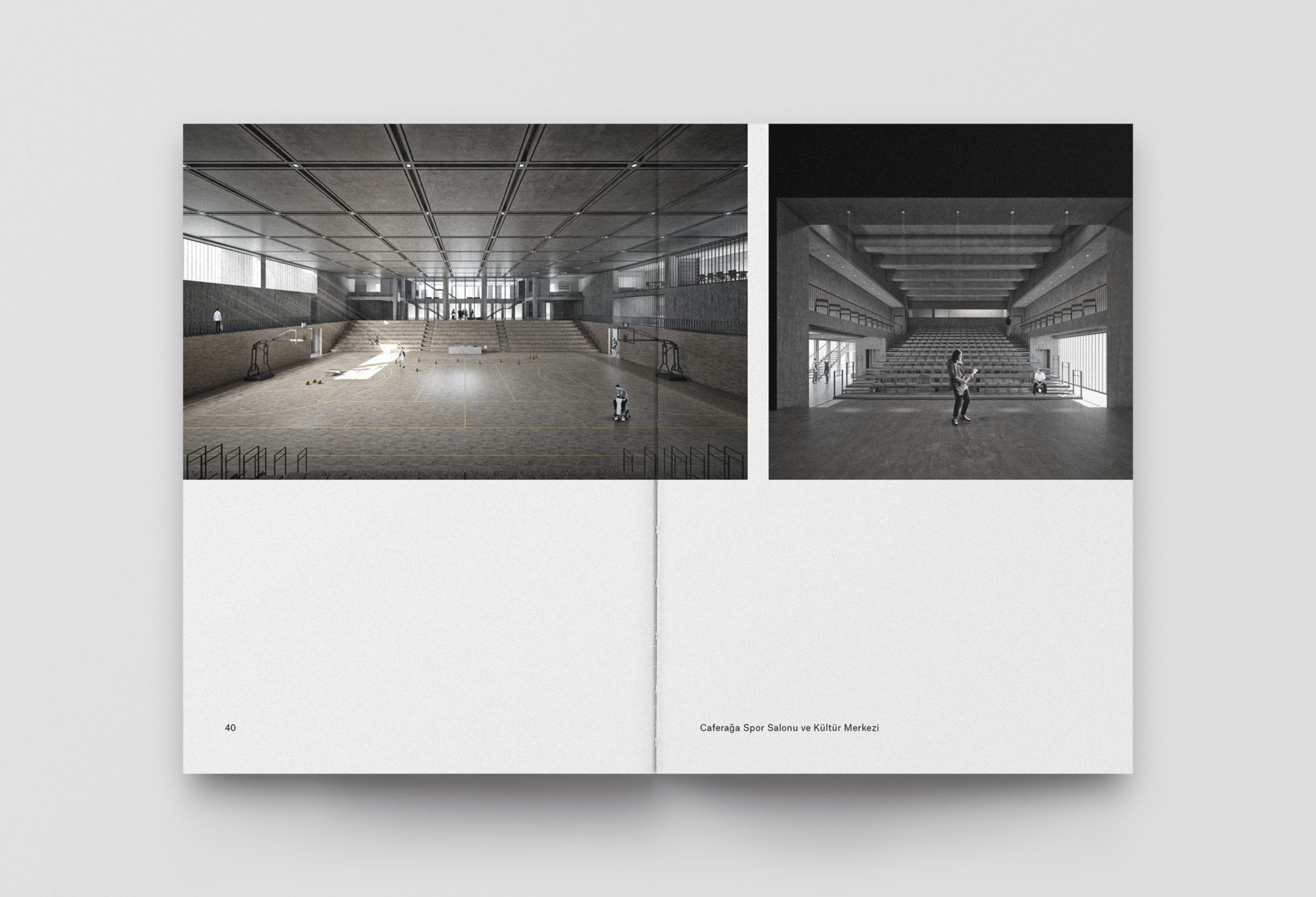
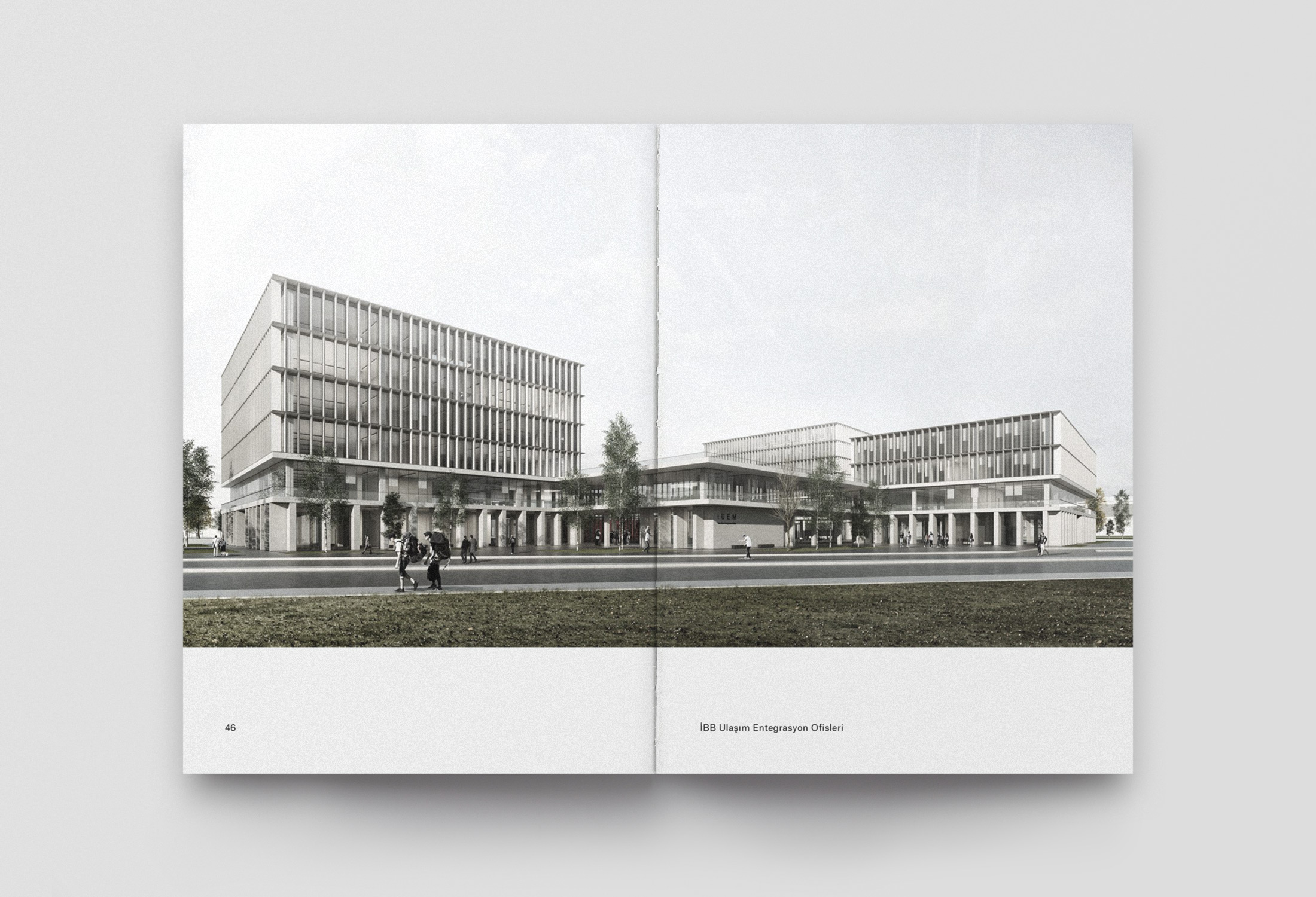
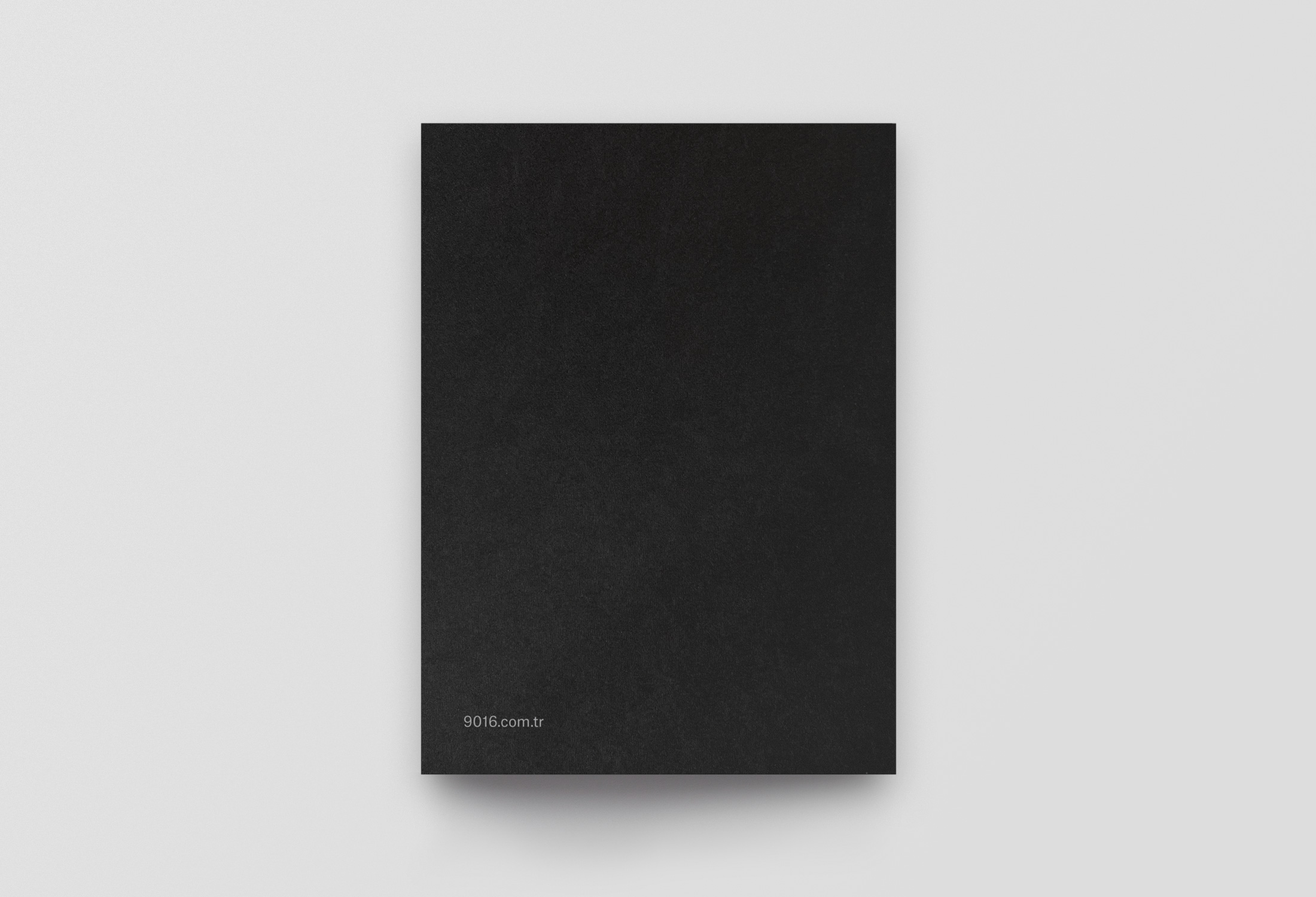
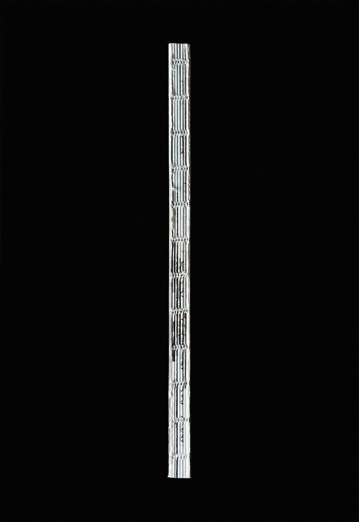
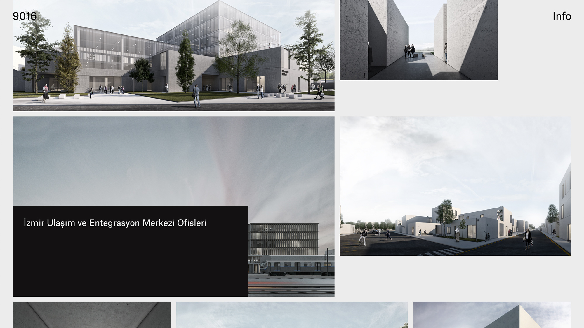
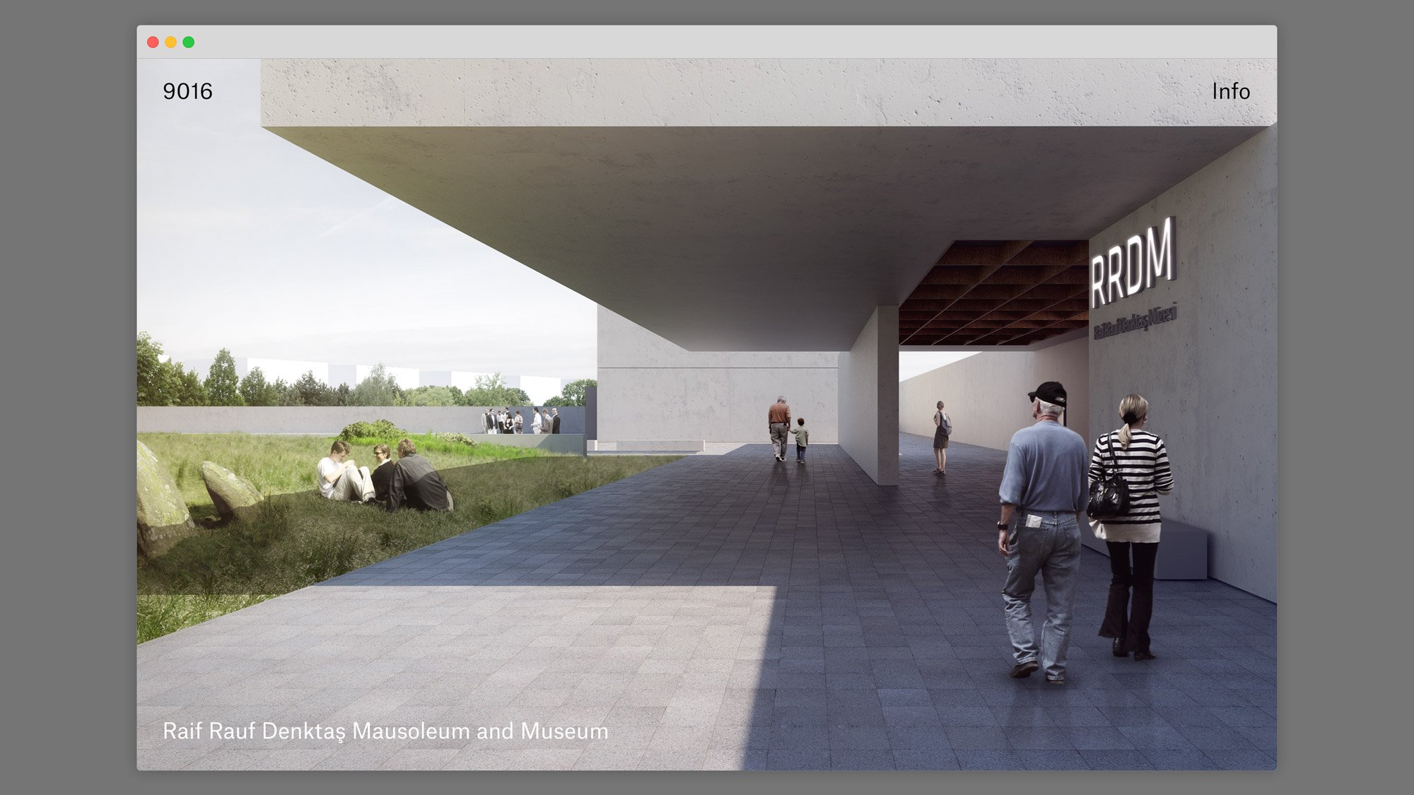
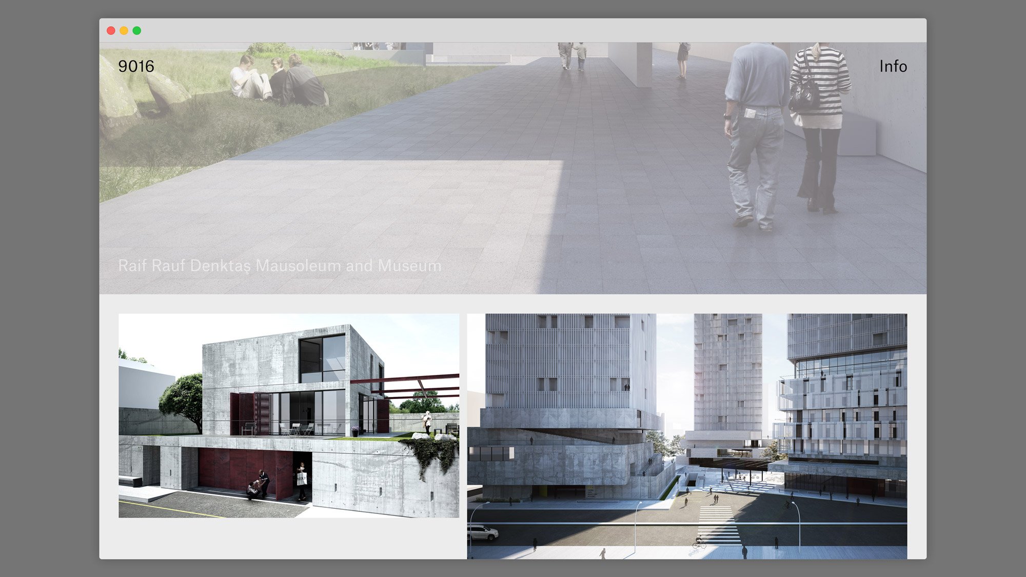
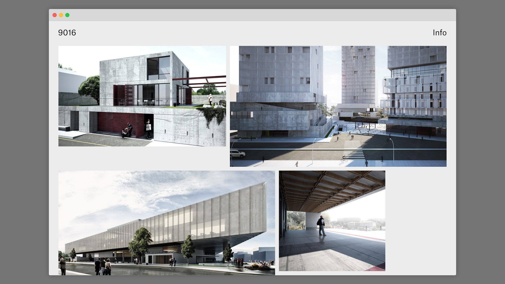
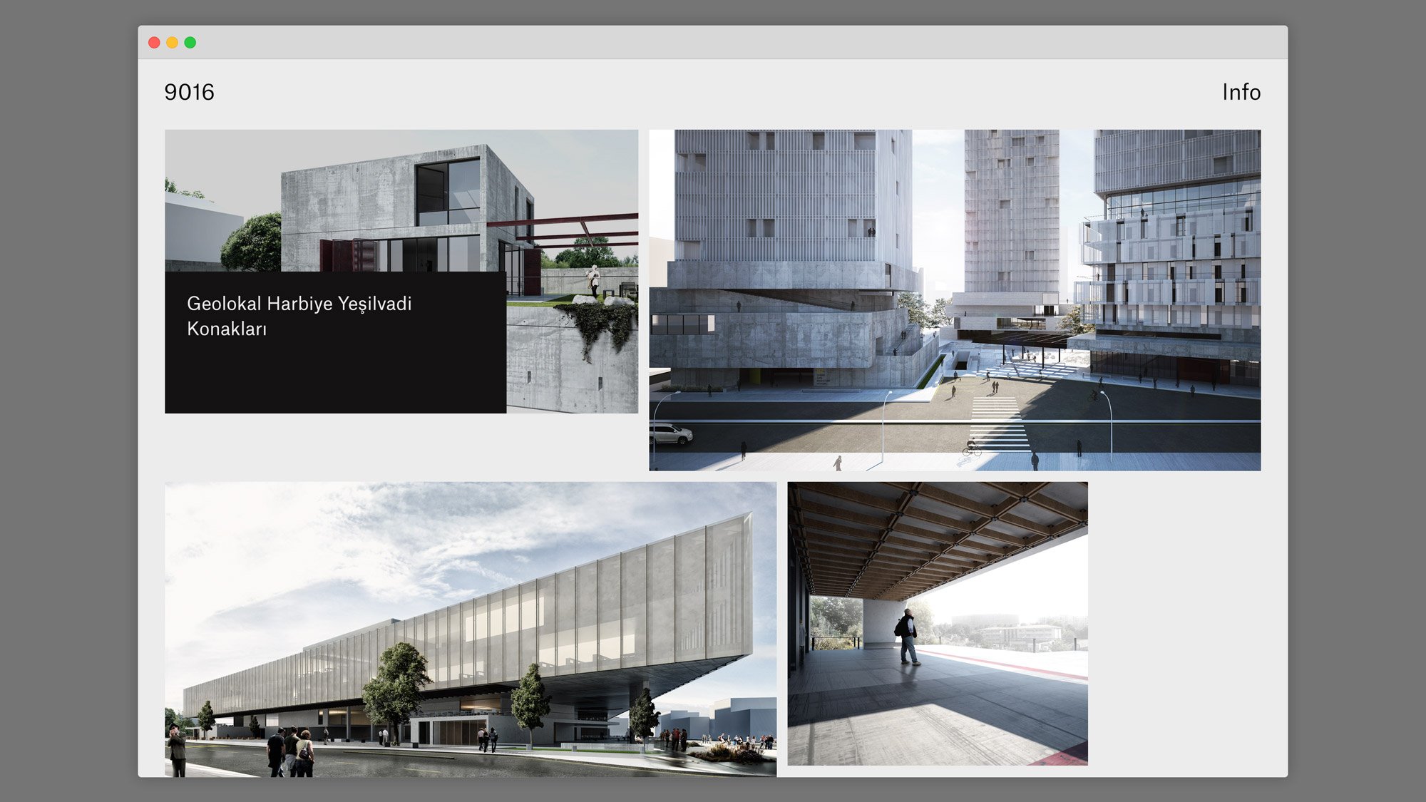
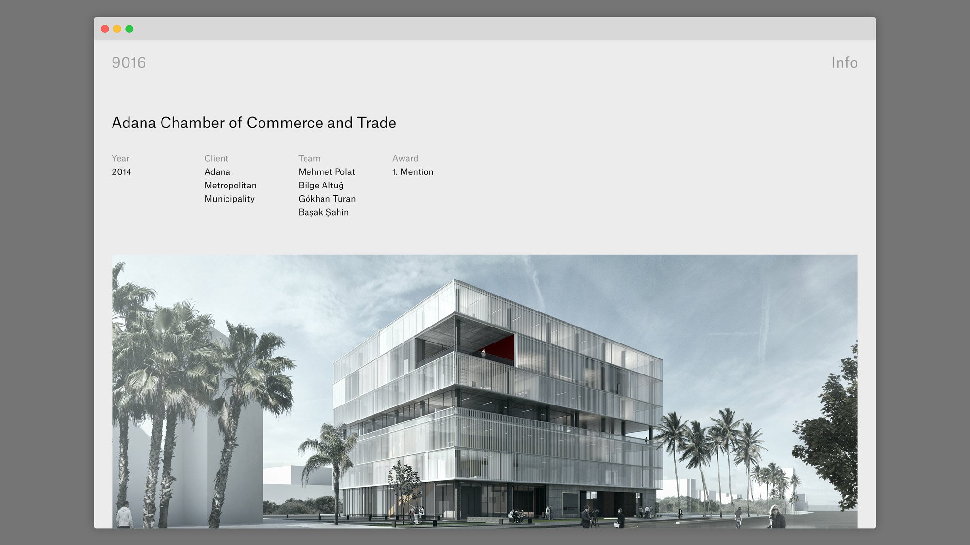
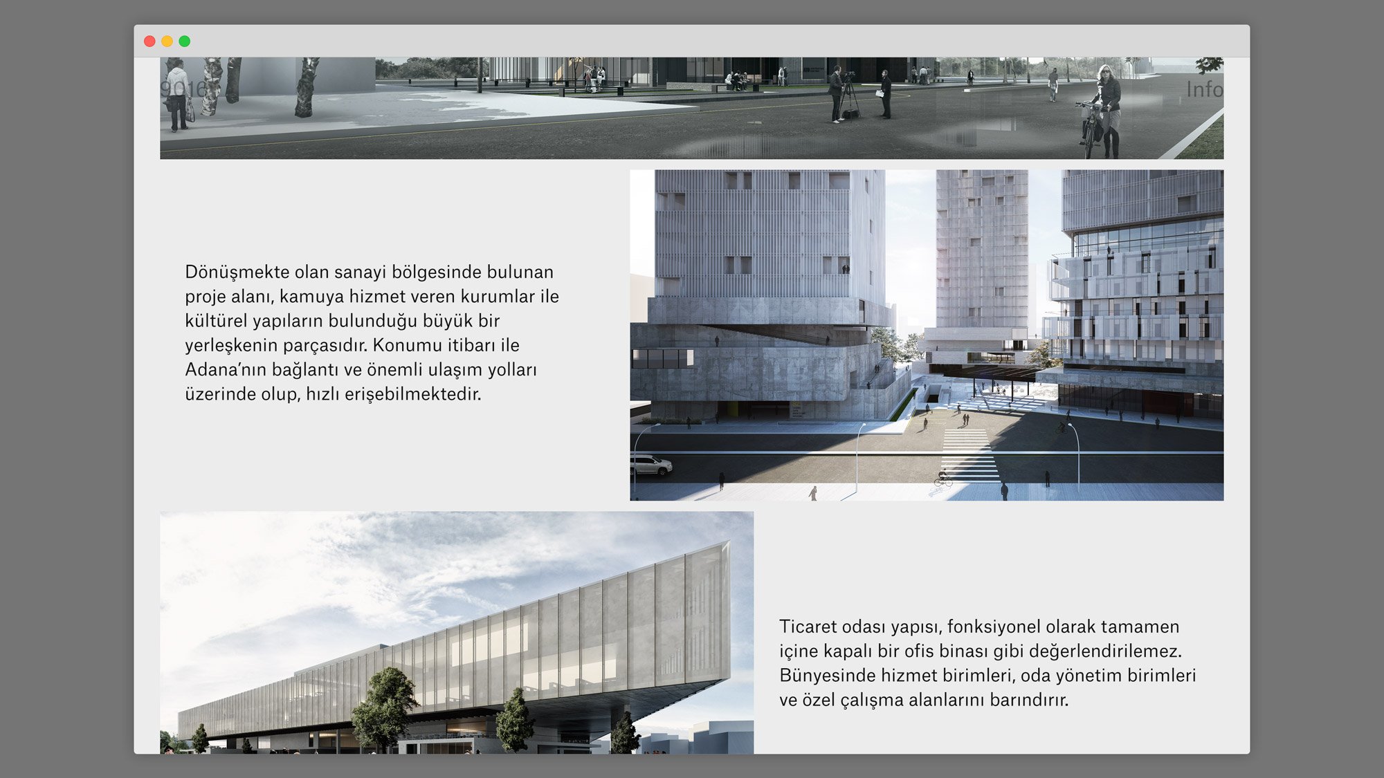
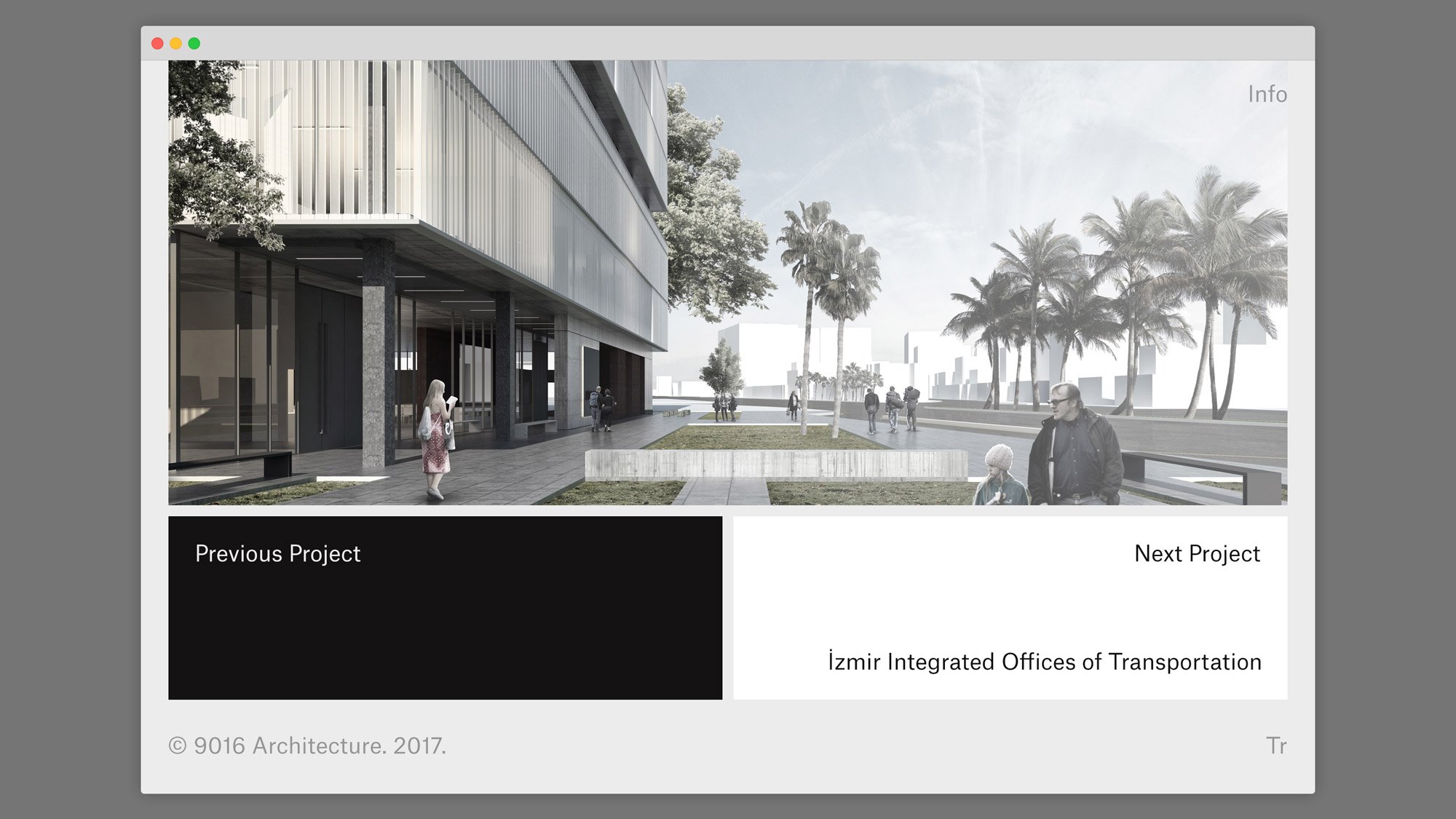
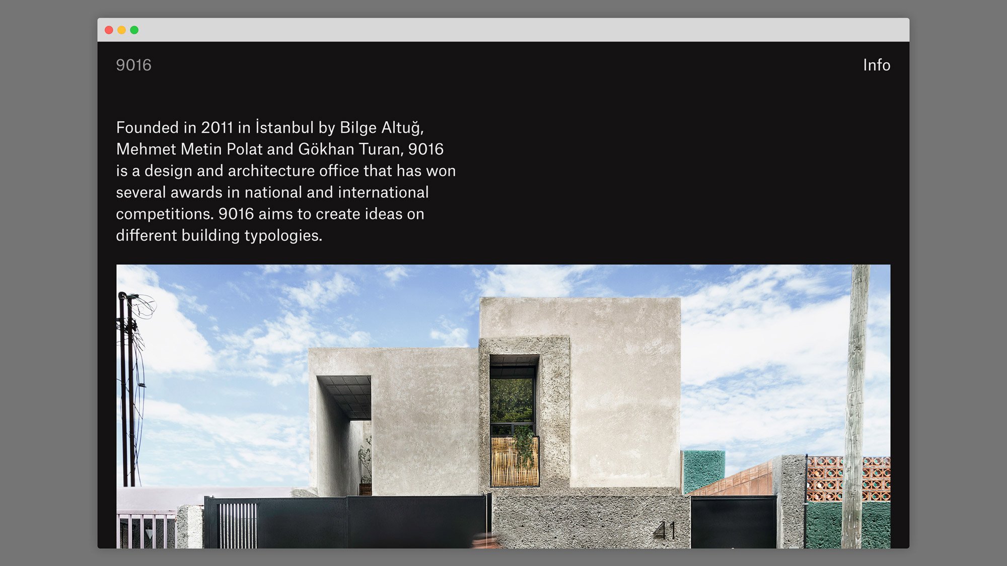
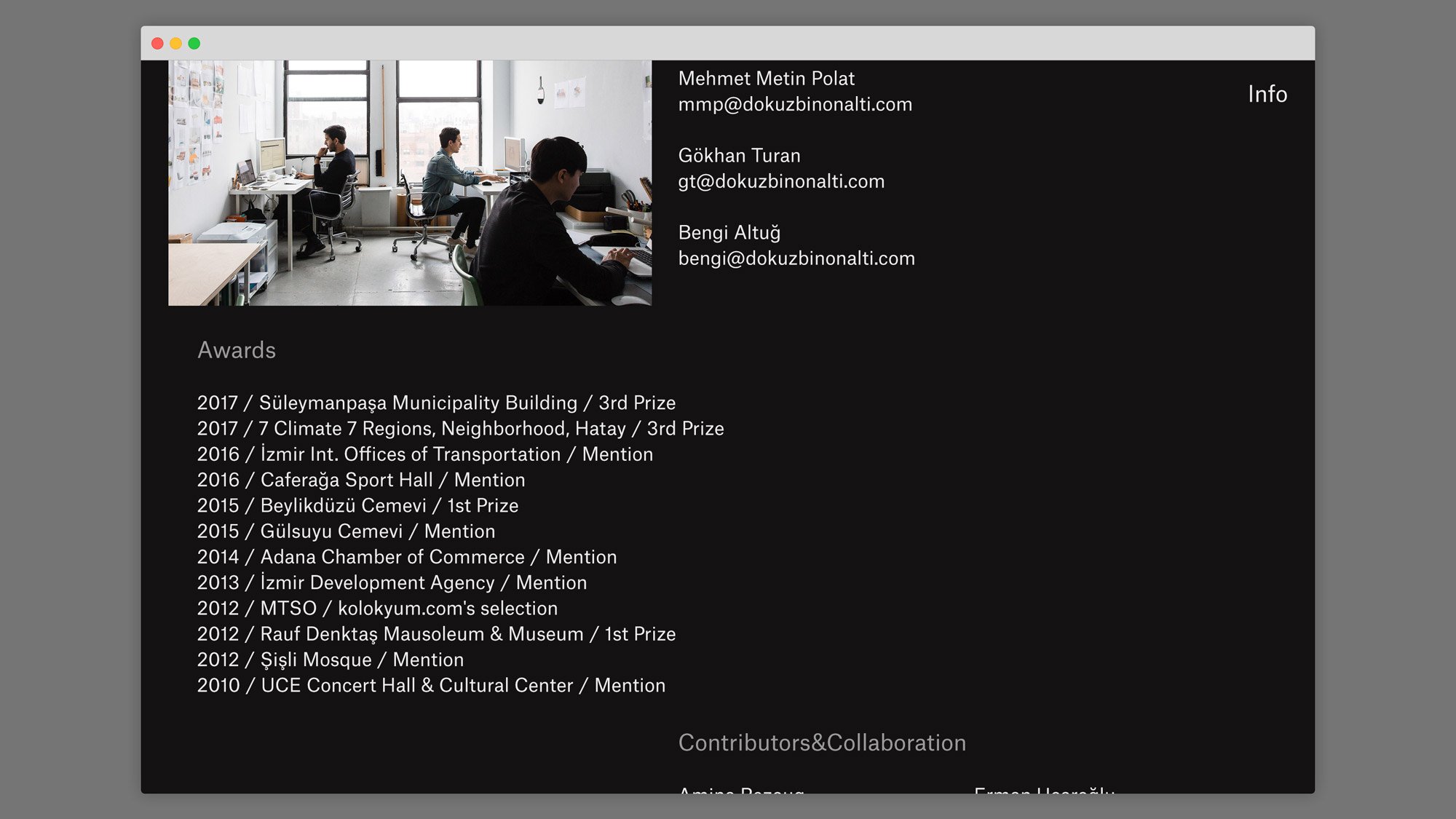
The approach in this project is to highlight the content with calm, simple, and minimal language and minimize distractions, solving the design with as few parameters as possible. With less, while glorifying the content while doing so. To do so an easy, accessible, and readable structure was established. Content is placed on the page with a modular grid structure. Sometimes the designer should be invisible like in Crystal Goblet.

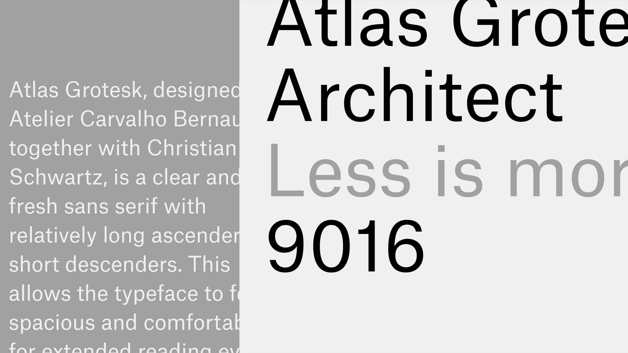
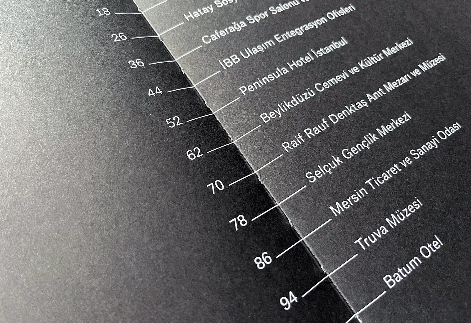
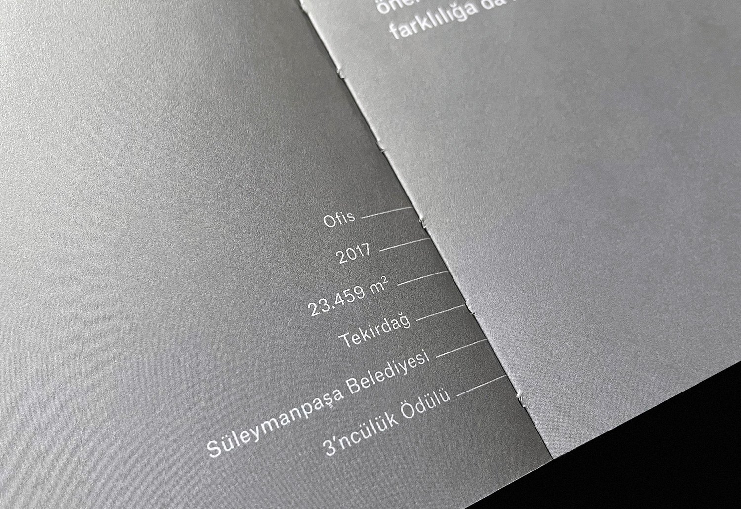
Only one font (&one weight) and one color (black & shades) were used to establish that simple and neat language. The structure and skeleton of Atlas Grotesque Regular give the right neutral tone for the design.
Only one font (&one weight) and one color (black & shades) were used to establish that simple and neat language. The structure and skeleton of Atlas Grotesque Regular give the right neutral tone for the design.

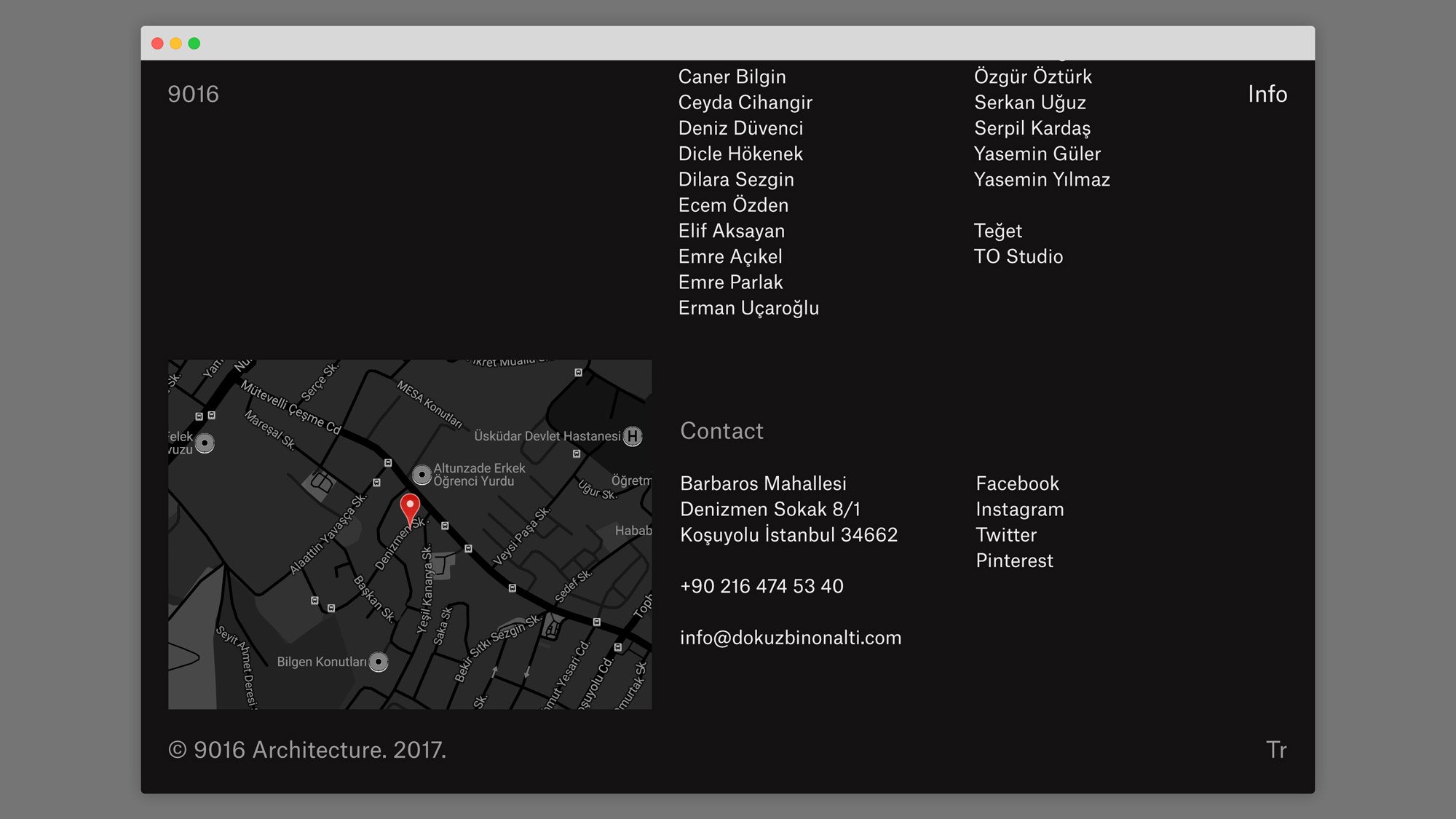
Web Design
Editorial Design
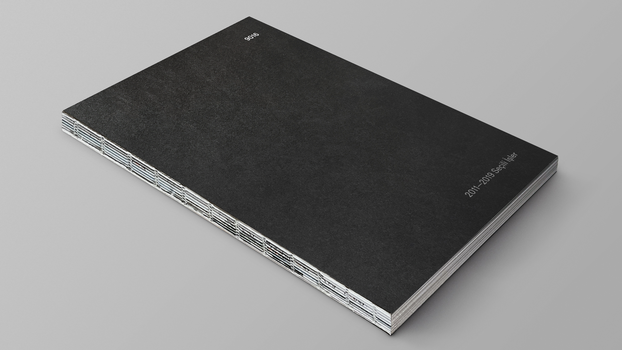
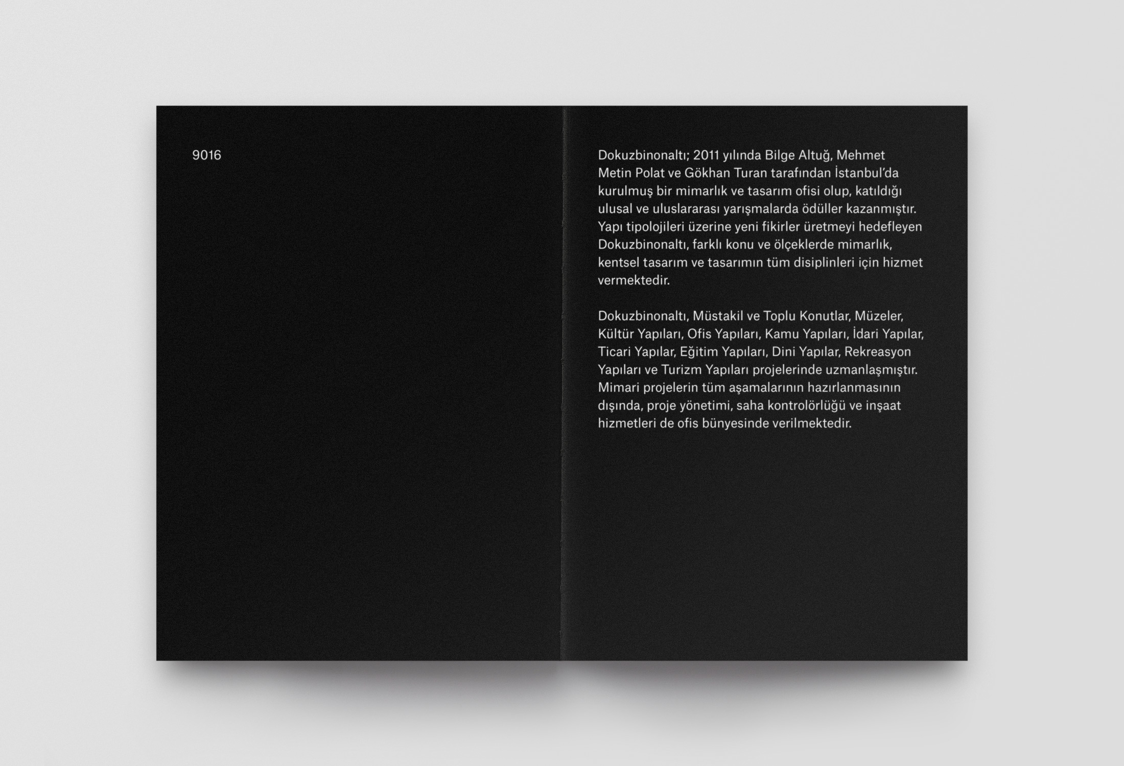
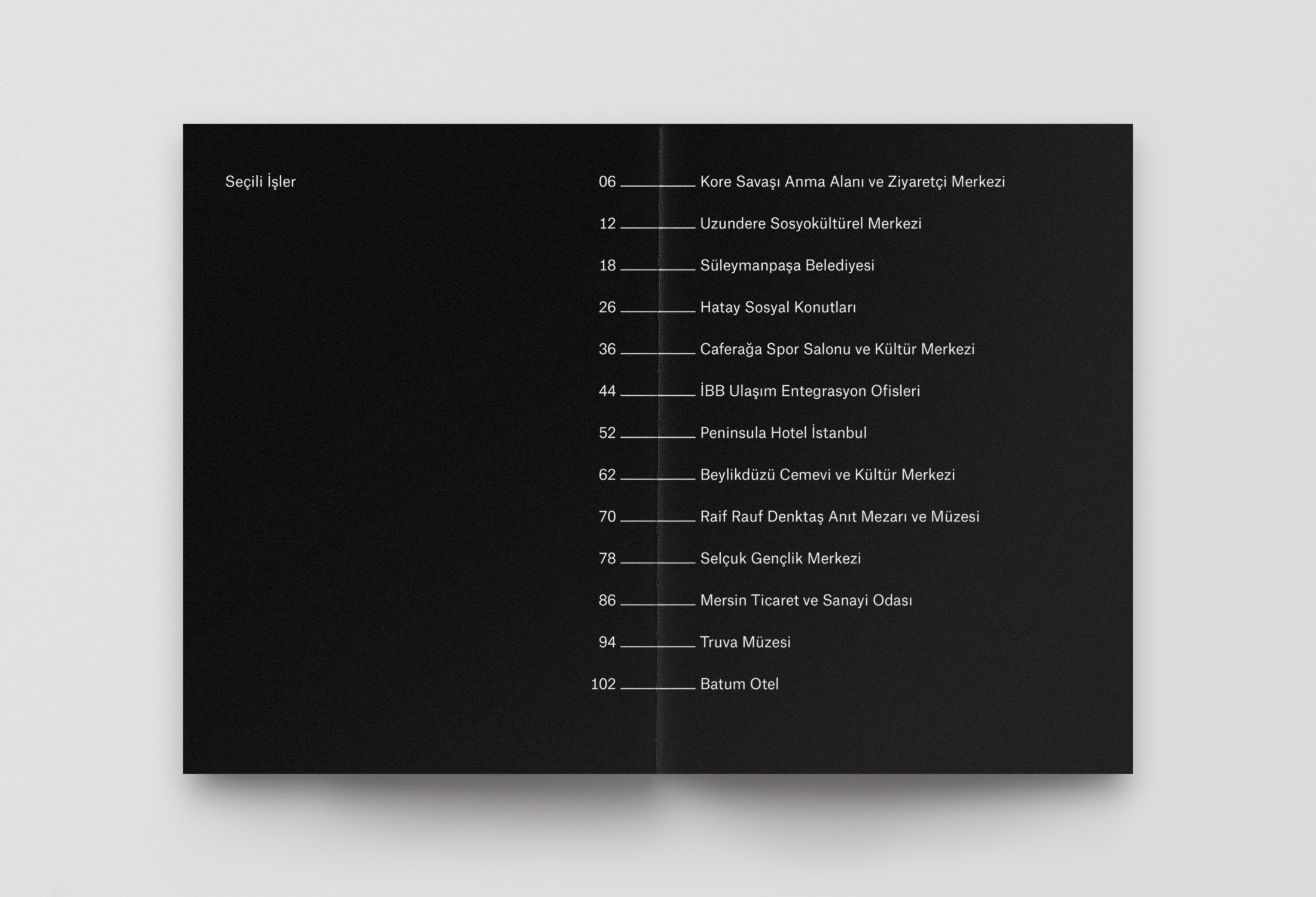
The structure and skeleton of Atlas Grotesque give the right neutral tone for the design. With one weight and two different font sizes, the catalog maintains the minimal use of parameters and plain language.
