Beije
A menstrual care brand committed to natural, sustainable, and effortless solutions delivered directly to consumers. We reimagined Beije’s brand identity and packaging to better reflect the values of accessibility, inclusivity, and human connection. Our mission was to shift the brand’s tone from an elite, distant feel to a more vibrant, approachable, and versatile identity—one that resonates with today’s values of inclusivity and openness.
Brand IdentityPackagingDigital2022

Challenges Identified
The initial brand identity conveyed an exclusive, high-end feel—suggesting “boutique = expensive.” The design relied on thin, contrasting fonts that were difficult to read, and an overall aesthetic that felt restrictive and disconnected from modern, inclusive values. Gender stereotypes, limited emotional range, and an inability to express political messages were additional hurdles.

The previous packaging used white, thin, and high-contrast fonts, resulting in low readability and a faint overall presence.


The old identity felt dull and distant, with a limited range of expression that made it challenging to convey emotions.
Solutions
We proposed a bolder, younger, and more inviting stance for Beije’s identity, one that felt approachable, affordable, and adaptable to diverse messages. Through extensive exploration, we developed a modular design system with flexible color and font palettes that could communicate a range of expressions—from joy and enthusiasm to values-driven stances—while maintaining a cohesive look. This updated system, slightly shifted toward an industrial aesthetic, introduced new colors, typography, and illustrations, all rooted in a humanistic approach that allowed the brand to feel both dynamic and accessible.

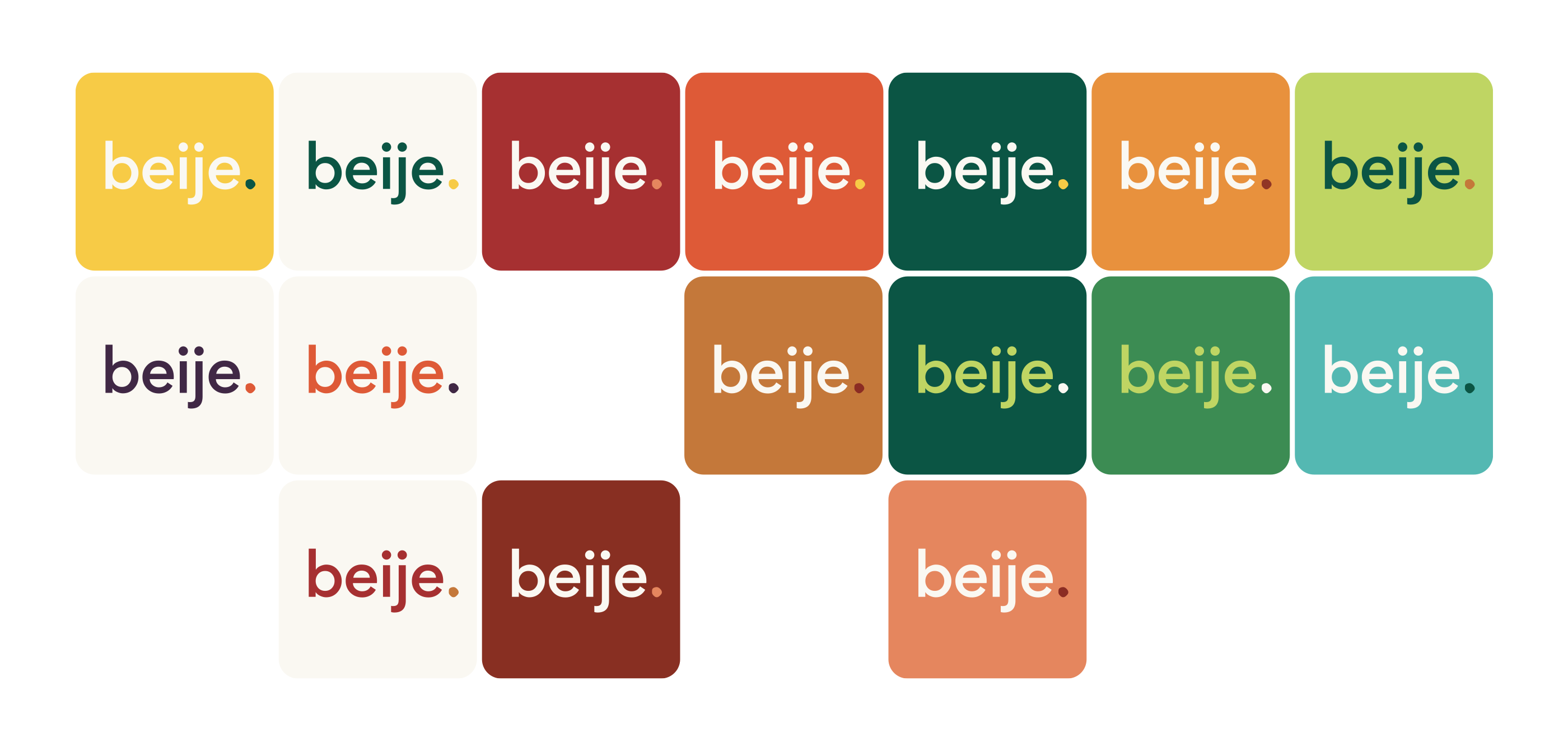
The Beije logo consists of “beije” typed in a contemporary sans-serif and an organic-shaped period at the end. The all-lowercase choice makes it more friendly and humanistic. The typeface is neutral, clean, inclusive, reliable, peaceful, and friendly. The period at the end gives it an even more self-confident stance, while the organicity introduces a natural, unique, personal element.


The Beije logo has a subtle dynamic component: the organic shape of the period at the end can vary in different applications, symbolizing the variety of people and emotions that Beije relates to.
Typography & Colors
The typography and color choices for Beije were carefully selected to embody the brand’s new, approachable tone. We introduced a versatile typeface that balances clarity with warmth, reinforcing Beije’s friendly and inclusive identity. The color palette, centered around a primary vibrant color paired with adaptable accent tones, offers flexibility for a range of messages and moods. By incorporating a mix of bold and soft hues, we crafted a visual language that feels both contemporary and welcoming, supporting Beije’s mission to create a sustainable and accessible menstrual experience.


We developed illustrations grounded in a humanistic approach, bringing warmth and approachability to the brand. These illustrations add a dynamic, accessible layer to the identity, reinforcing Beije’s mission to connect authentically with its audience.
Packaging


