Toyi
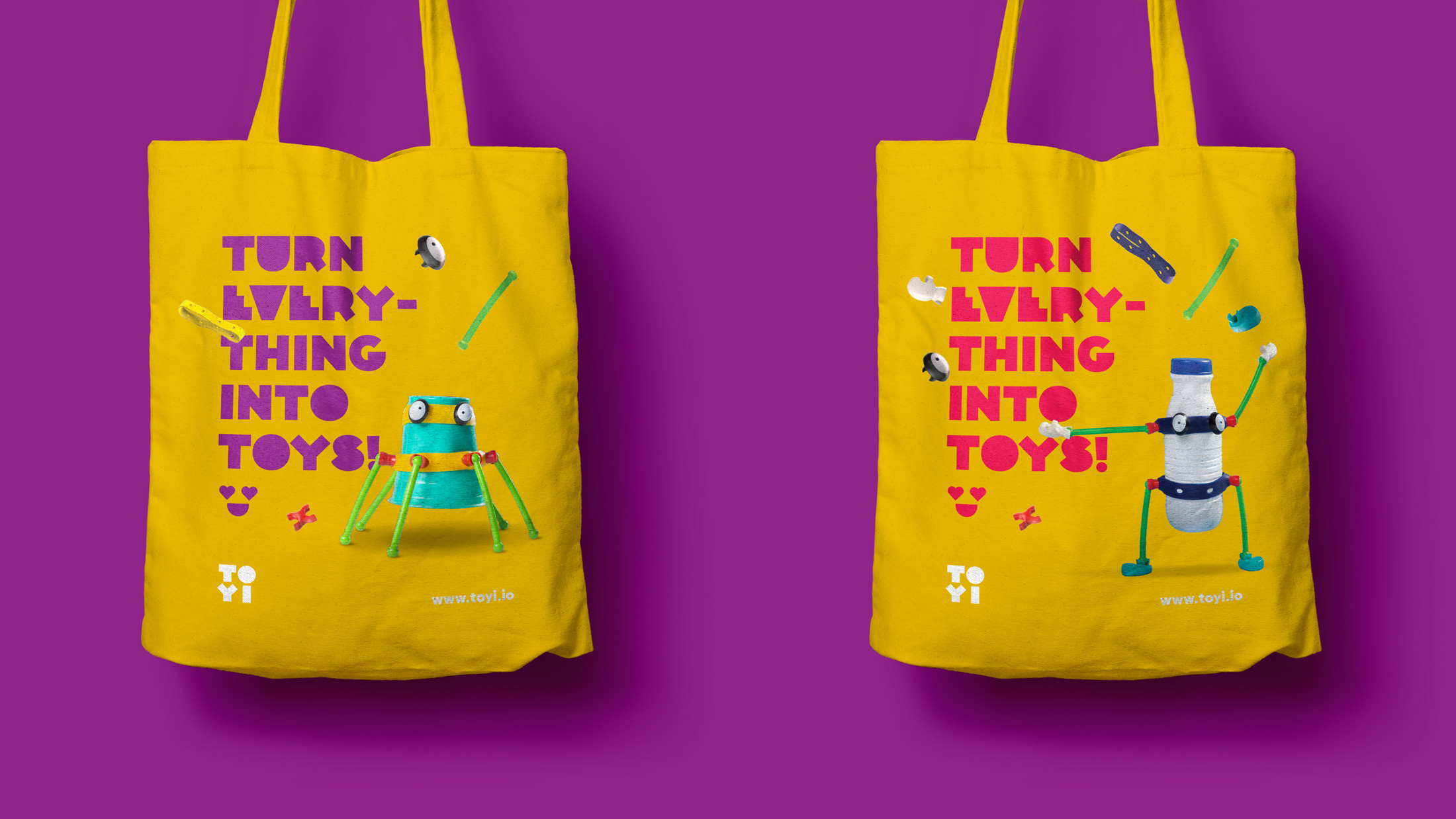
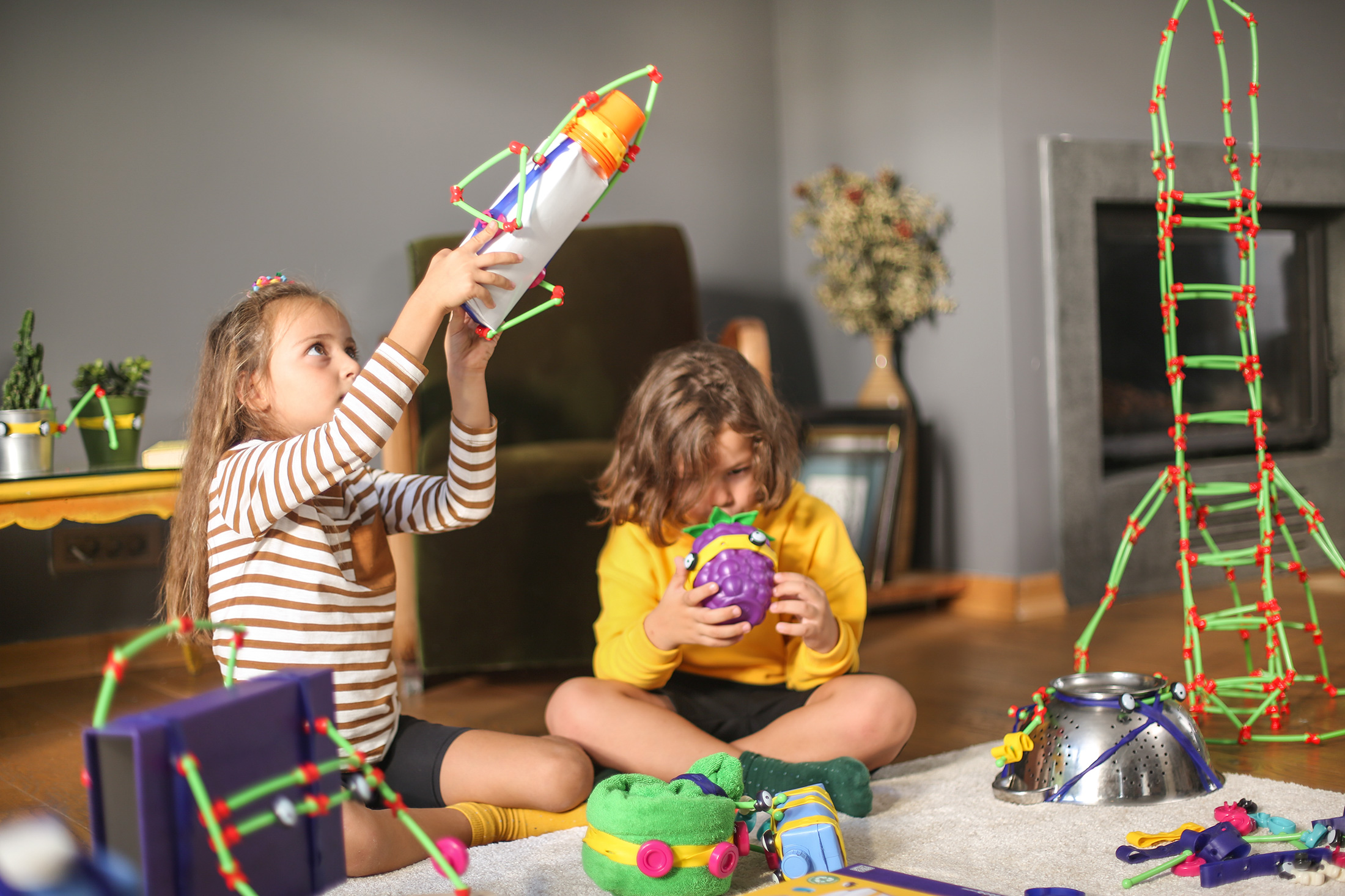
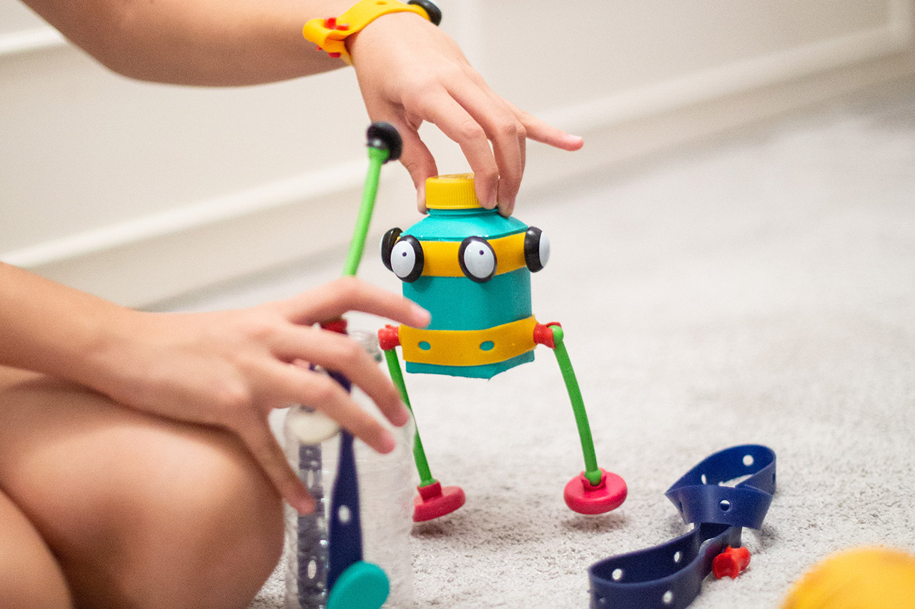
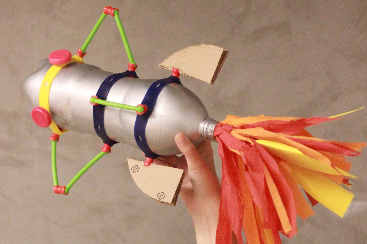
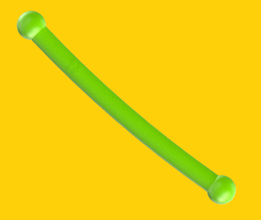
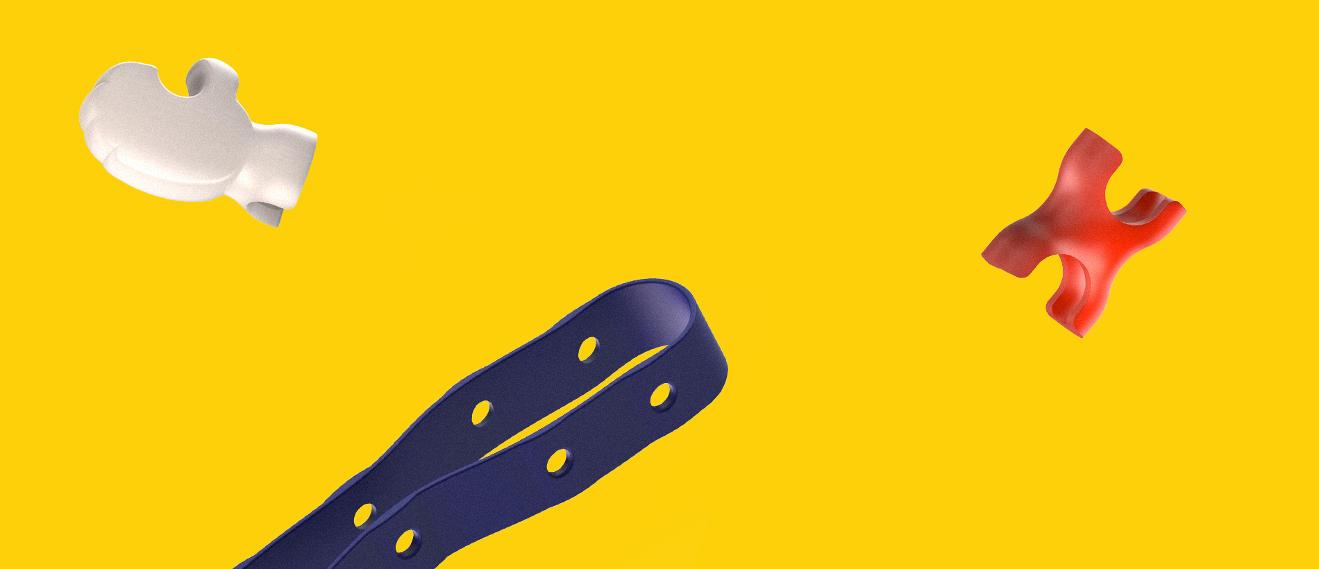
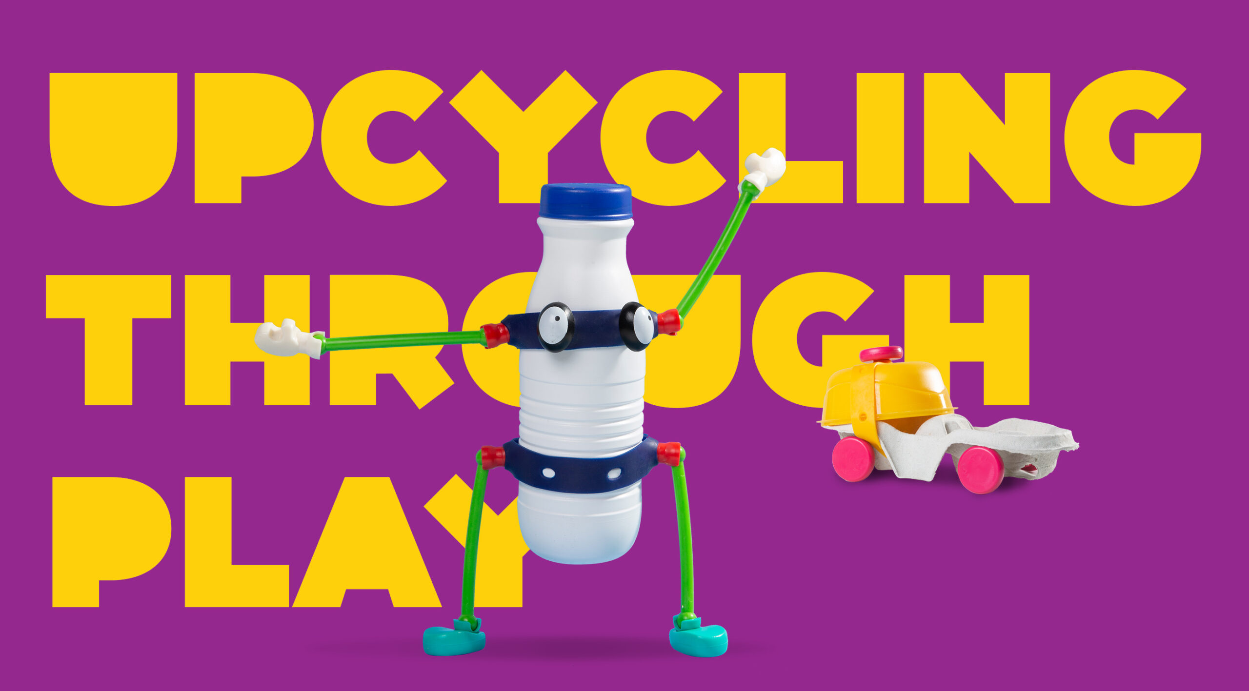
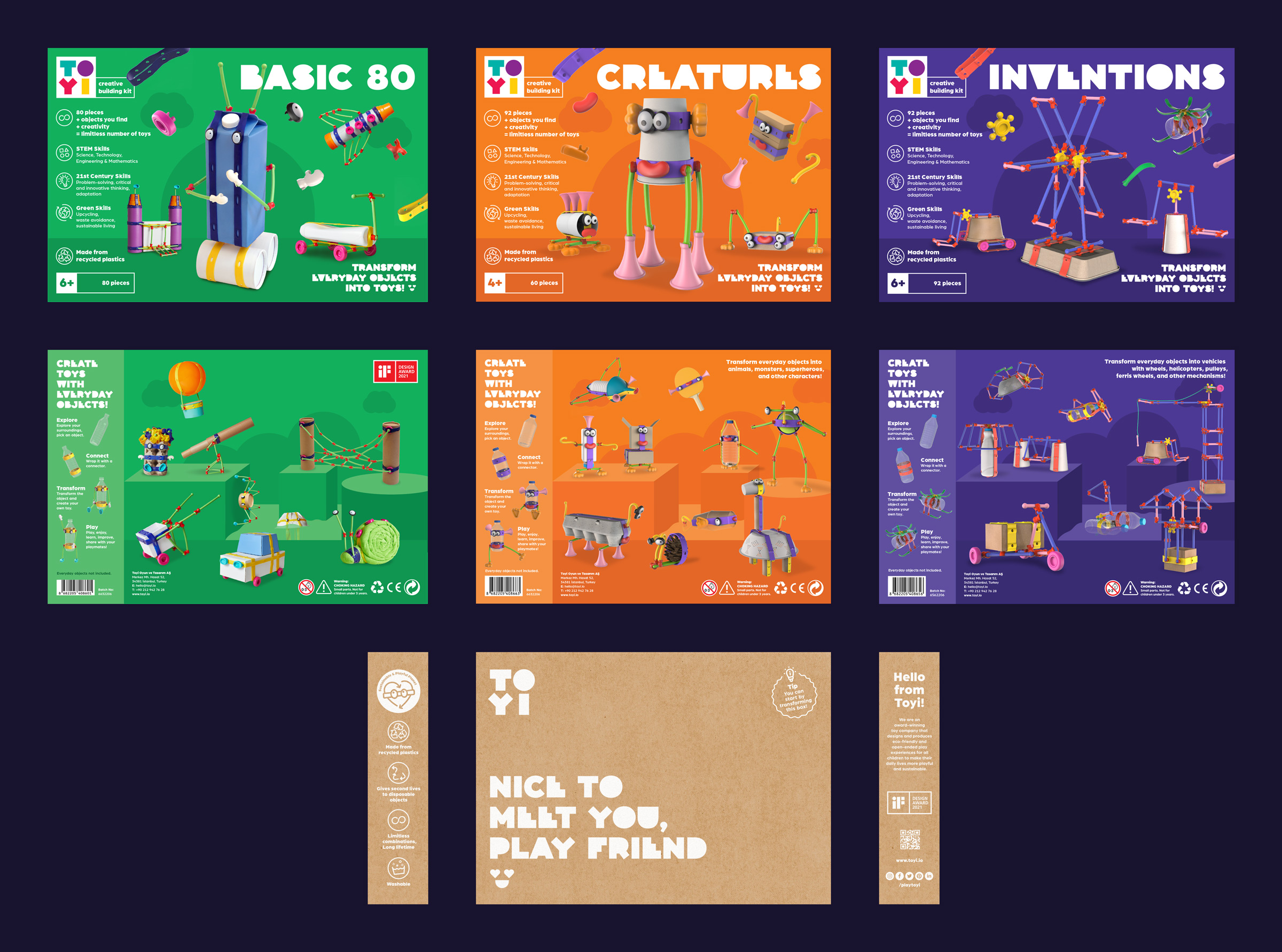
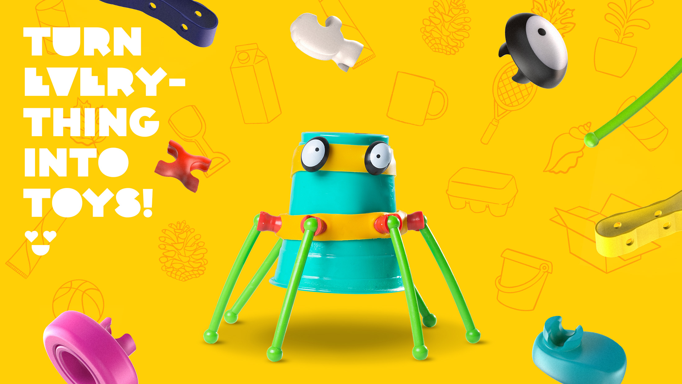
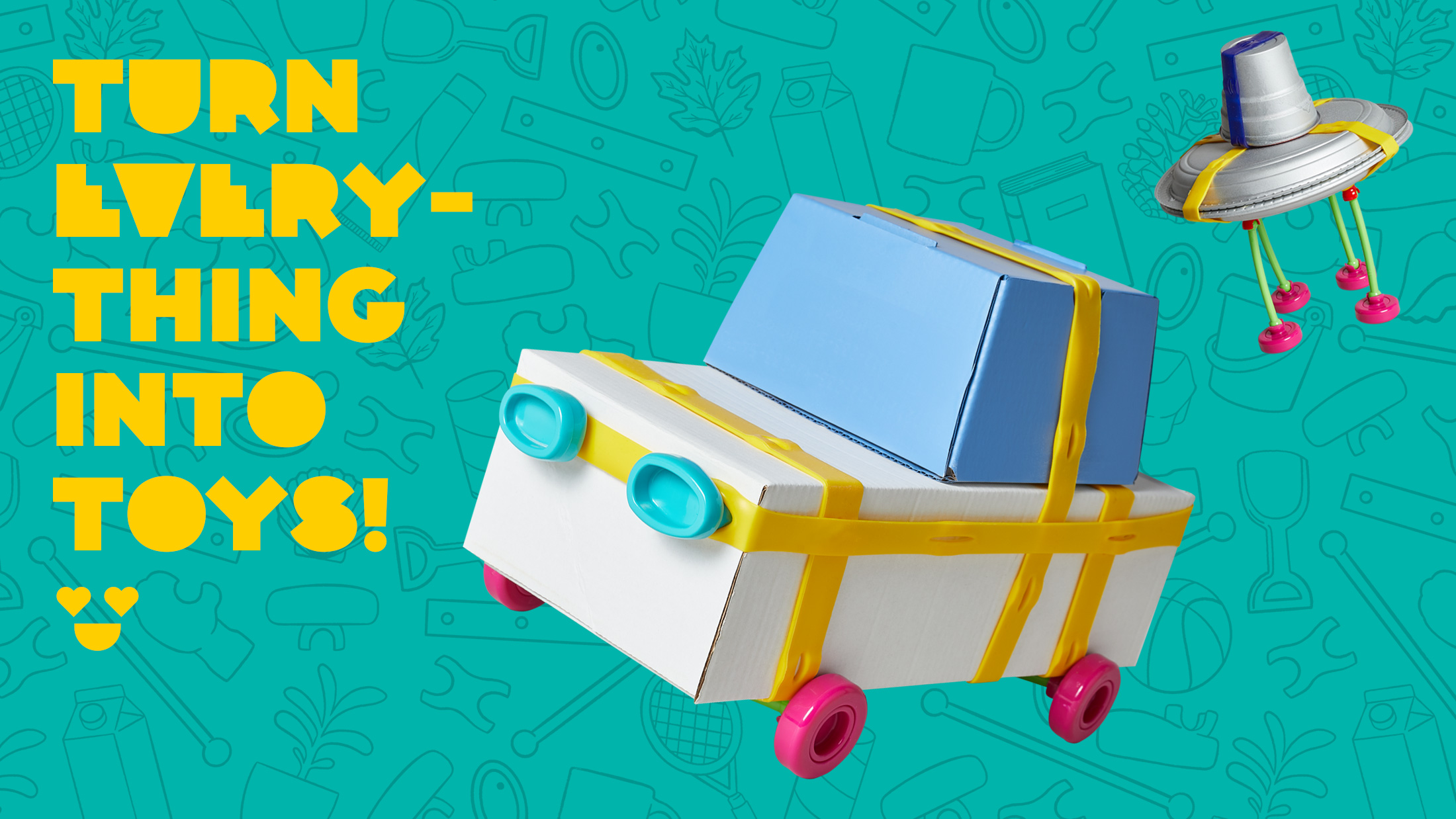
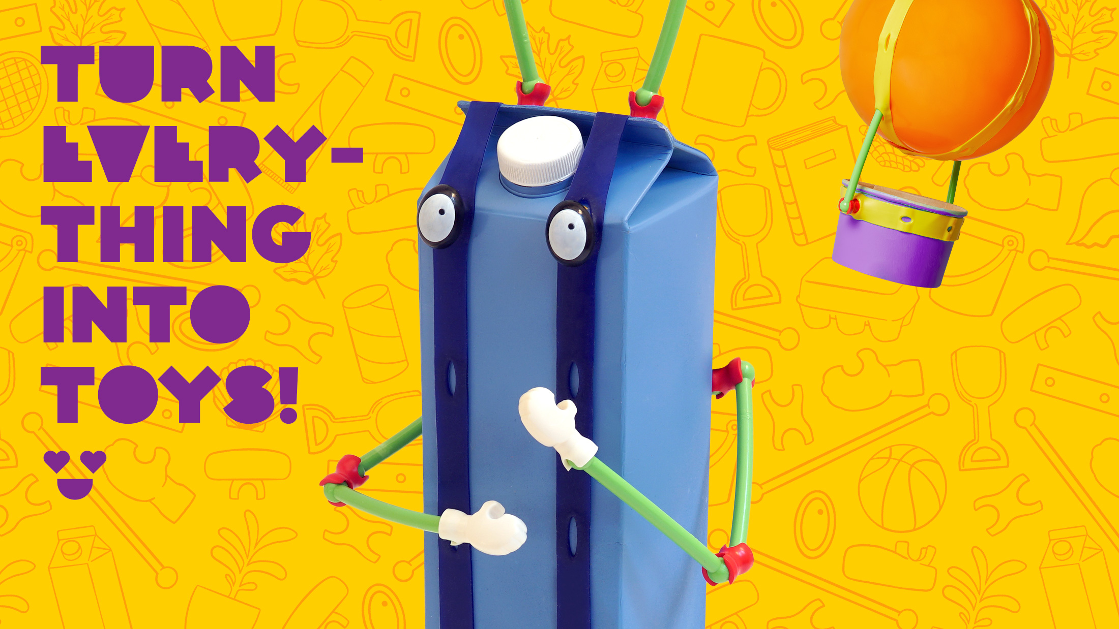
An eco-friendly creative building kit that empowers children to turn everyday objects into one-of-a-kind toys. The kit includes wheels, feet, hands, eyes, joints, sticks, and flexible connectors, allowing kids to transform any object around them into their imaginative creations. I designed a colorful, playful identity that reflects Toyi’s spirit of creativity and transformation.
Brand IdentityCollateralType DesignPrintPackaging2018―2023
Exploration
Toyi reimagines the concept of a toy by encouraging children to creatively explore their surroundings, transforming everyday objects into new playthings. When designing the logo, it was crucial to create an identity that transcended the first set of Toyi parts, as the brand planned to expand into different products.

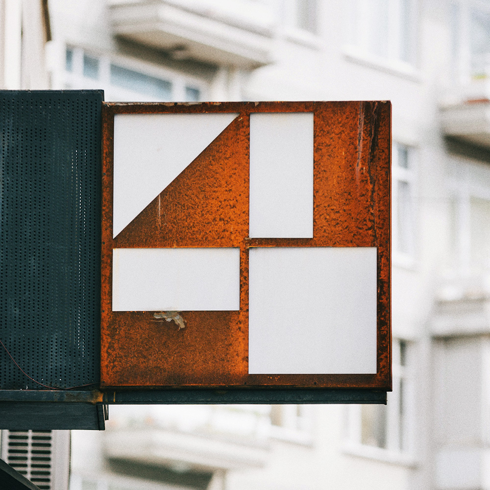
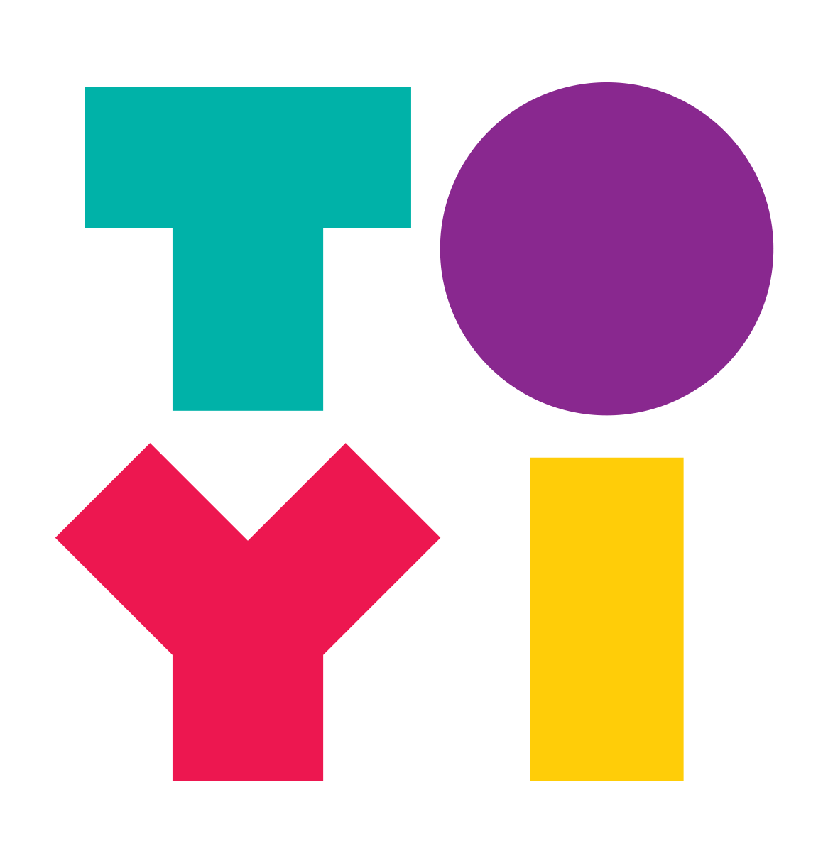
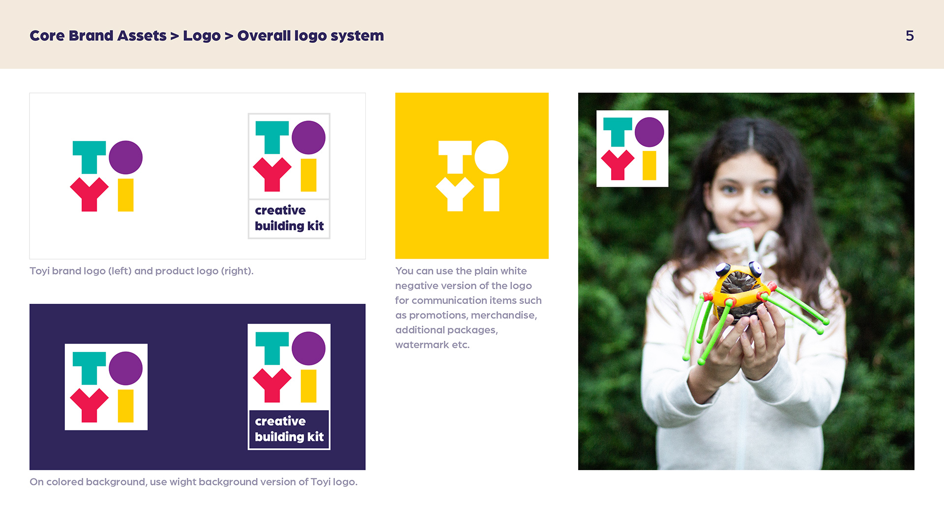
The logo was conceived as an inclusive, umbrella identity—a system that symbolically represents the assembly of various elements rather than directly referencing specific Toyi parts. For instance, the letter ‘I’ in the logotype connects with the letter ‘O,’ forming a dotted ‘İ’, and together they arrange themselves in an organic, non-linear way, reflecting the unpredictability and fluidity of play. The resulting identity is simple, colorful, and joyful, with the playful letters of the Toyi logo evoking the spirit of creativity and discovery.
The design is intended to be an umbrella identity, an inclusive system that covers a wider area than the first toy parts produced by them; it relates to Toyi more abstractly, symbolizing the coming together of different parts. For example, the letter ‘I’ in the logotype is linked to the letter ‘O’ and they are forming an ‘İ’ with a dot. They line up to form the logotype in a non-linear fashion, exemplifying the organic nature of play and the unexpected unities arising from it. A simple, colorful, and cheerful identity emerges as the letters for the Toyi logo evoke toys and play.


Custom Typography: Toyi Font
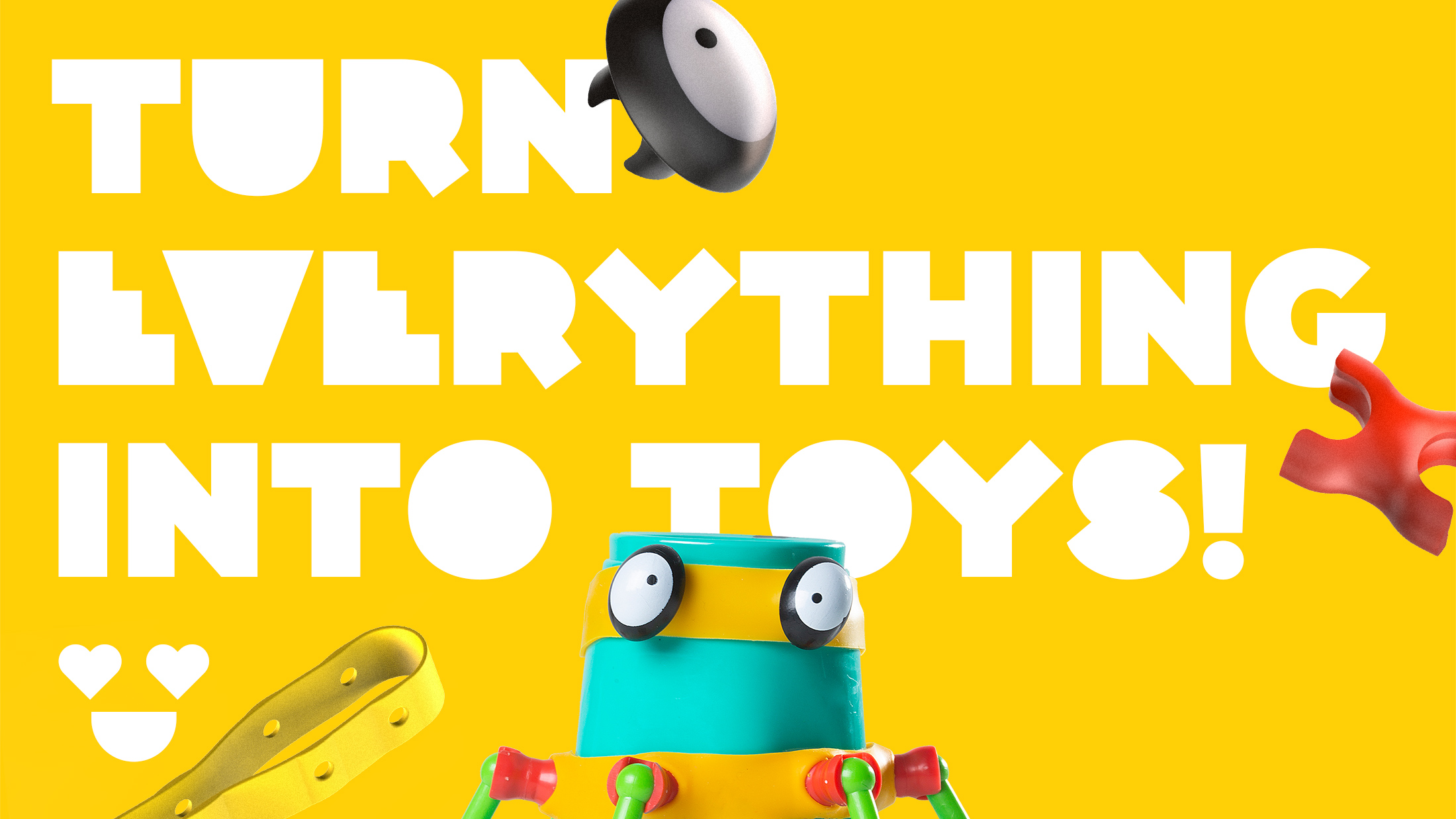
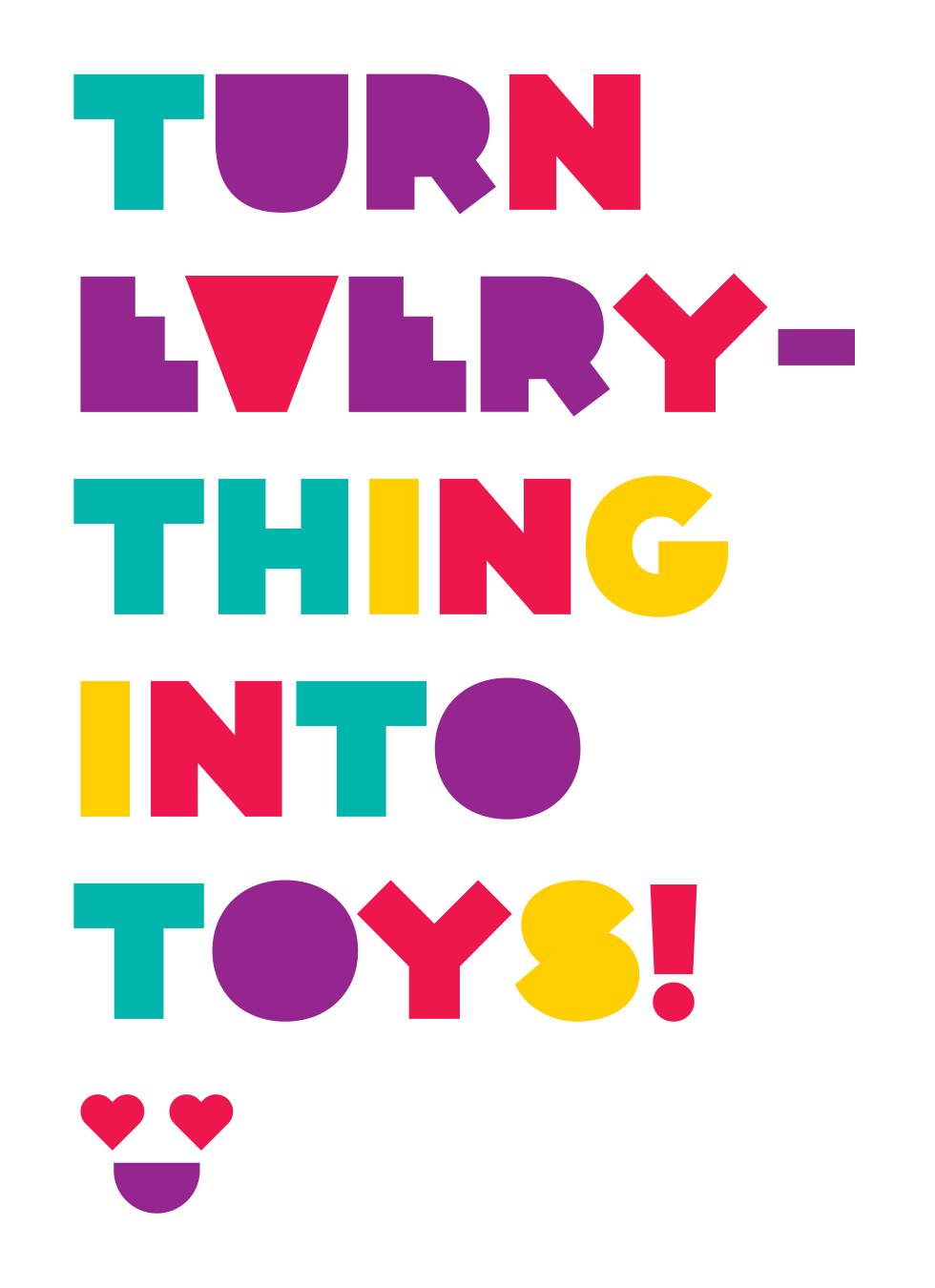
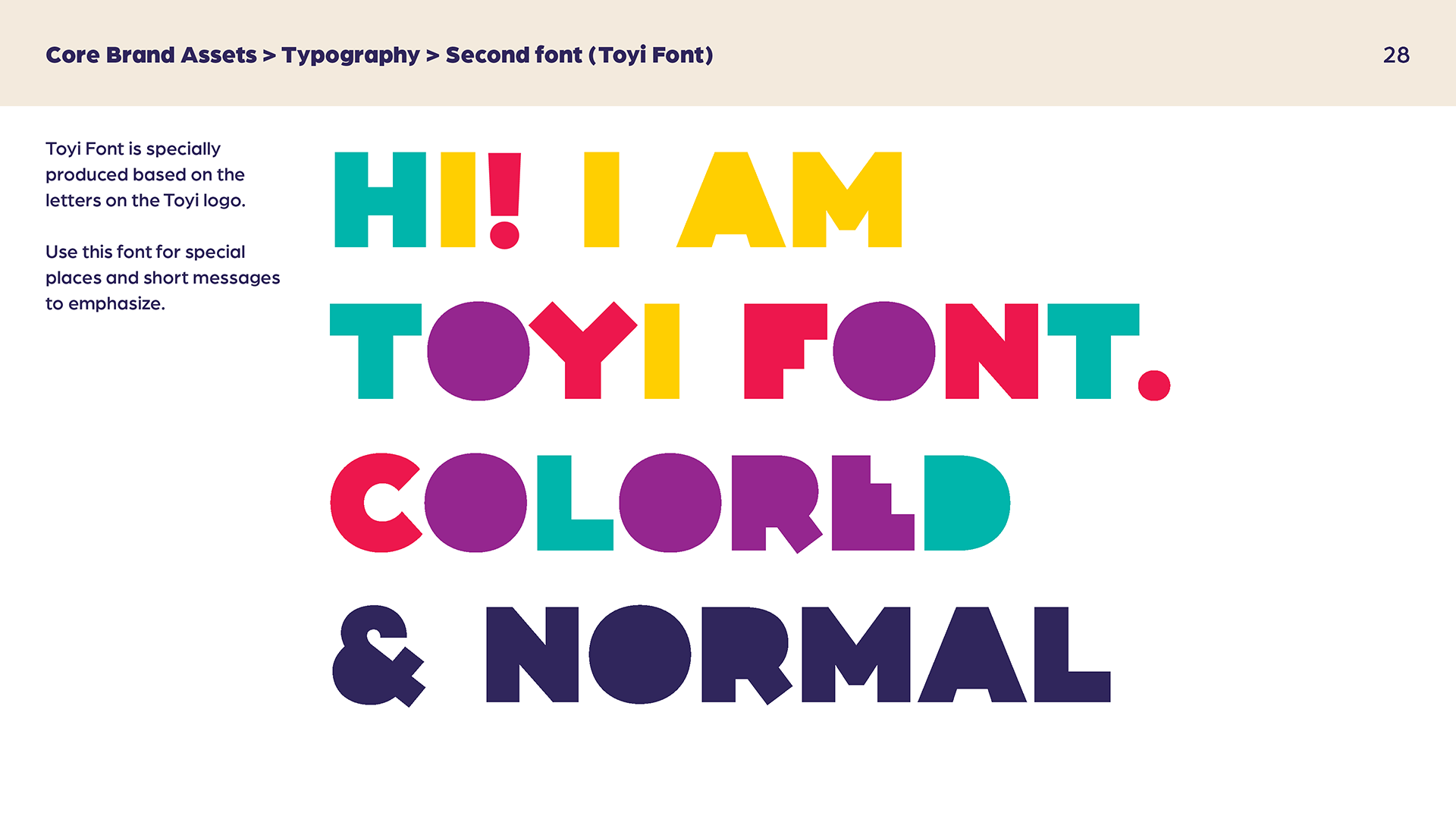
I designed a geometric, playful sans-serif typeface for the Toyi logo, drawing inspiration from the forms of the letters T, O, Y, and I. This all-uppercase font comes in two variations—colored and regular—each contributing to the brand’s distinctive and lively appearance. With its bold shapes and unique features, the Toyi Font reinforces the brand’s identity across various applications, ensuring easy recognition and a cohesive visual language.
Custom typography ‘Toyi Font’
I designed a geometric, playful, and colorful sans-serif typeface for the Toyi logo, inspired by the letters T, O, Y, and I. This all-uppercase font comes in two versions: colored and regular. With its bold forms and distinctive features, the font enhances the brand’s identity, giving it a unique appearance. It’s utilized across various applications, making it easy for audience to recognize the brand.

Packaging

Promo Visuals
Brand Guideline
Ad Packshot
