Don't look too close
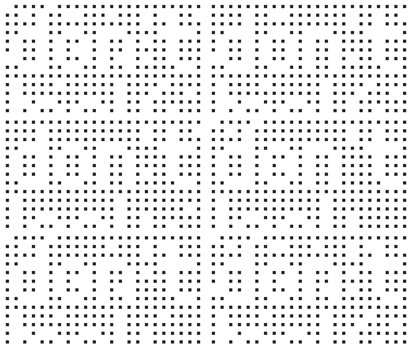
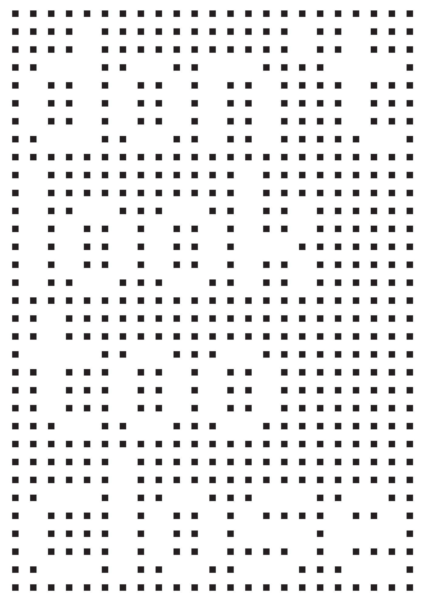
A poster design for the 2023 Faculty Show of the Art & Design Department at Binghamton University, NY. Is it the dark areas we see that create letters and shapes and enable us to perceive them, or do the spaces around them actually define them?
Poster Design2023

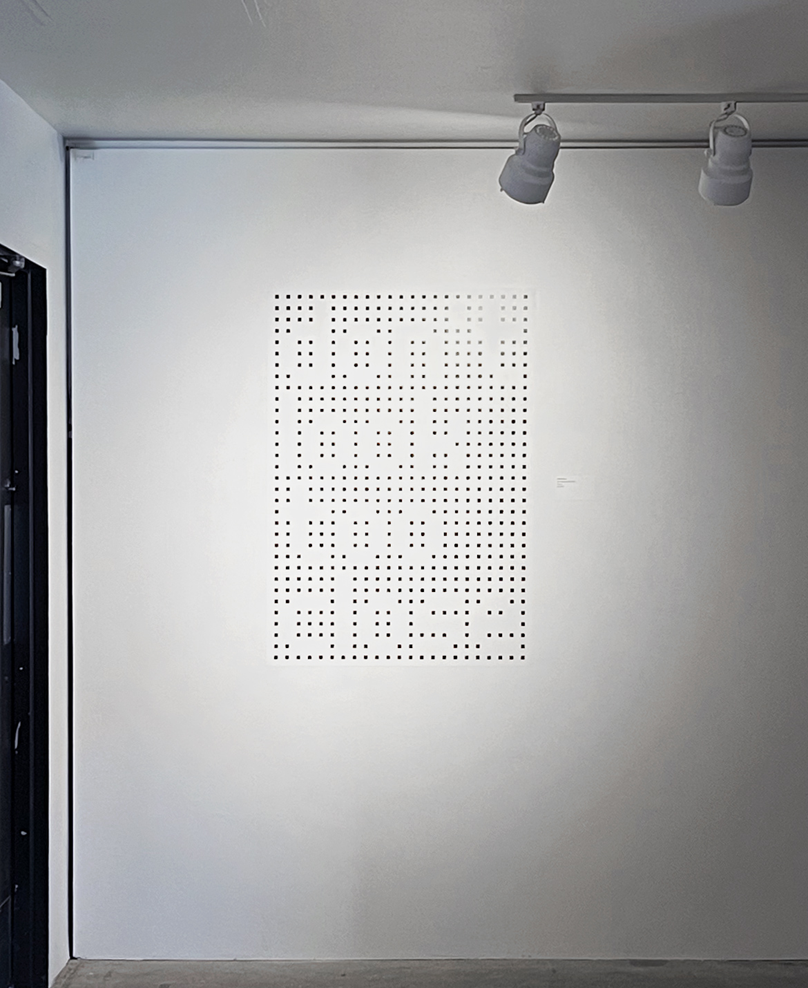
Negative areas make up positive areas, and vice versa. Our different perspectives and our changing distances determine how these perceptual interactions play out and enable us to see letters/shapes. Changing the area we focus on allows us to see what we couldn’t see before. What we perceive when we look very closely takes on a completely different expression/shape within the whole as we move away. Sometimes we need to step back and look from afar.

don't look too close, 2023, UV Print, A0
Faculty Show, Art + Design Department, Binghamton University, NY

