Piyano Evi
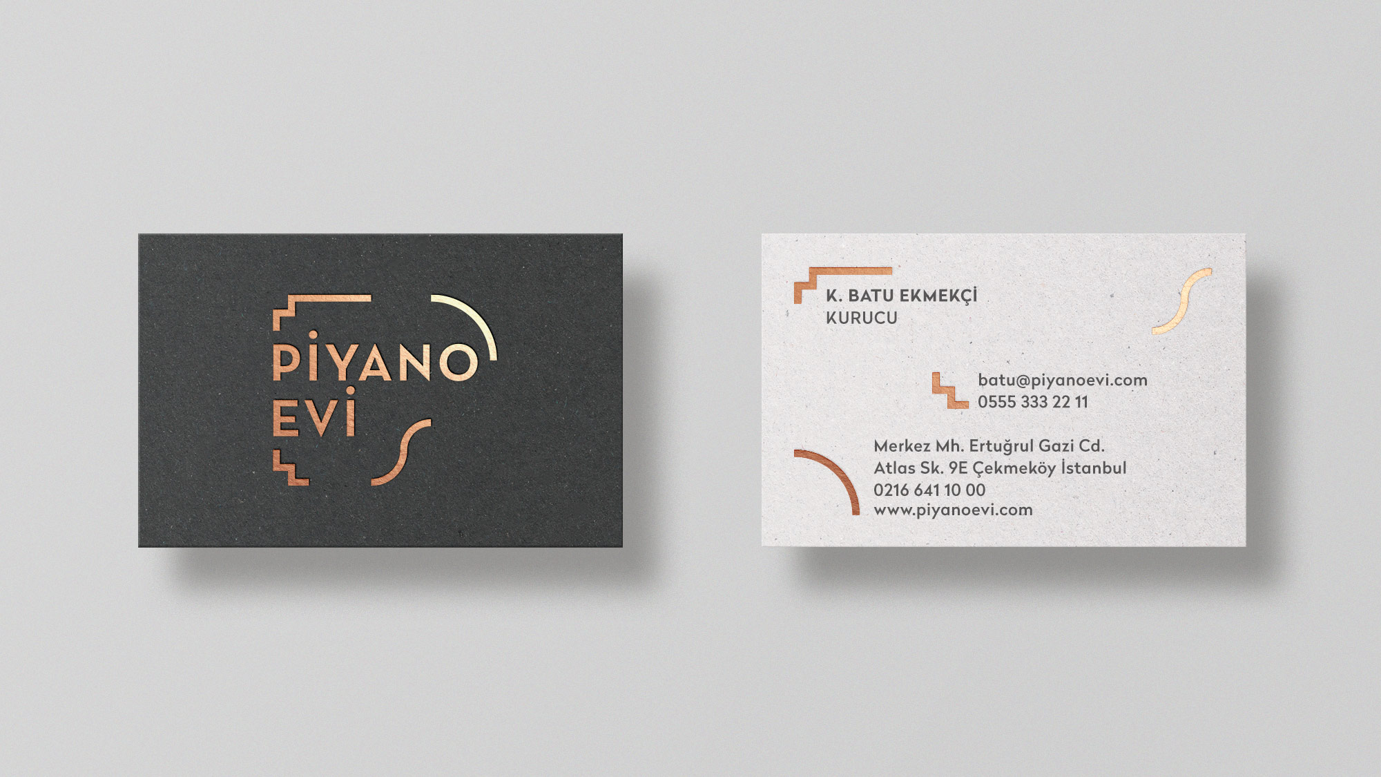
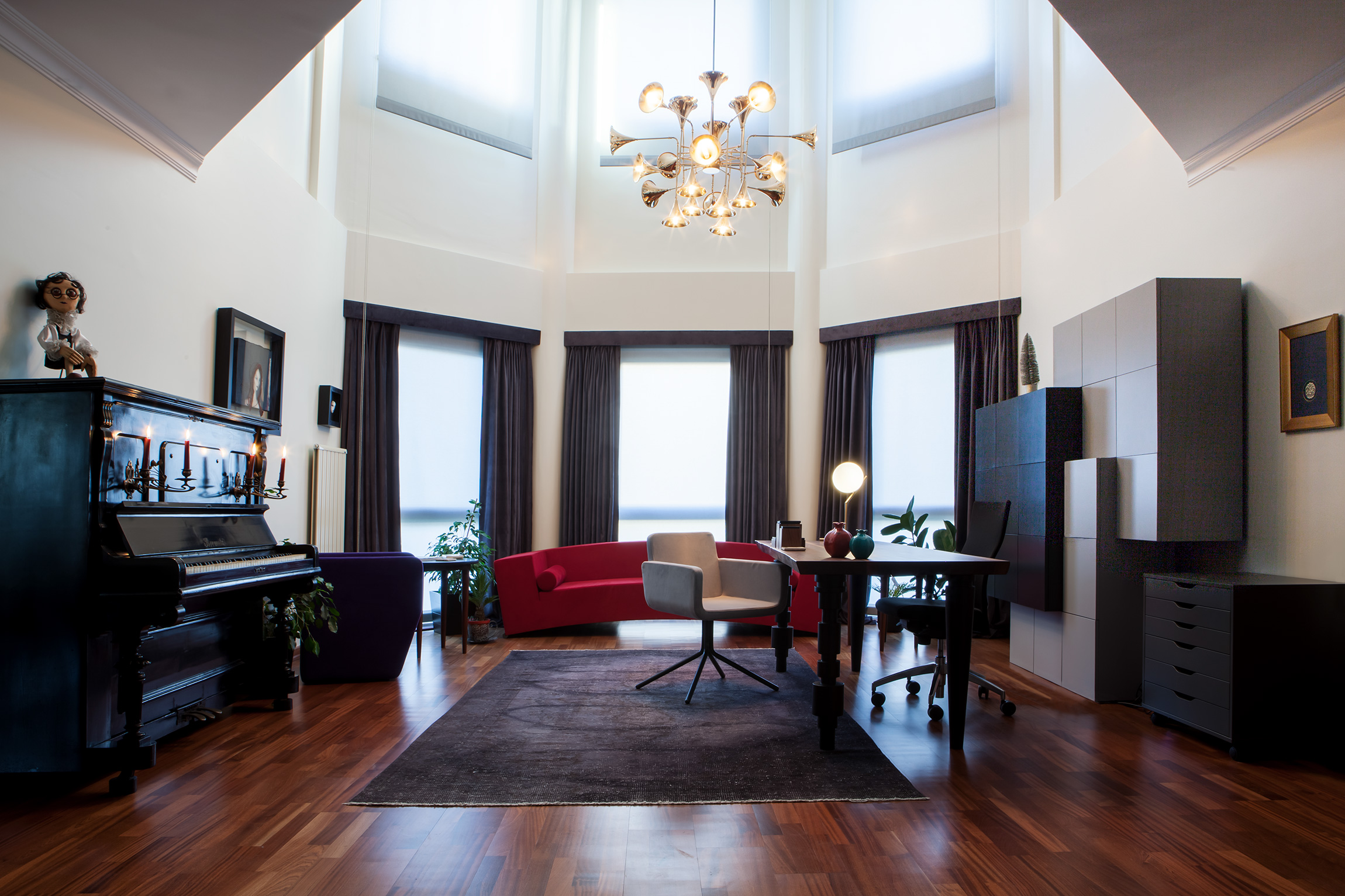
A music education center (Piano House) in Istanbul, provides piano, violin, guitar, singing, and drama lessons. I designed an identity inspired by piano and graphic notations, representing the education space.
Brand IdentityCollateralPrint2017

Approach
Based on the idea of a space/center for music education, an open-framing shape was created for the visual identity. The letter ‘P’, formed by subtracting parts of the top view of the piano and also inspired by graphic notations, becomes a symbol representing the education space that is Piyano Evi.



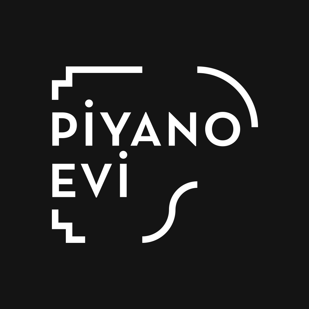
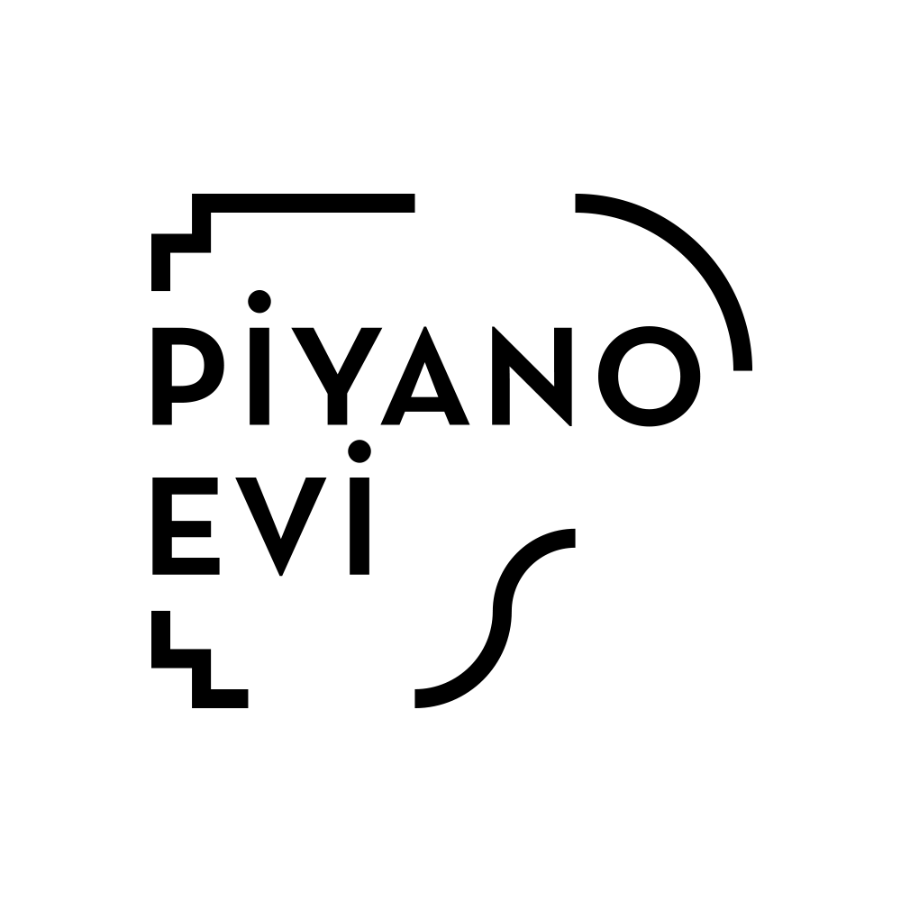
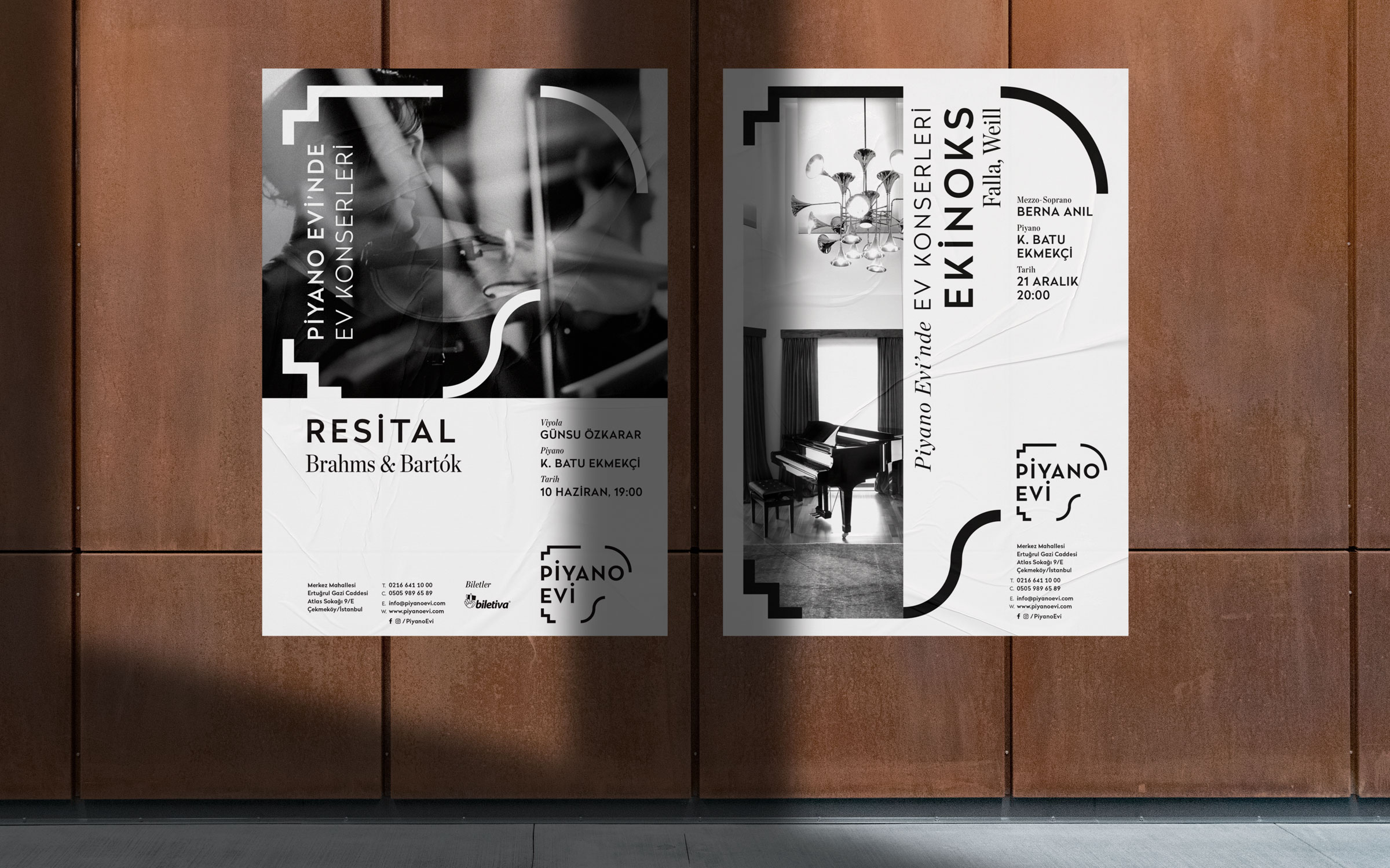
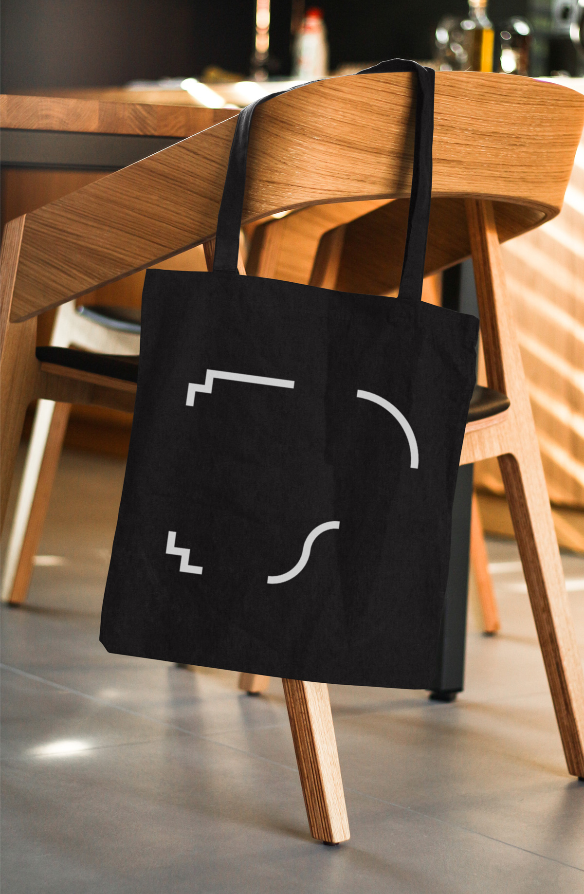
The pieces of the symbol also refer to the decorations of the Baroque period and form the graphic elements of the identity. The corner parts that make up the logo take different roles in building the visual identity, as separate items or as frames carrying the idea of an inclusive music space.
