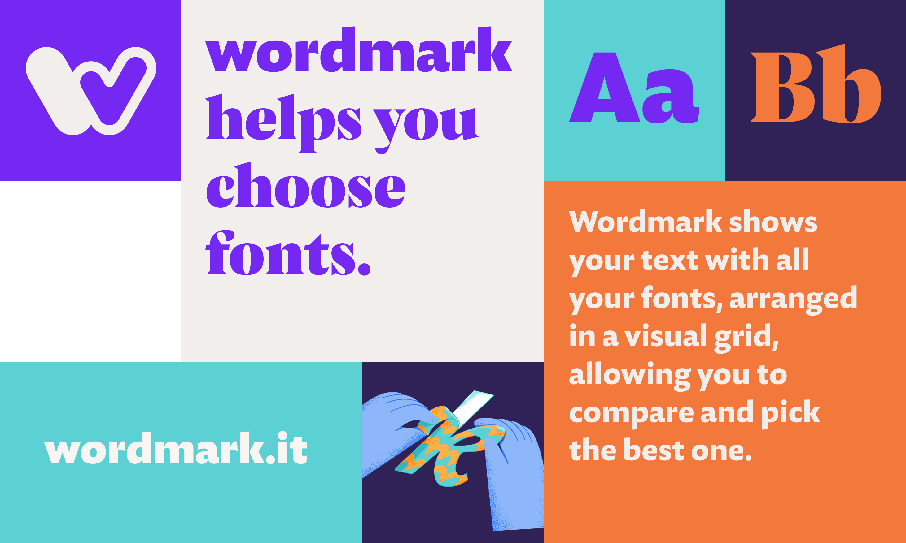
Wordmark
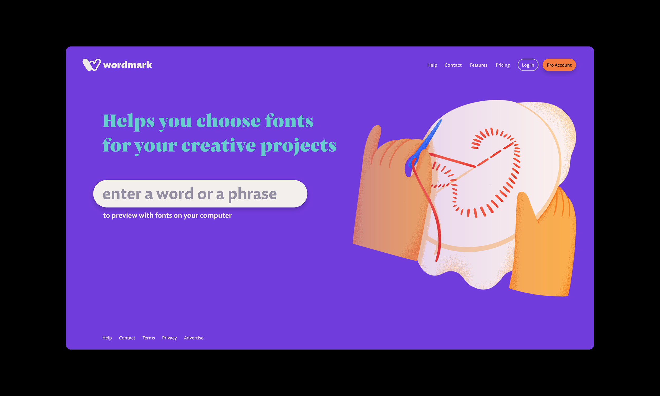
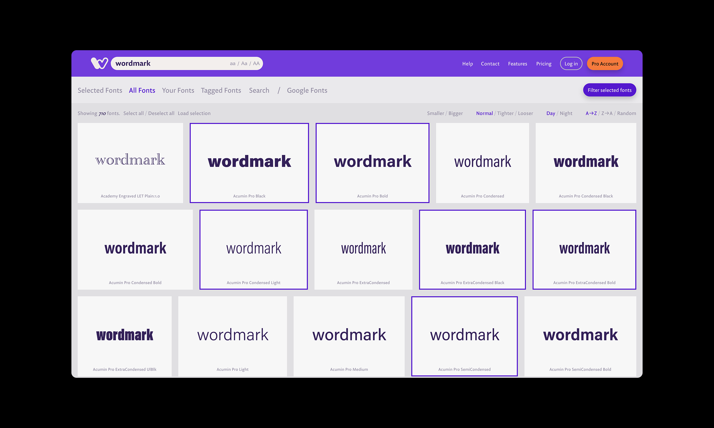
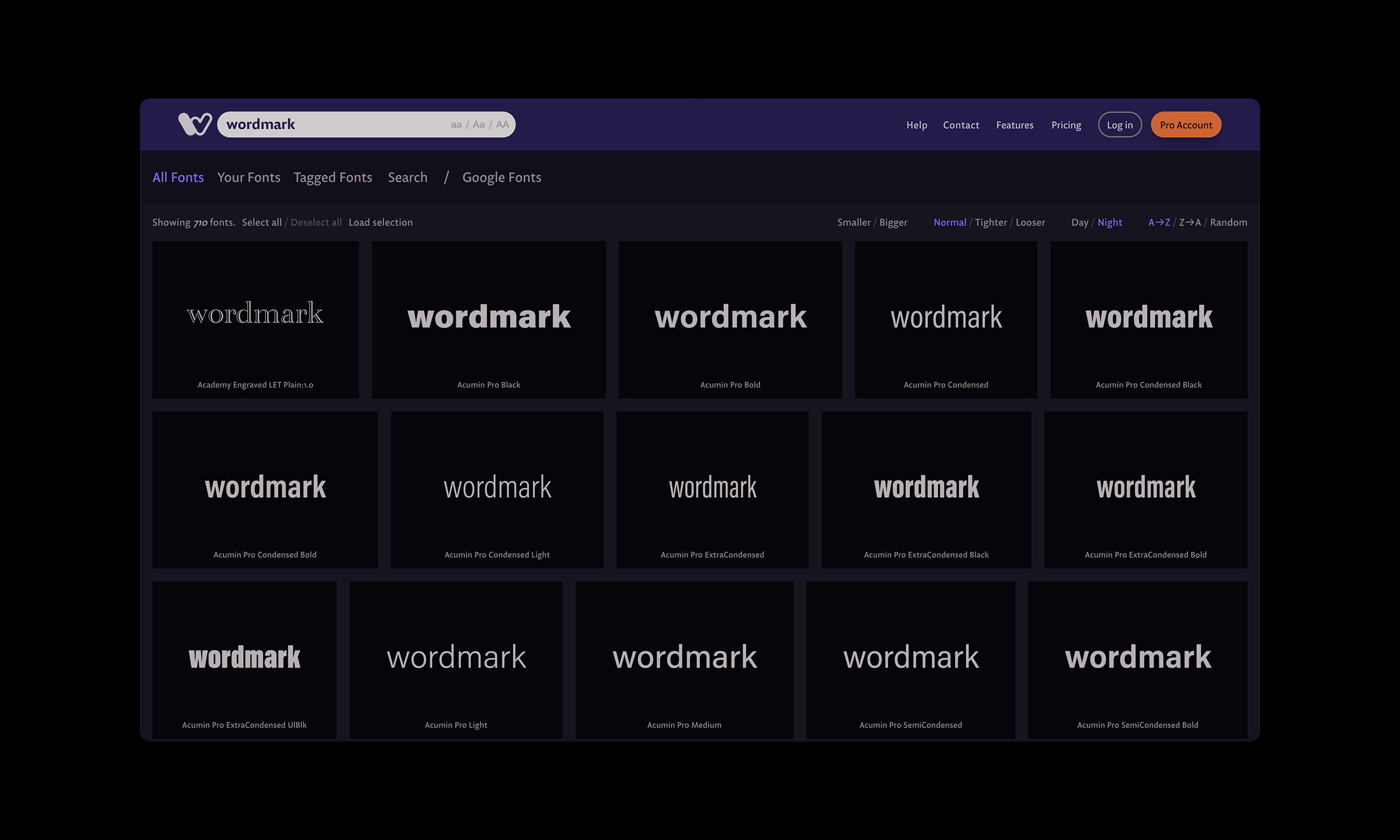
A web application designed to help users select the perfect font for their crafting projects. Rather than scrolling through endless drop-down menus, Wordmark shows your text displayed in all your fonts, arranged in a visual grid, making it easy to compare and choose the best match. I designed a bold and vibrant identity, featuring colorful hands shaping the letters, symbolizing the creative and playful process of font selection.
Brand IdentityUI Design2021
Exploration
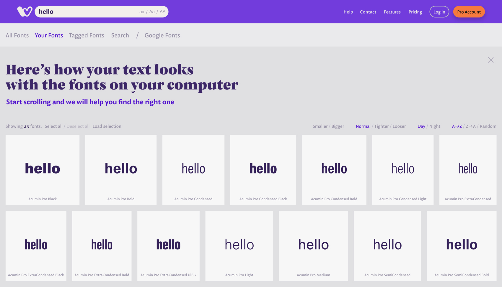
We initiated this project with in-depth user research, uncovering that a large portion of app users are engaged in handicrafts and small-scale production. Many of these users don’t have font management programs installed on their computers, relying instead on Wordmark to view and select the fonts available on their systems.
Approach
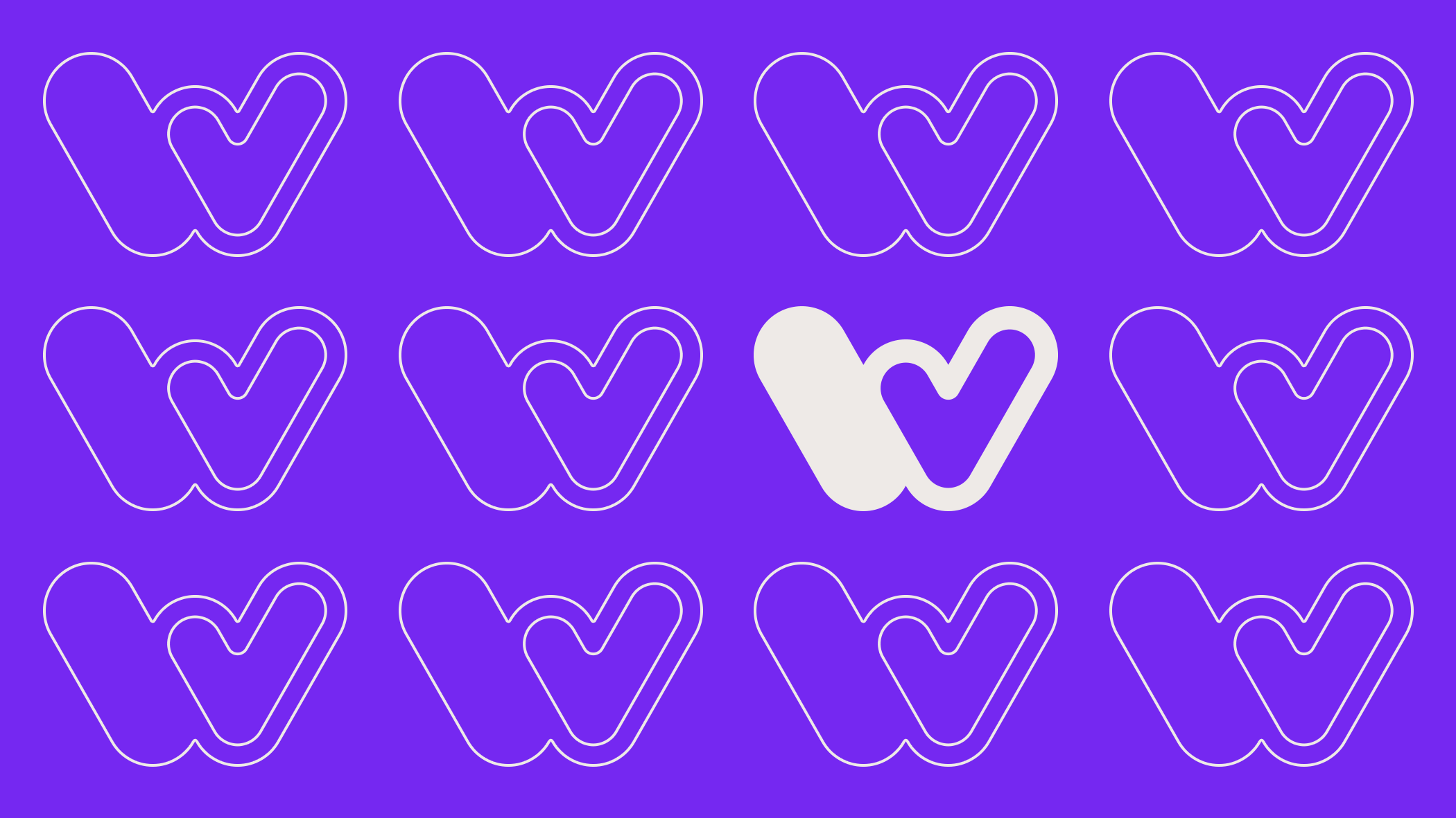
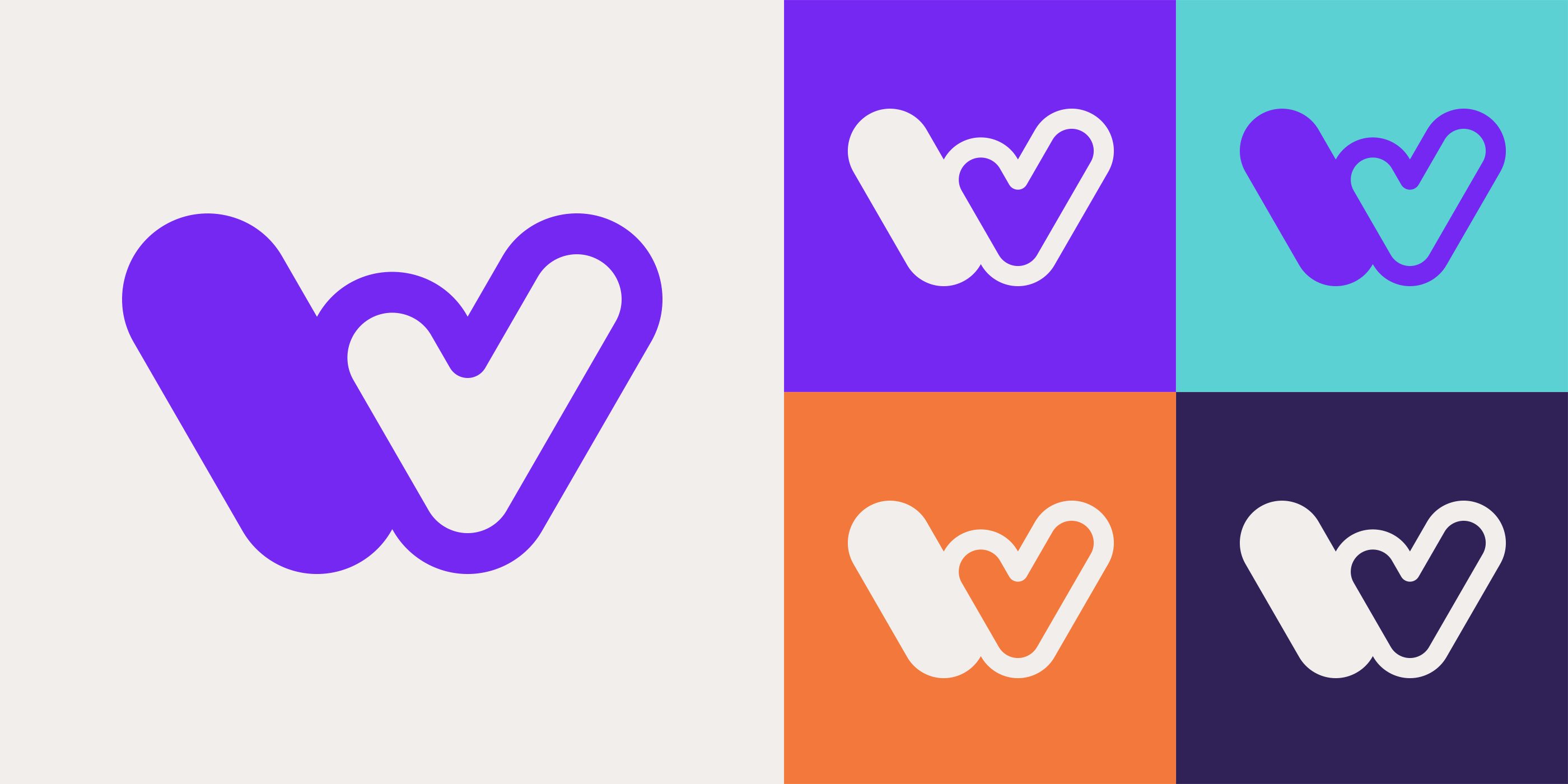
Our user research pointed us toward developing a warm, friendly, and human-centered design language. Given that typography lies at the heart of Wordmark’s function, we focused on crafting a symbol around its first letter, “W.” This symbol incorporates themes of “choosing,” “approving,” and “marking,” reflecting the core behaviors of users within the app. The result is a bold, memorable, and sincere symbol that resonates with the application’s purpose.


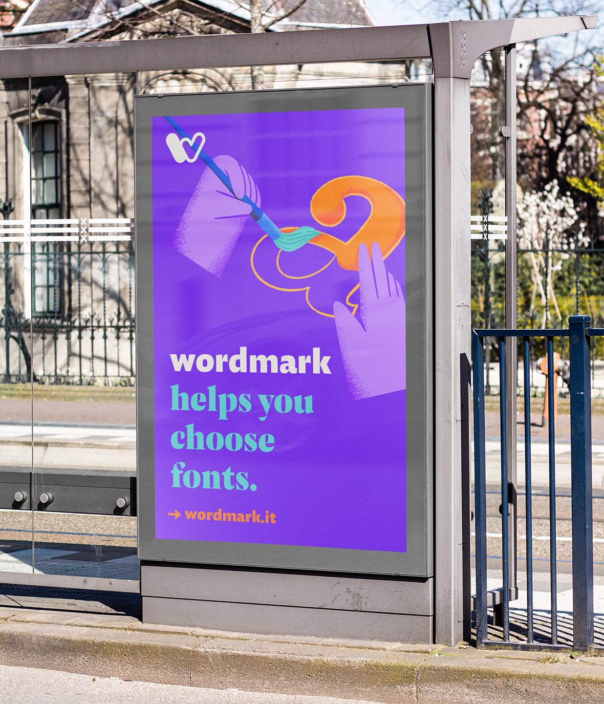
The Hands
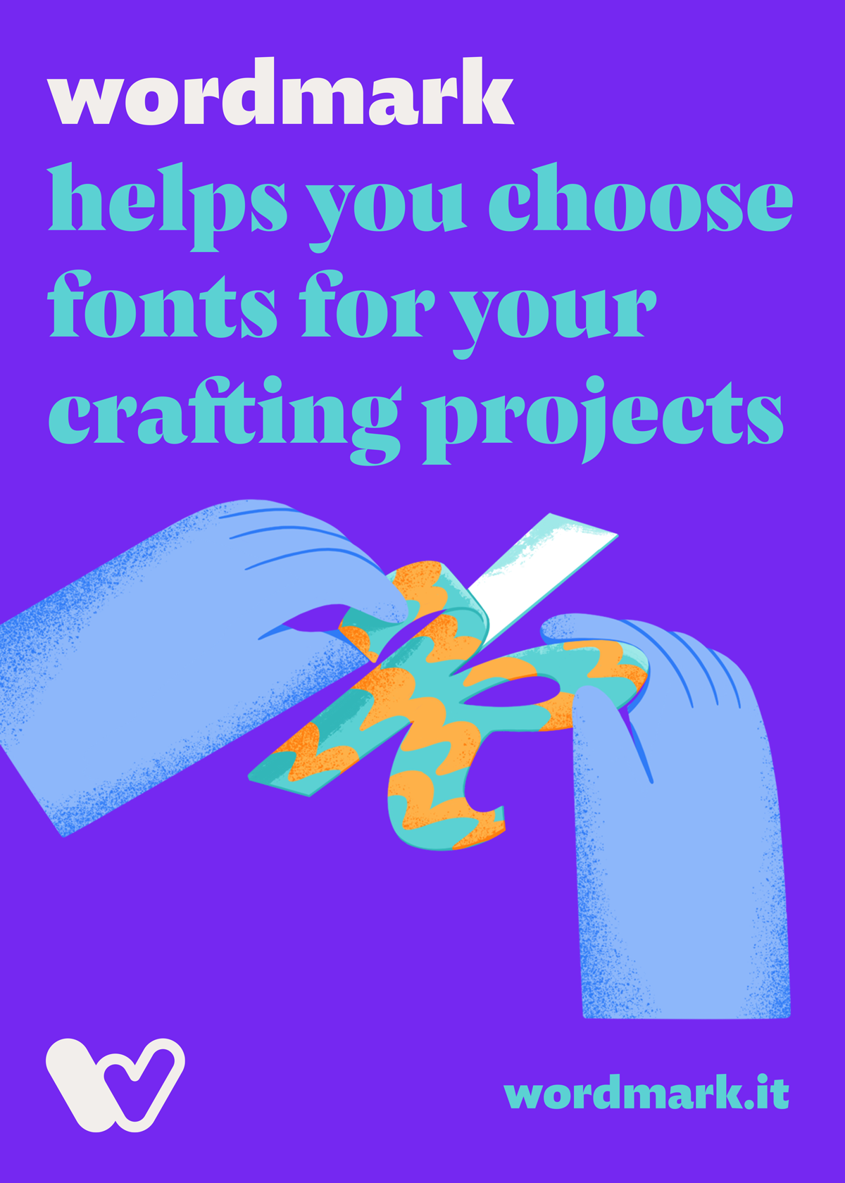
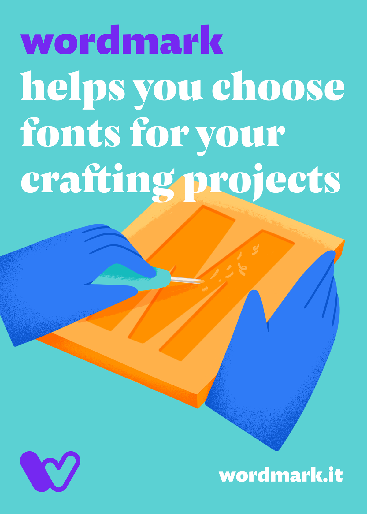
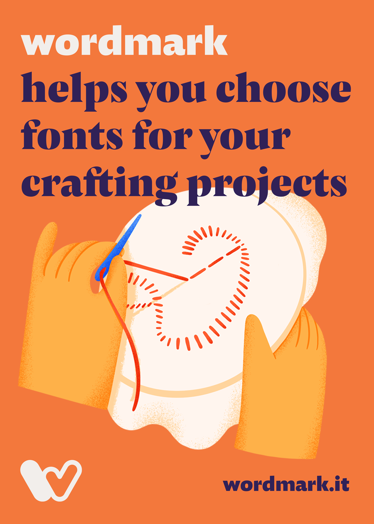
Inspired by the user survey results highlighting the role of handicrafts, we decided to incorporate this concept into the identity. The idea of hands, symbolizing diversity and creativity, took shape. Collaborating with Selin Tahtakılıç, we developed illustrations of hands crafting the letters of “wordmark” using various techniques, each reflecting the unique approaches and backgrounds of our users.

Typography & Colors
In keeping with Wordmark’s user base and the message we wanted to convey, we selected a humanist font family. The chosen Pensum font family, with its sans-serif and display serif options, perfectly aligns with the project’s expressive and approachable tone. Its humanistic style complements the identity, bringing warmth and personality to the design. Similarly, the color palette was carefully crafted to reflect this warmth and humanistic feel while seamlessly integrating with the application’s interface.

Promotional Visuals
UI Design
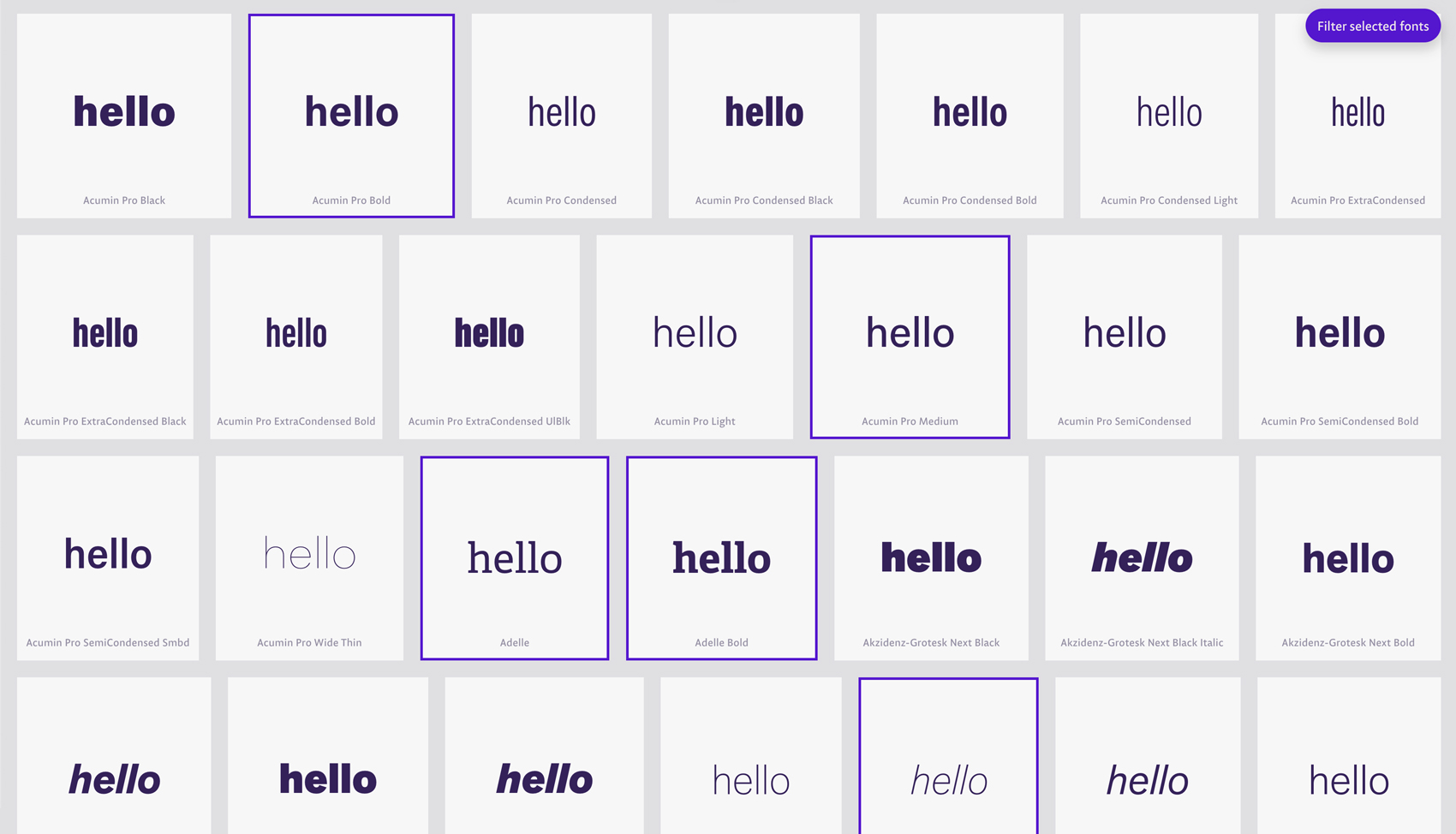
The website interface prioritizes simplicity and usability, developed through close collaboration with Fahri Özkaramanlı, the founder of Wordmark. Typography, color, and illustration work in harmony to create a cohesive experience that reflects the brand’s identity. The interface adapts seamlessly between light and dark modes, ensuring a comfortable viewing experience for users across different environments.
See more at www.wordmark.it ↗


Credits ↓
Design & Art Direction: Emre Parlak
UI Design: Emre Parlak & Fahri Özkaramanlı
Illustration: Selin Tahtakılıç

If you’re working on something that needs a strong visual language — or you’re not sure yet what it needs — I’m happy to talk. More about me & my approach 〉
